ROLE: Product Designer —
User Research, Interaction/Visual design, Prototyping & Testing
TOOLS: Figma, Maze, Optimal Workshop, Whimsical
PLATFORM: Desktop
TIMELINE: 80 Hours
OVERVIEW
Who is Tompkins Community Bank?
Tompkins has helped the communities they serve not only grow, but thrive since 1836. Tompkins is a community-based financial institution, that considers it their duty to provide innovative financial solutions for local families and businesses as they navigate their financial journeys.
Tompkins’s banking model is centered around the communities they’re located in. They pride themselves on having local leadership teams, community banking boards, and team members who live within the communities they serve. Tompkins also strengthens their communities through the areas of community development, arts and culture, healthcare, human rights, education access, and beyond.
Problem
Tompkins prides itself on its commitment to diversity and inclusion and is looking for a way to bring financial literacy to their users.
Goal
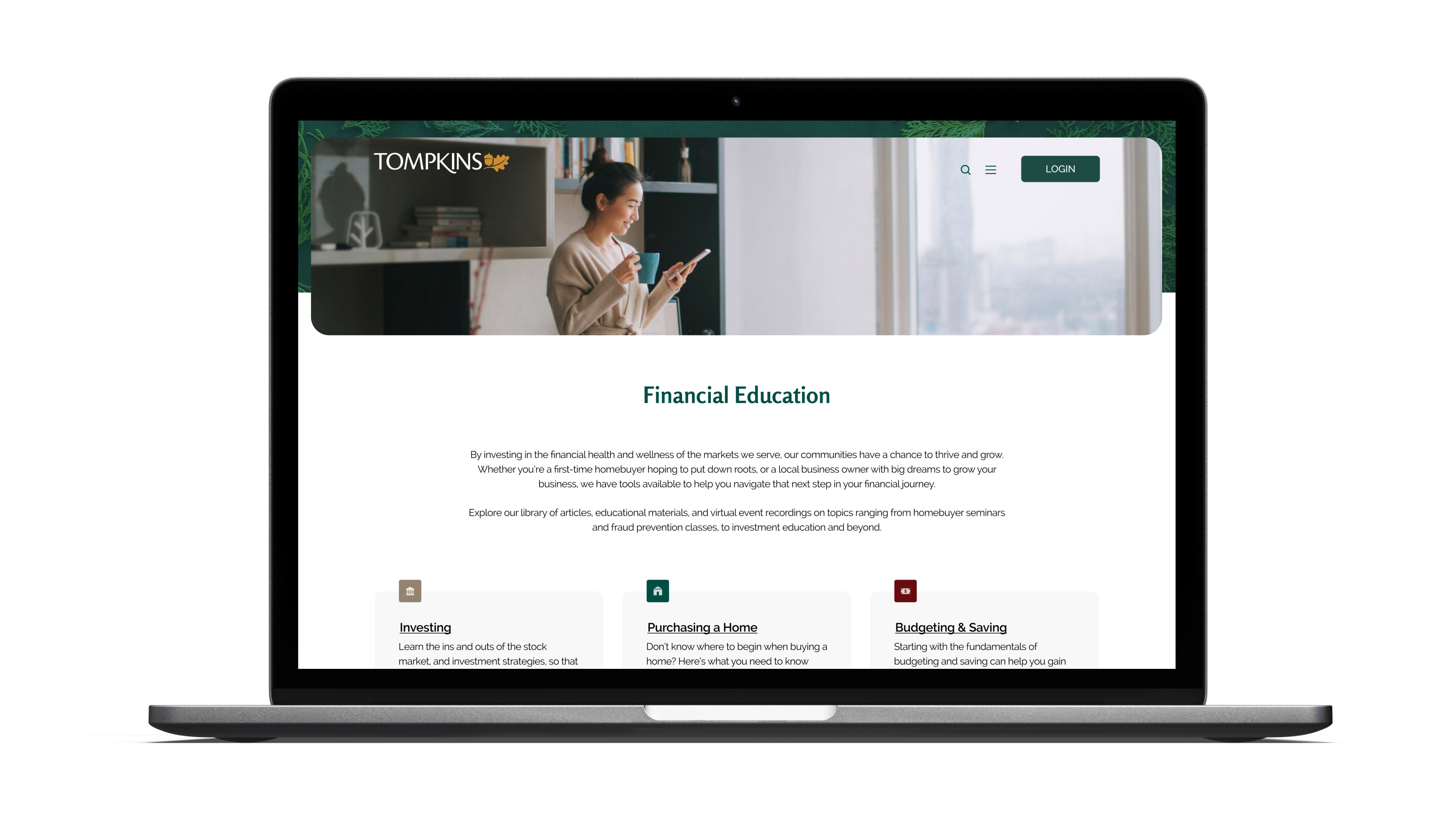
To add a ‘Finance 101’ section to their current site that empowers individuals from diverse socio-economic statuses by providing financial literacy tools.
DISCOVER
Research Objectives
- Conduct competitor analysis to discover industry standards, pain points, and solutions
- Identify potential communication barriers and formulate strategic solutions to mitigate these issues
- Identify user wants and needs while interacting with this feature. Then, create an implementation strategy for long term user engagement
- Discover how to create an environment in which the user feels comfortable and respected within the site feature
Competitive Analysis
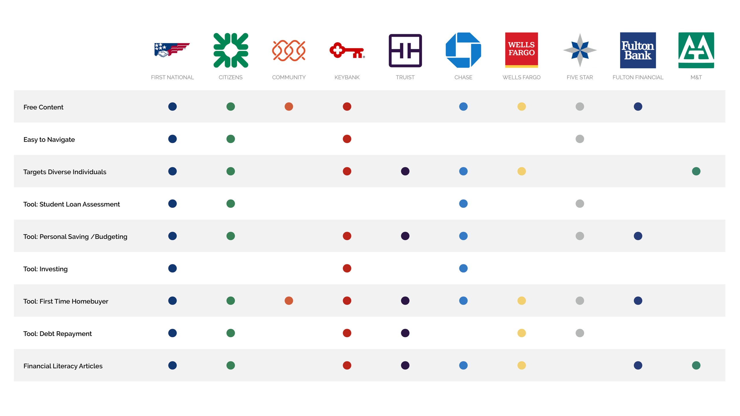
Research was conducted based Tompkins' direct and indirect competitors. For this analysis, the focus was specifically on education tools within the banking websites.
Summary of Findings
Most major banking institutions offer some level of financial literacy tools online. It is currently standard within the industry to provide:
- Tools for first time homebuyers and personal saving/budgeting.
- Free learning content and articles accessible without an account.
- Interactive features to simulate budgeting, loan repayment, and more.
Bringing these components to the new feature for Tompkins will help in their goal to empower individuals through financial literacy resources. One consistent flaw within the majority of the competitor sites, was that the education areas were surprisingly difficult to navigate. This was apparent when trying to locate specific information and/or tools. Honing in on ease of use, and the positive aspects from competitors above, will benefit Tompkins' new feature.
EMPATHIZE
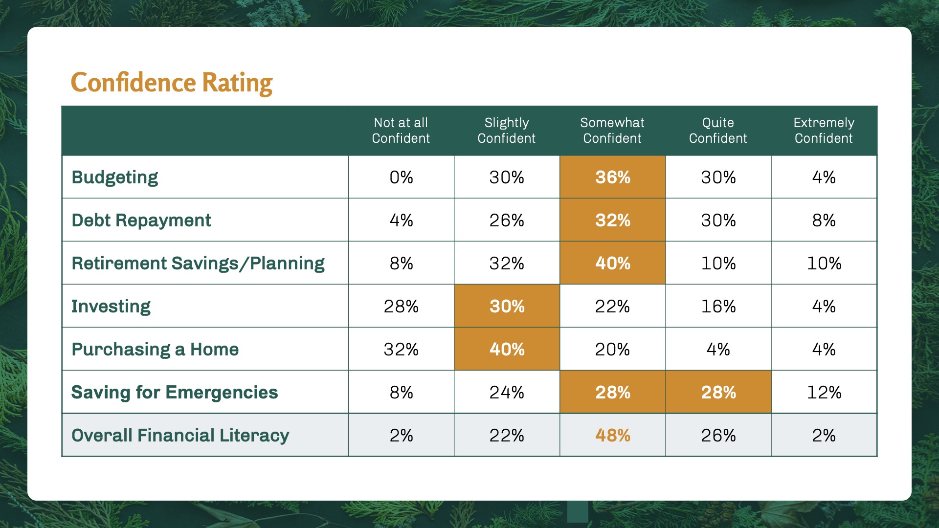
User Surveys
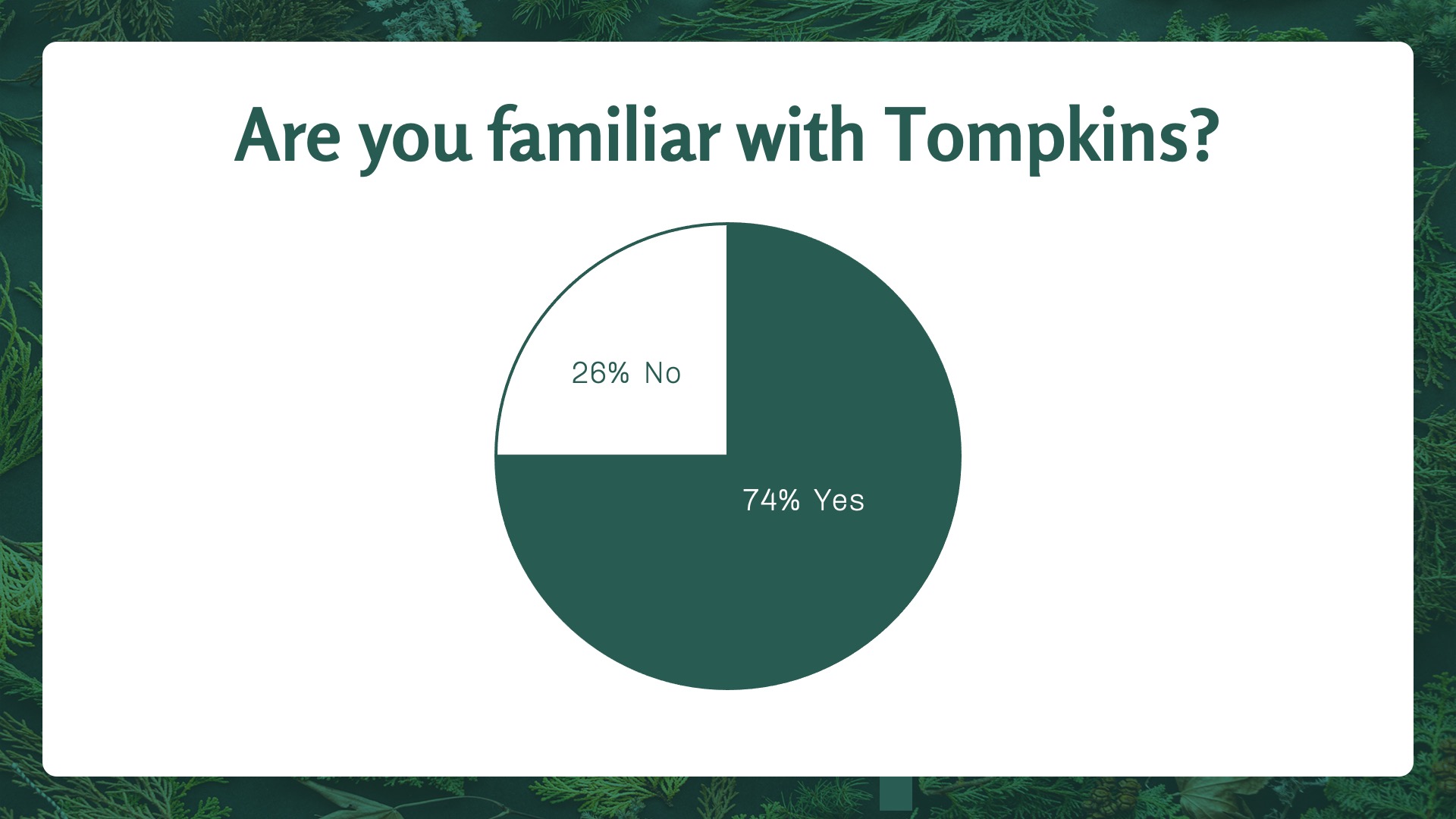
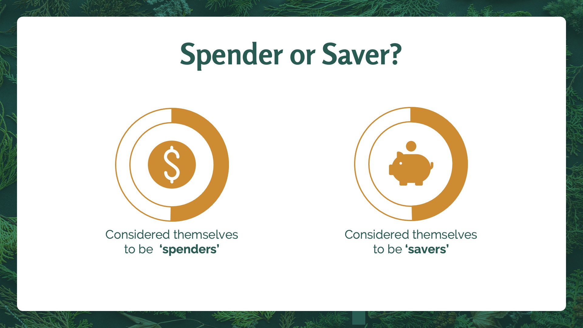
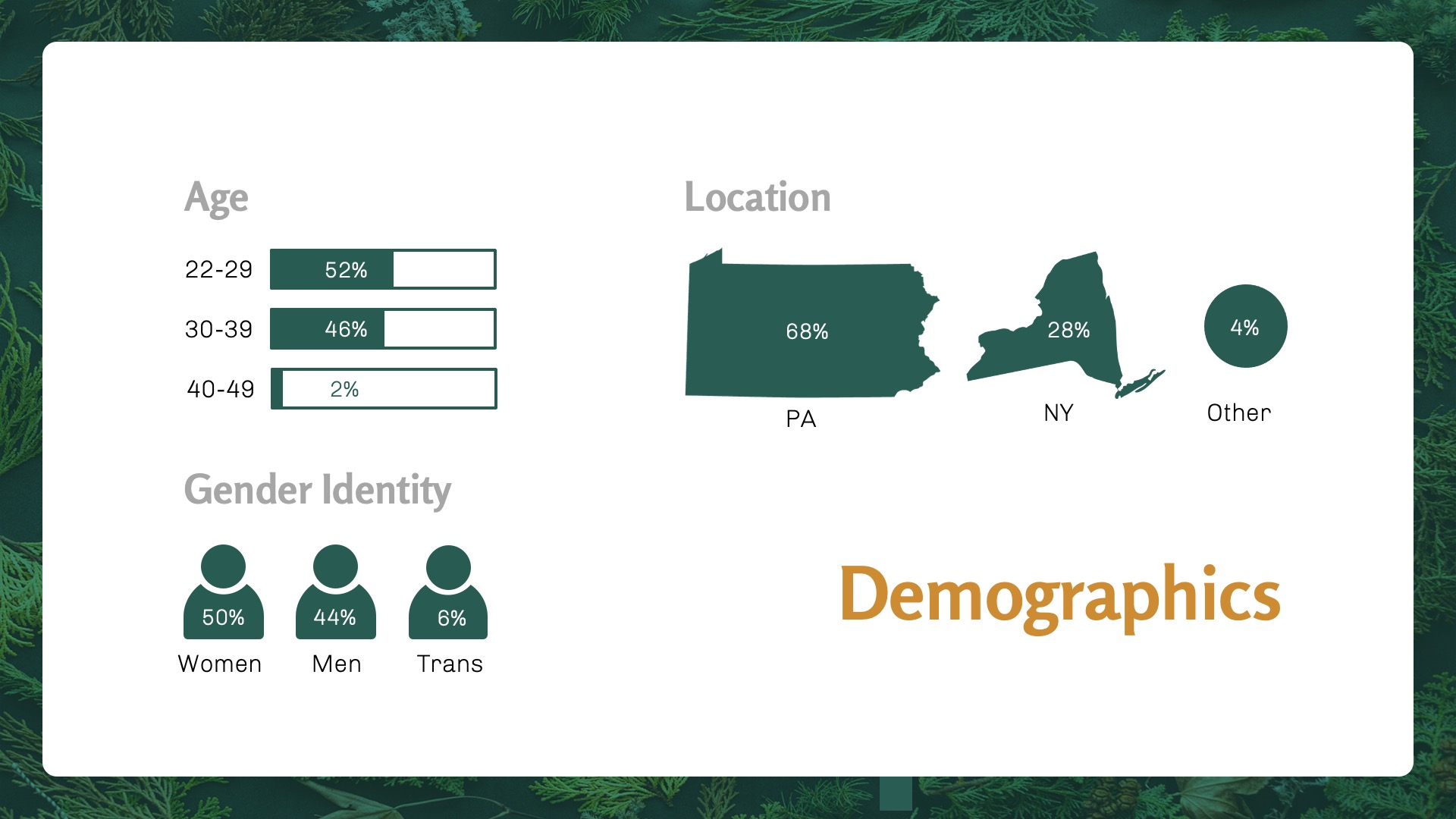
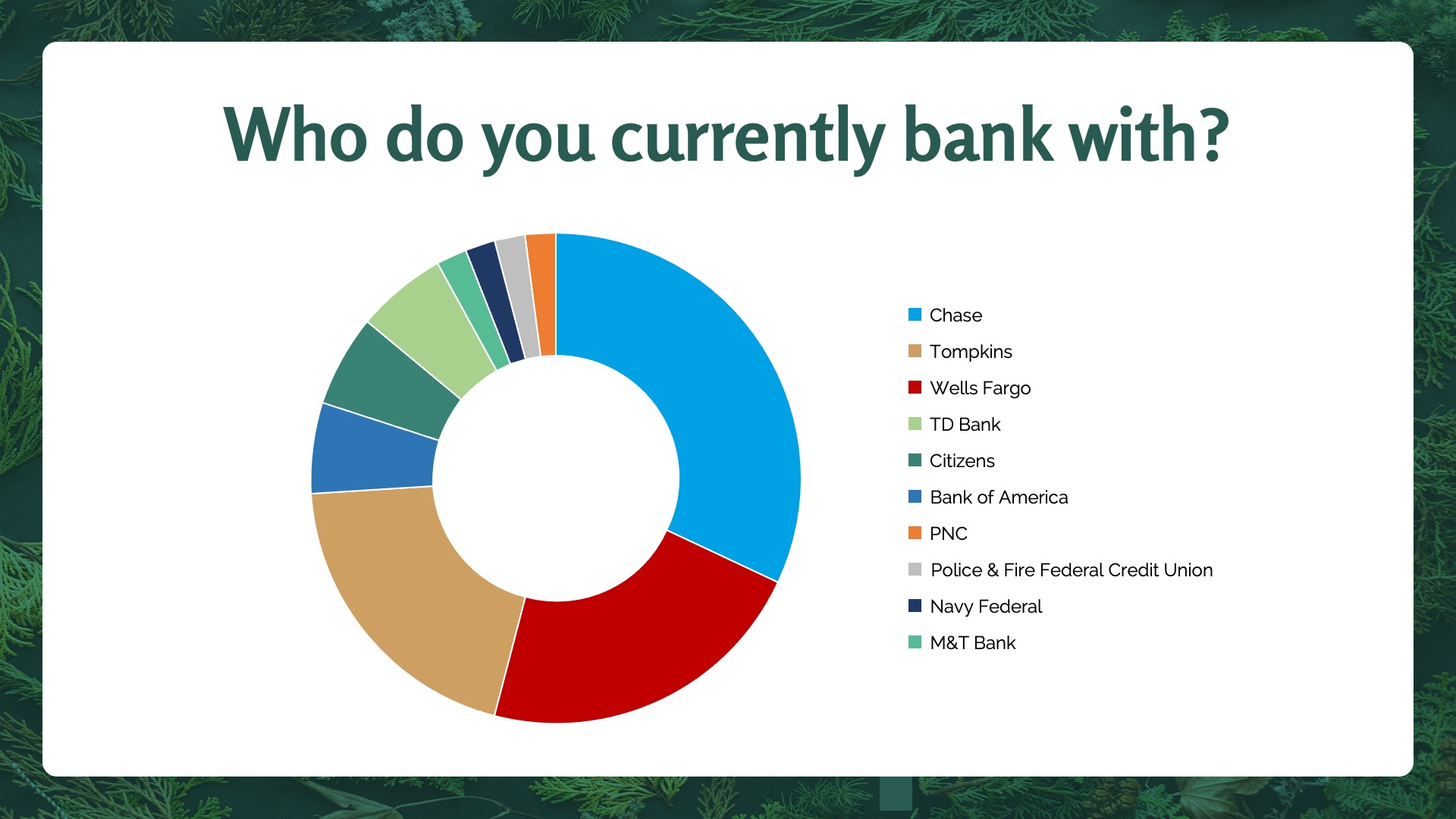
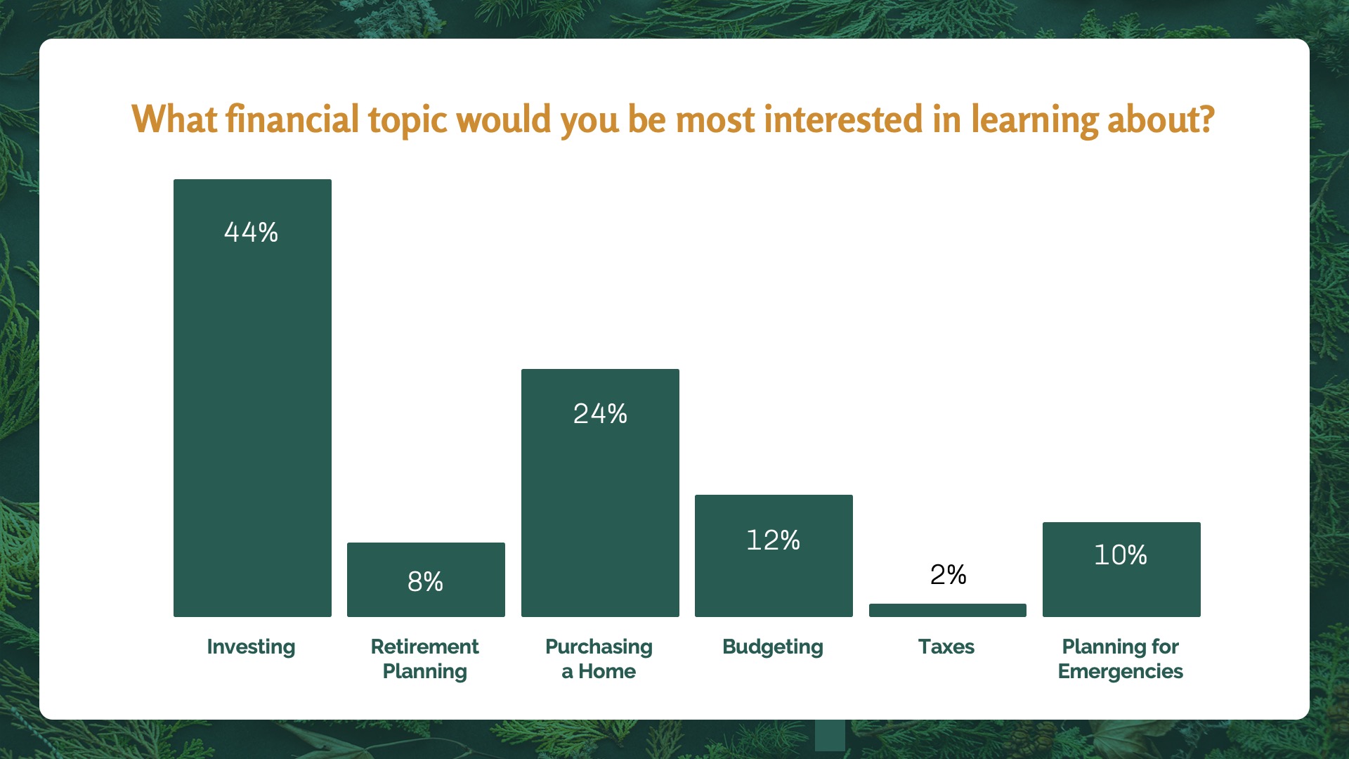
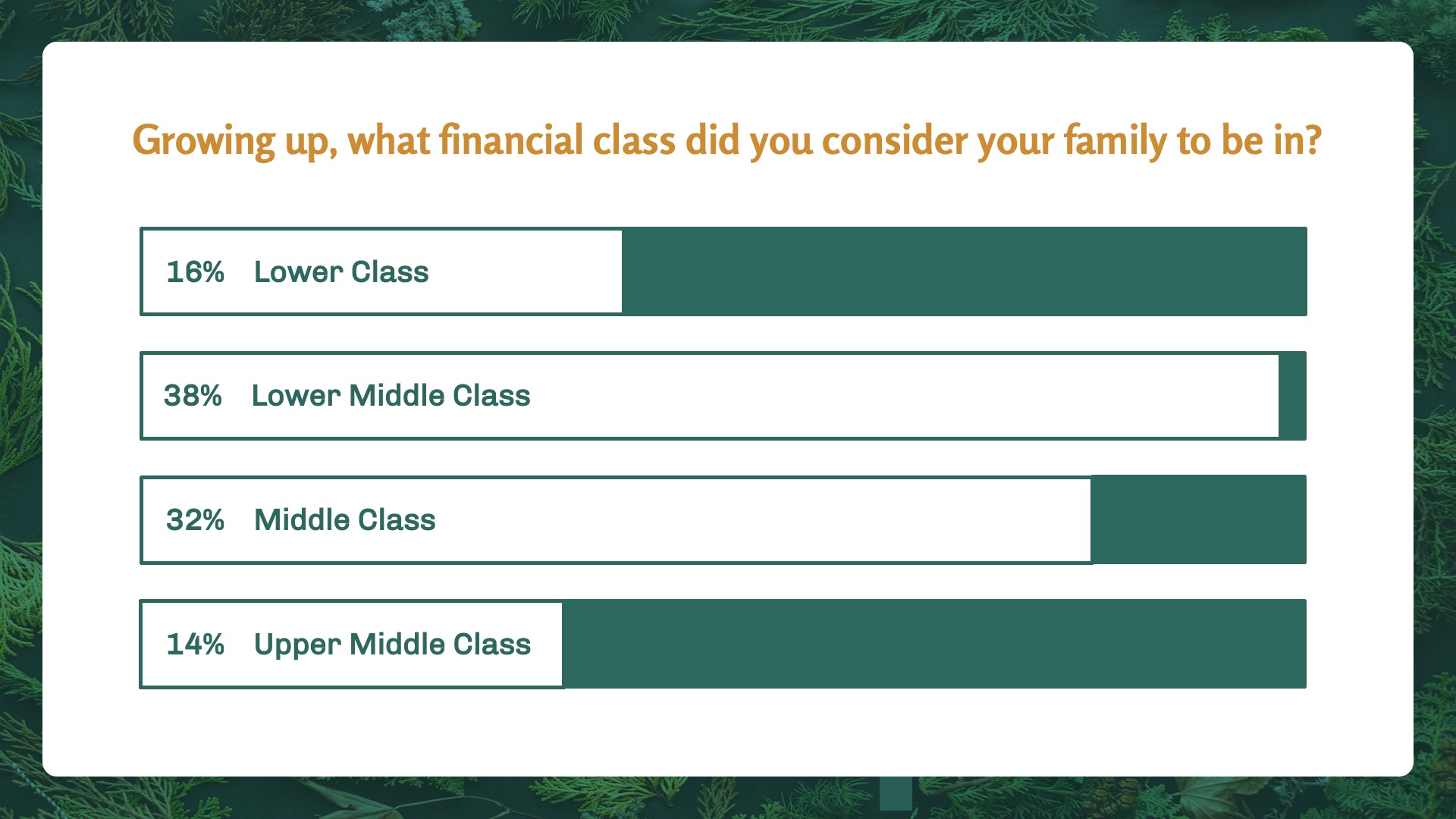
For this survey, insights were gathered from fifty participants.
When selecting individuals for this survey, to be included they needed to fit within one or more of these groups:
(1) Individuals who reside in Pennsylvania or New York,
(2) Individuals who are embarking on their first sizable financial decision
(3) Individuals who are between the ages of 25 and 35.



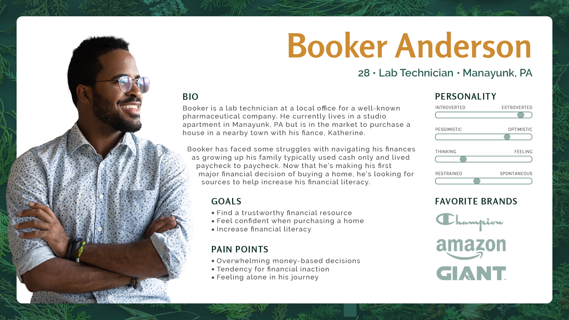
User Persona
With insights gathered, the user persona for Booker was created to identify the target audience’s needs.
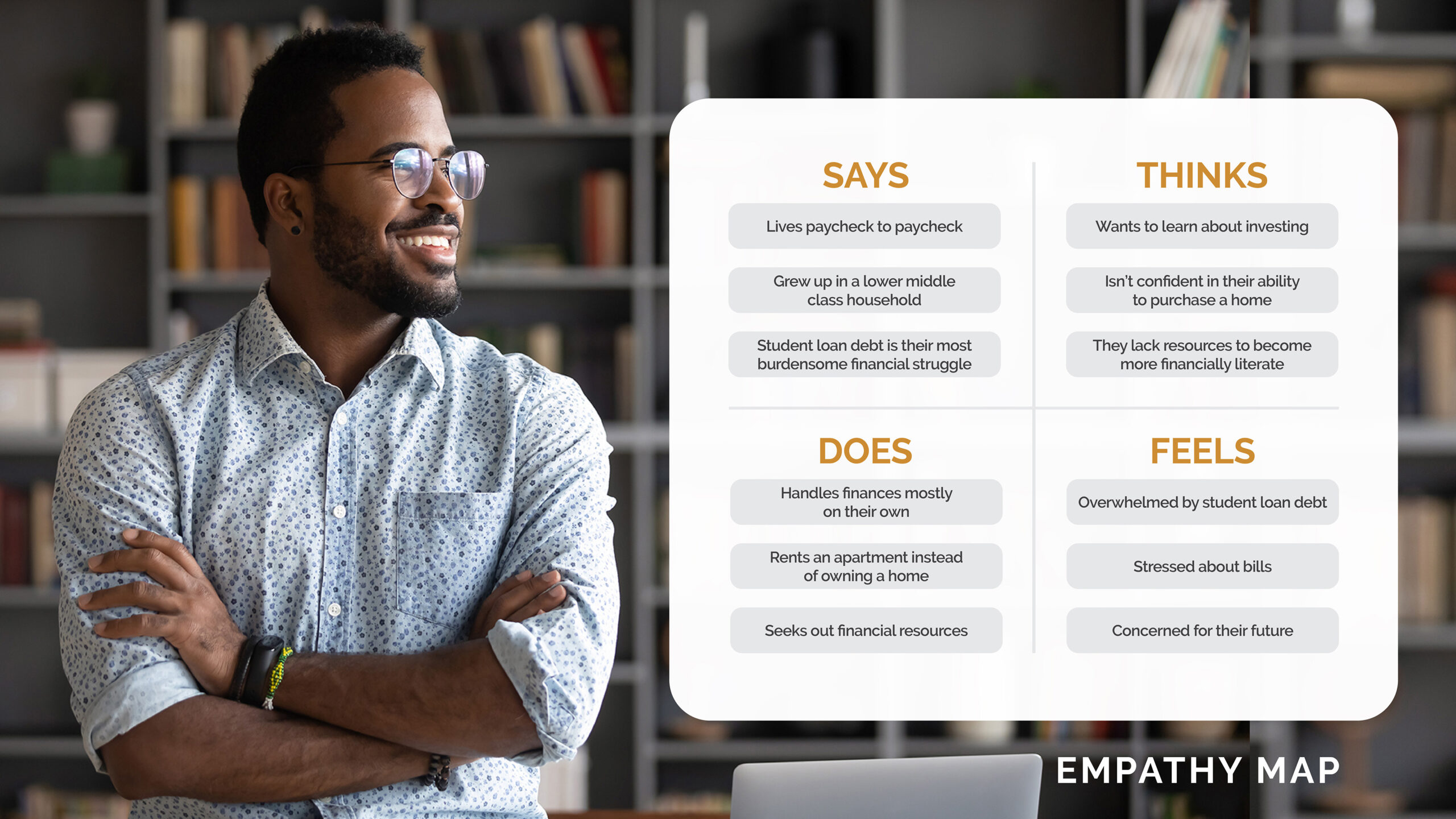
Empathy Map
To complement the user persona for Booker, an empathy map was constructed.
CATEGORIZE
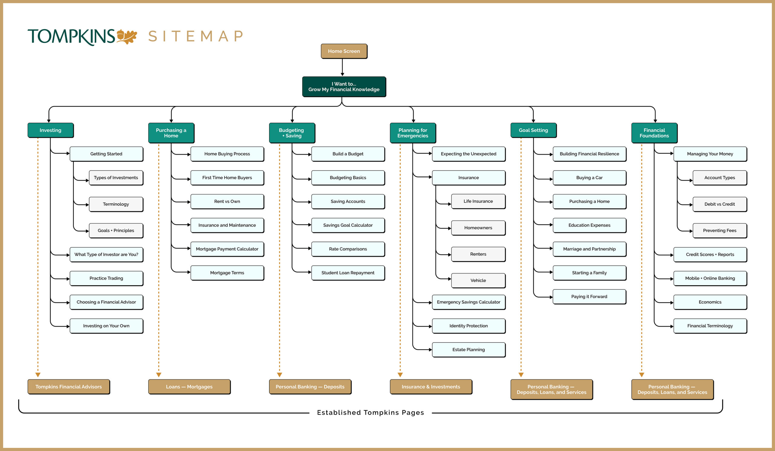
Sitemap
The sitemap is designed to highlight several Branches of Financial Knowledge, i.e. investing, budgeting, etc. Ultimately, each main knowledge piece funnels into an established page on Tompkins site that contains their offerings.
The survey data was used in tandem with the competitor research to determine the information architecture of the site.
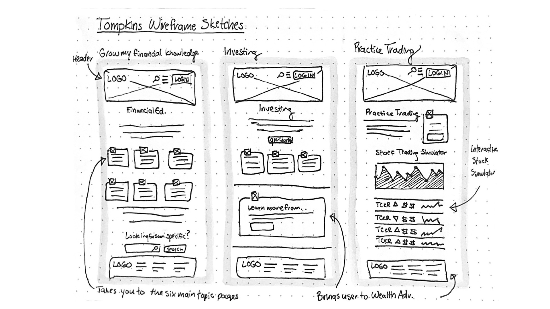
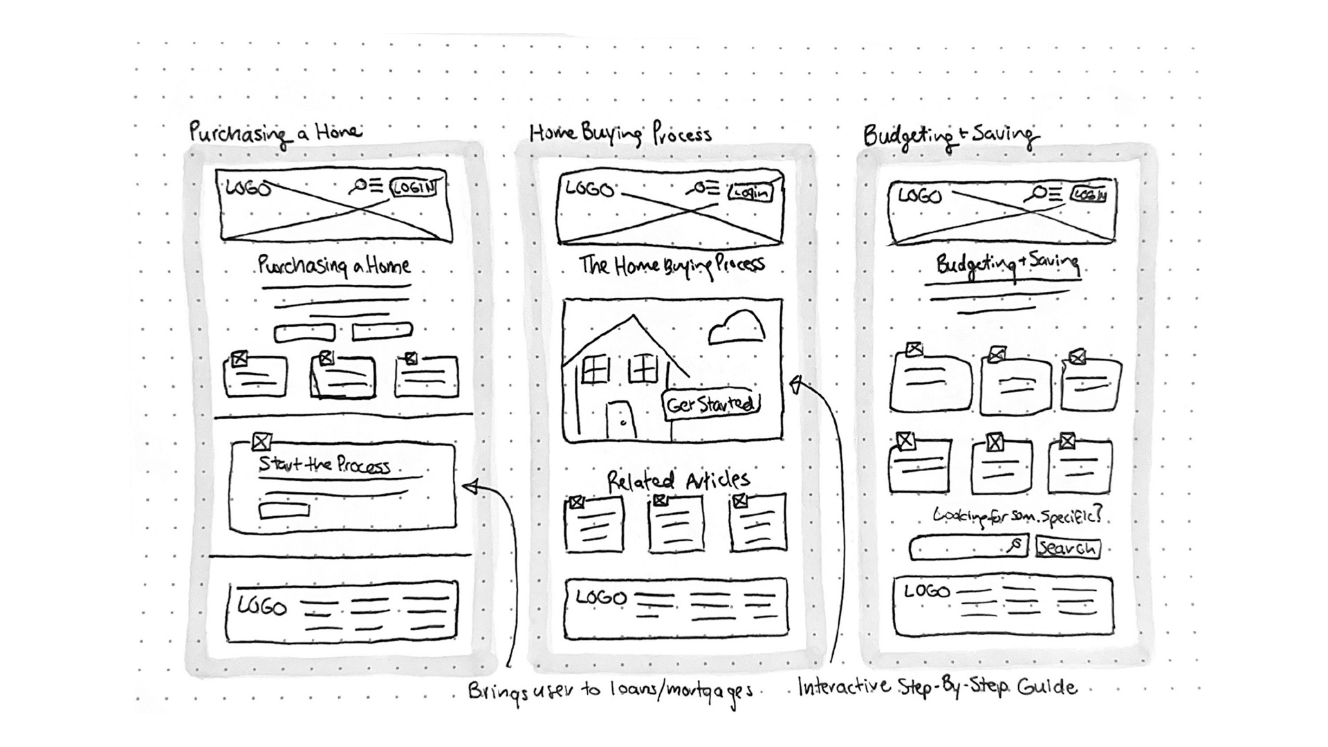
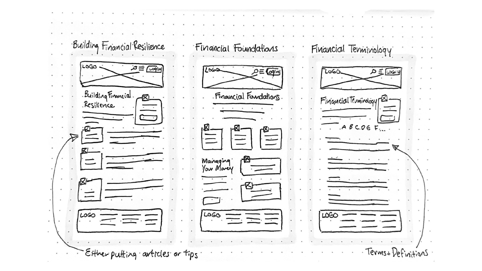
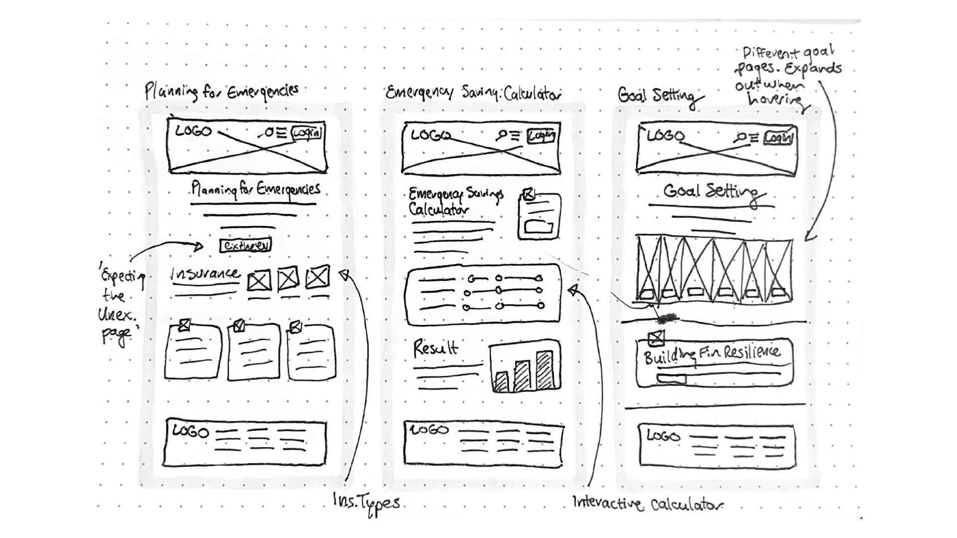
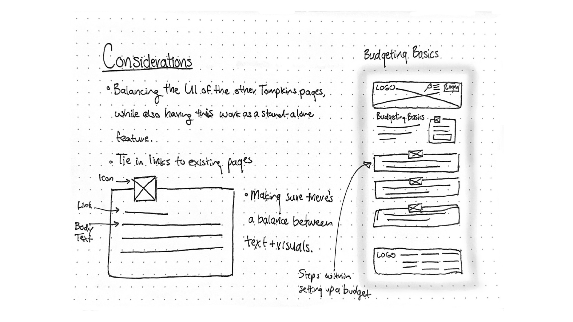
Low Fidelity Sketches
Potential content was ideated and then sorted visually with design drafts. The research and strategies listed above assisted in figuring out the user's priorities, needs, and wants within the financial literacy feature. The culmination of all of the data was drafted into low fidelity sketches to work off of for the rest of the design process.
INTERACTION
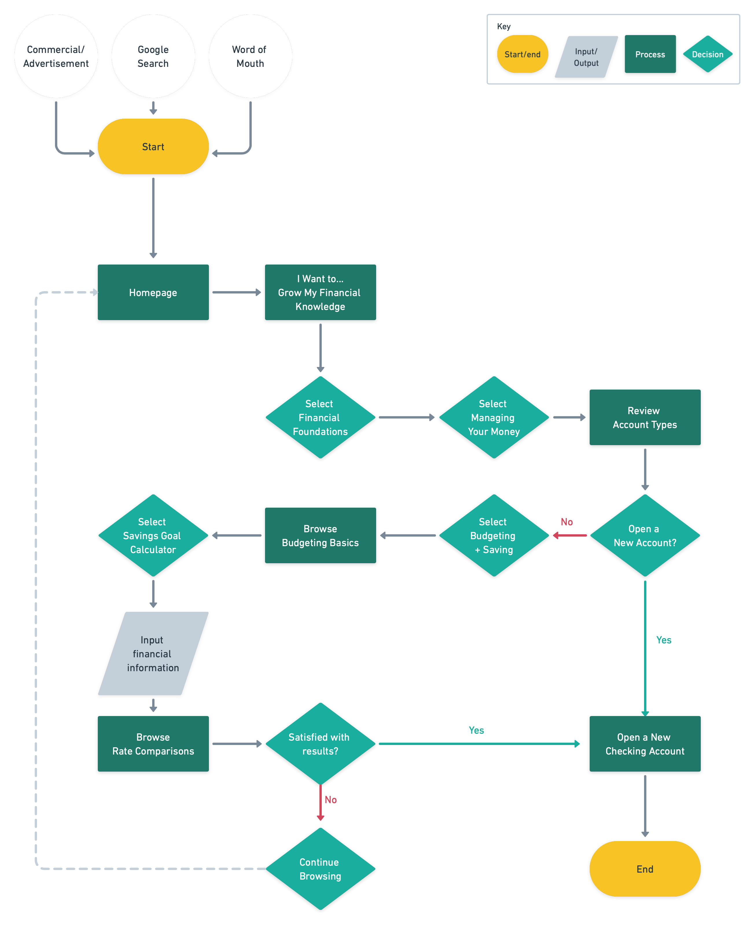
User Flow
A user flow was created to visualize the tasks involved in learning more about budgeting, and ultimately opening a new account with Tompkins.
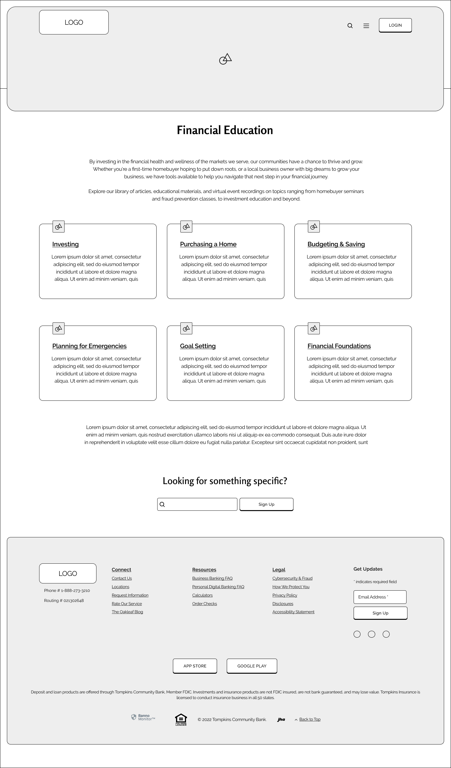
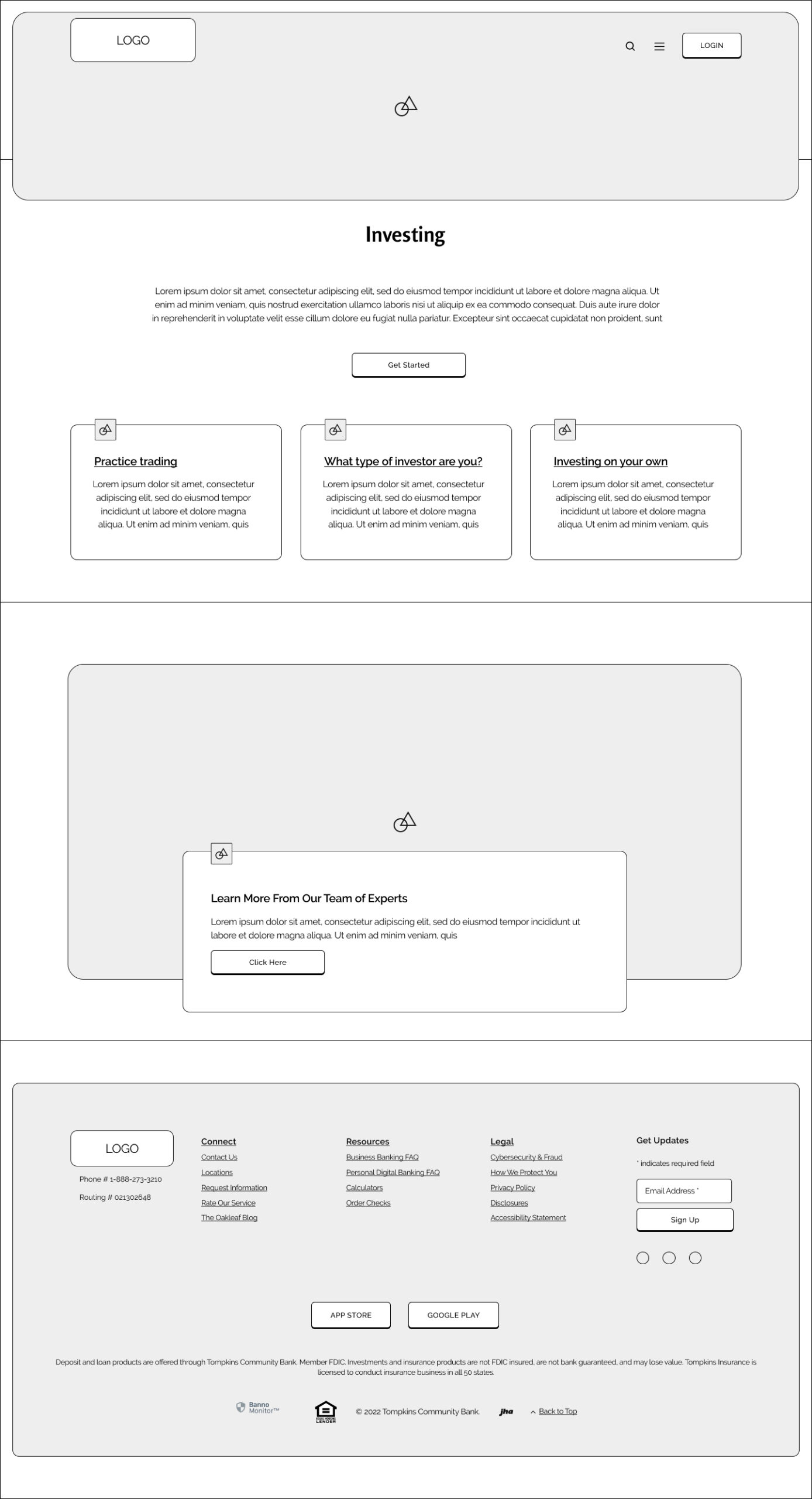
Wireframes
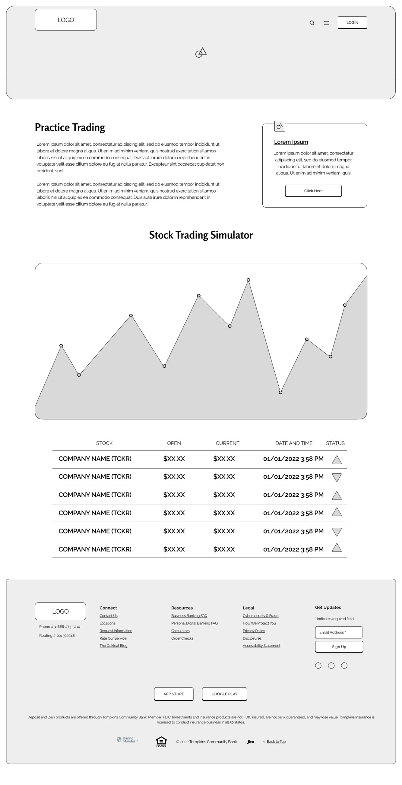
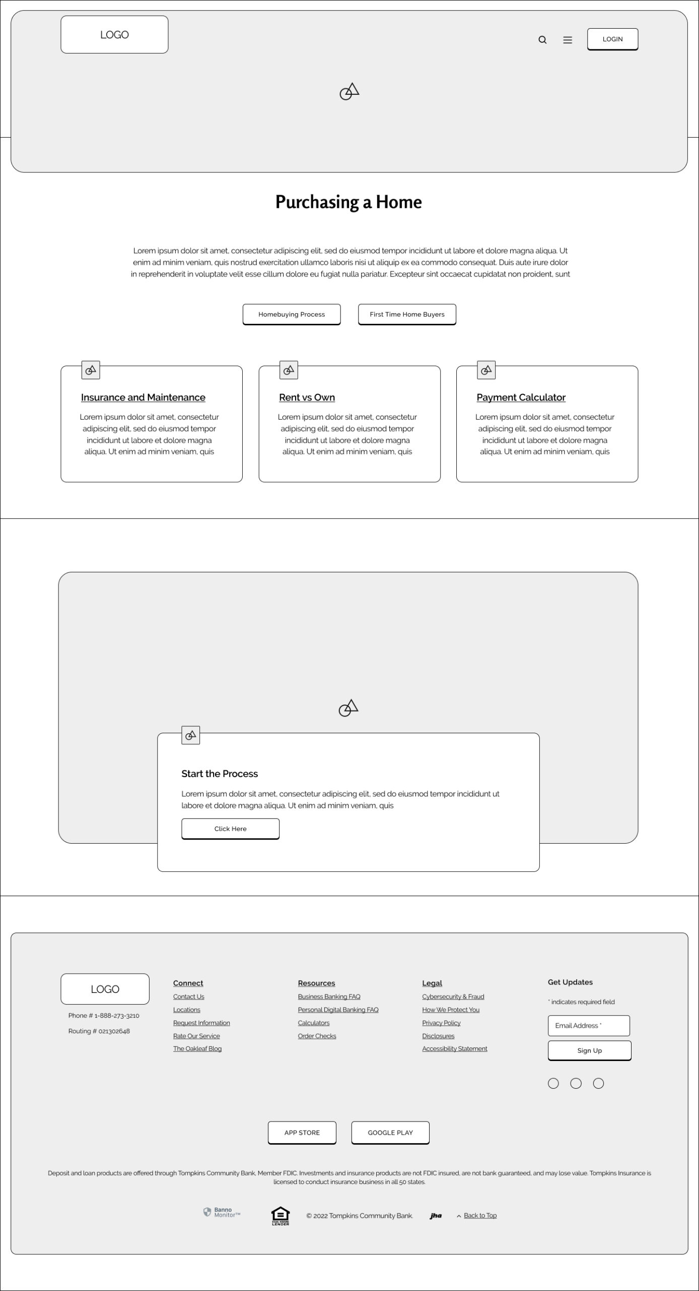
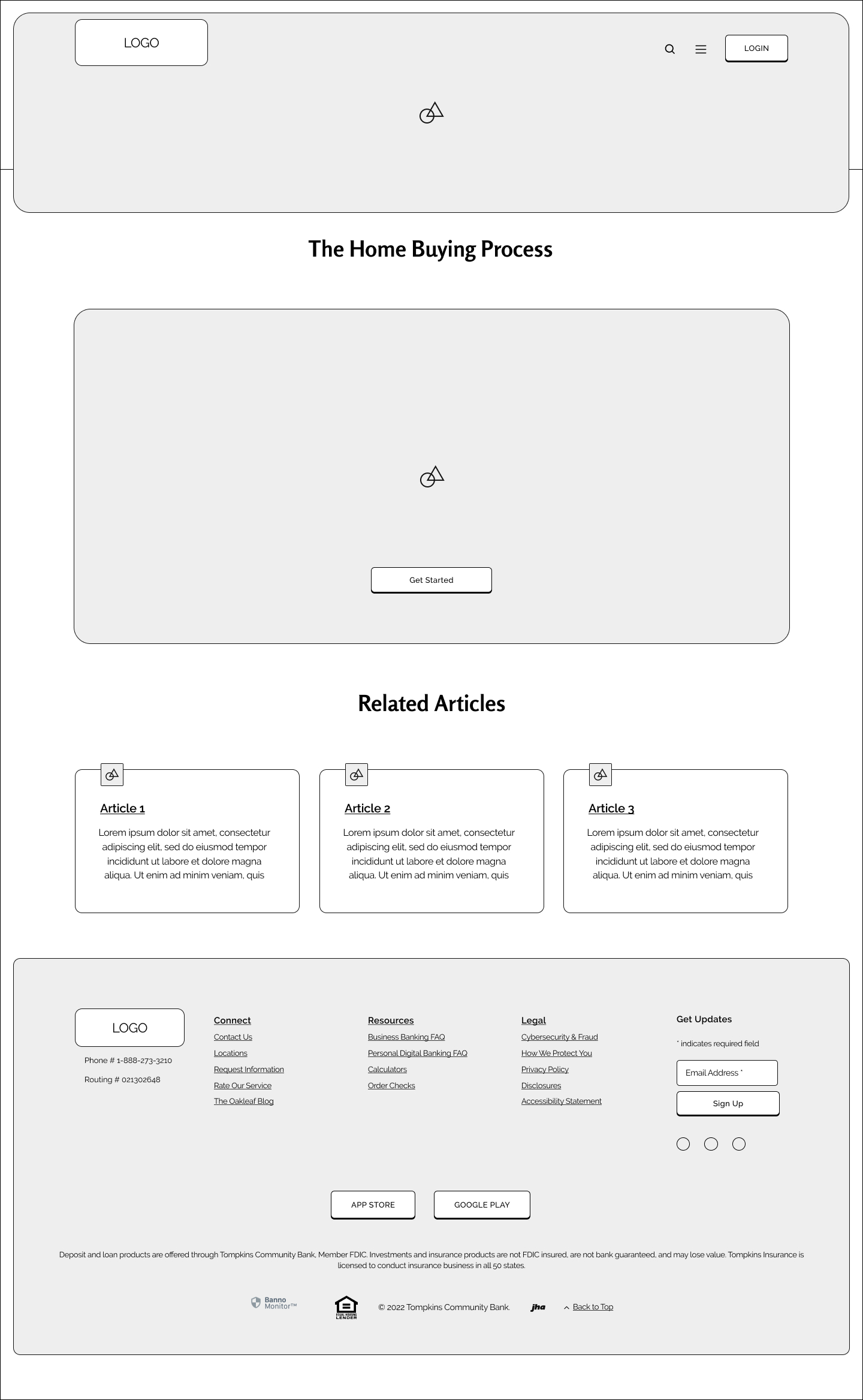
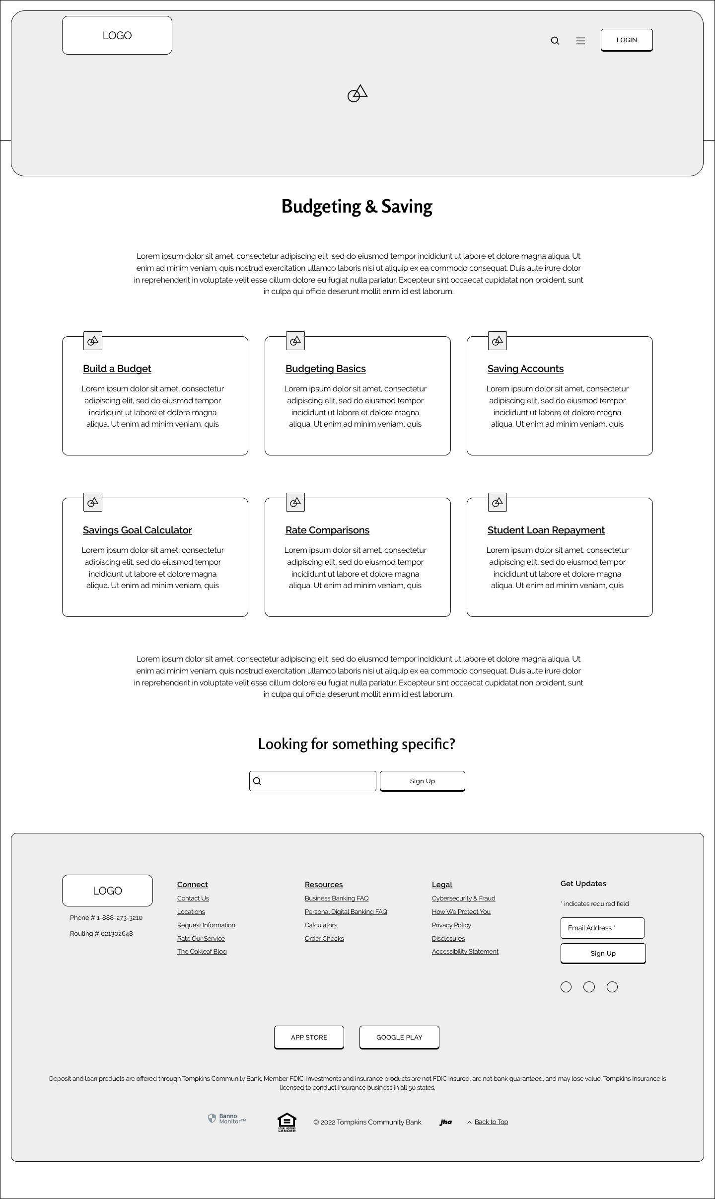
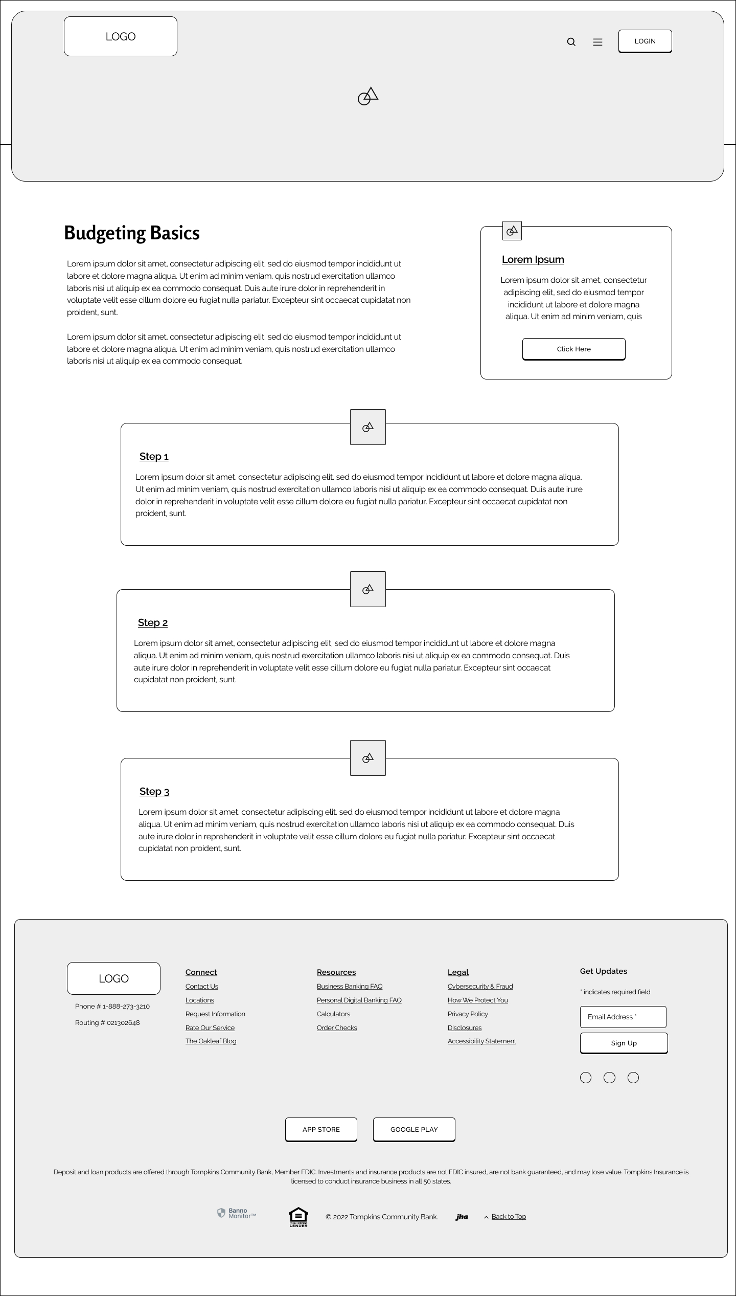
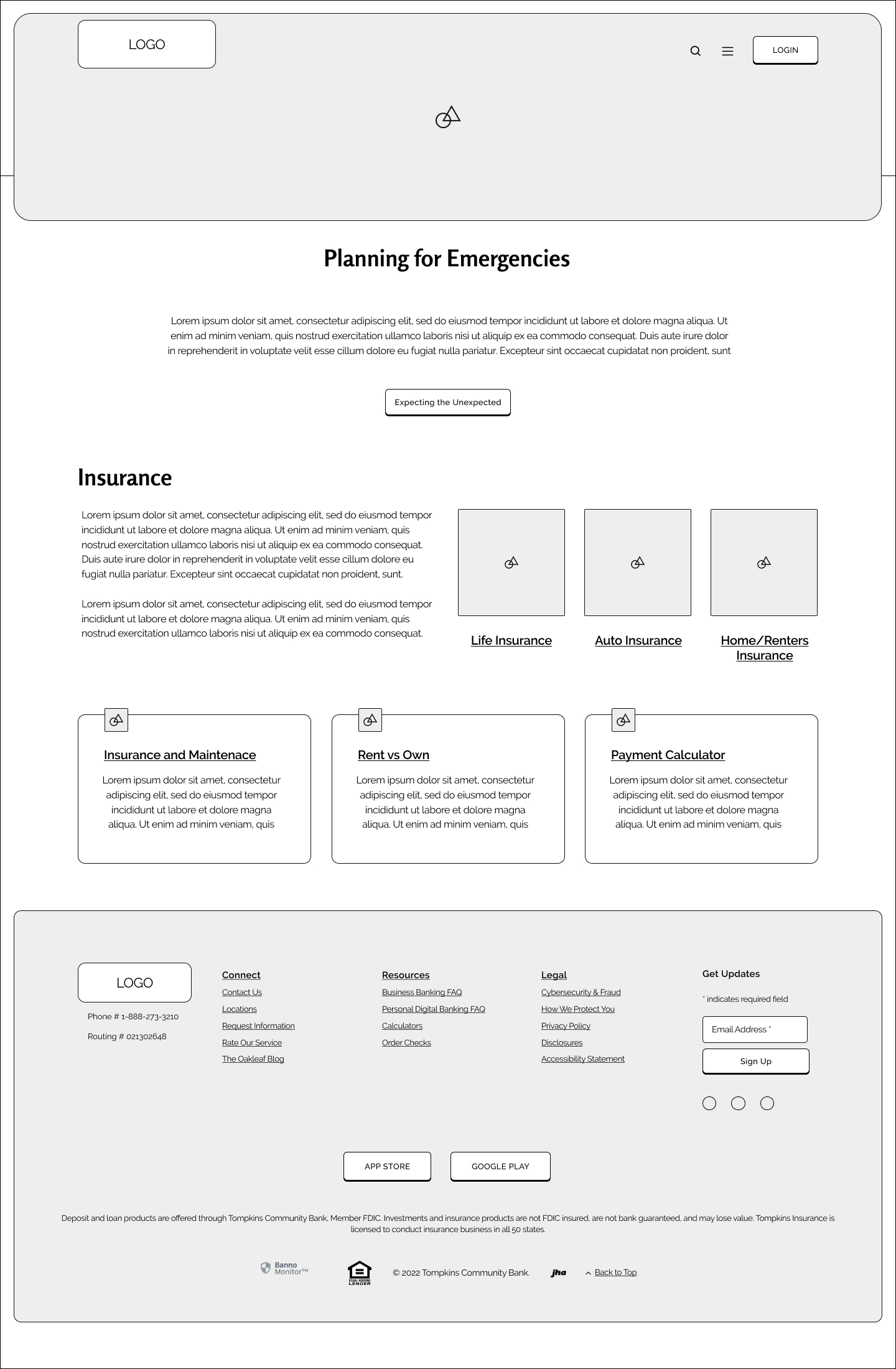
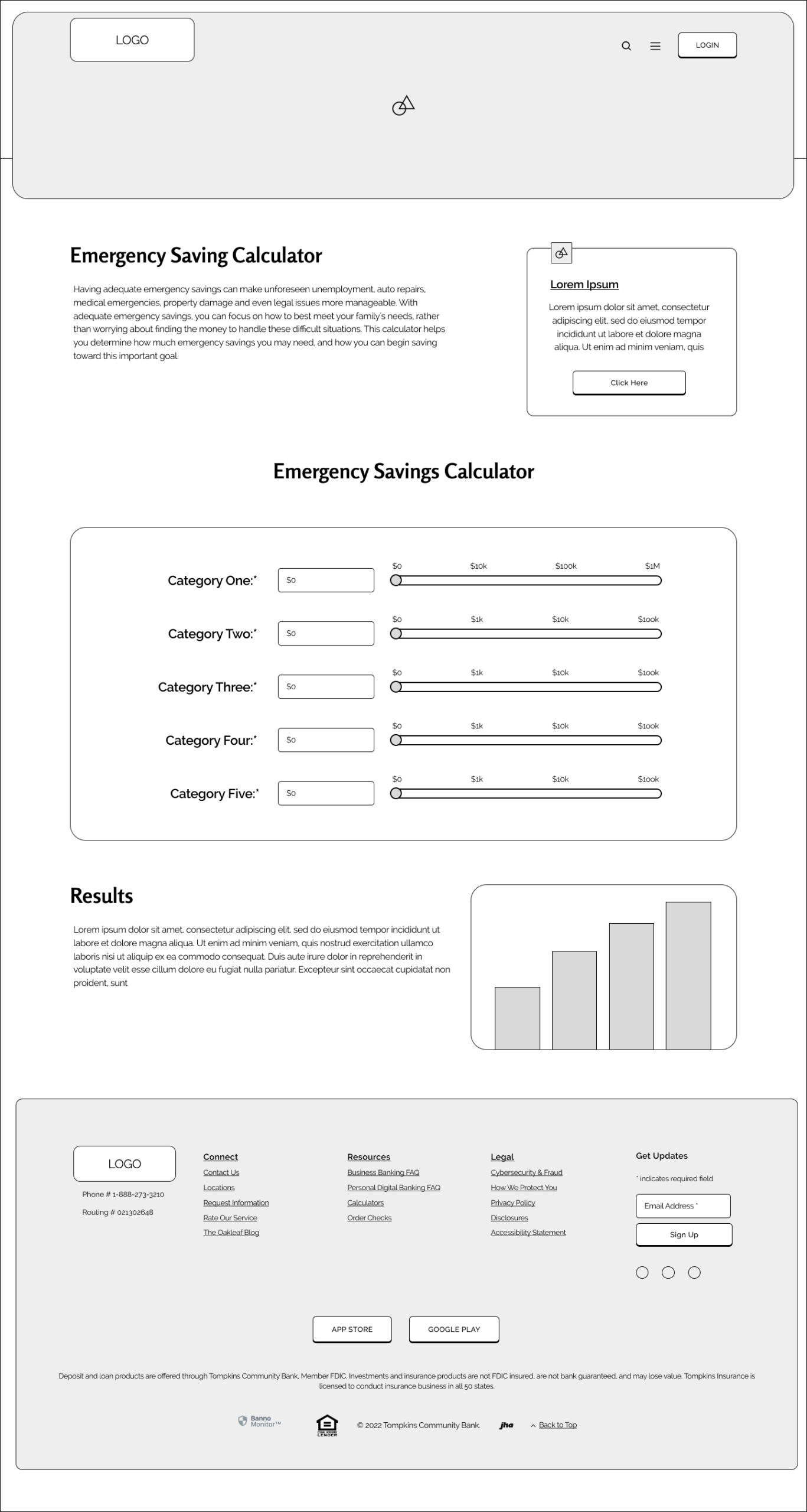
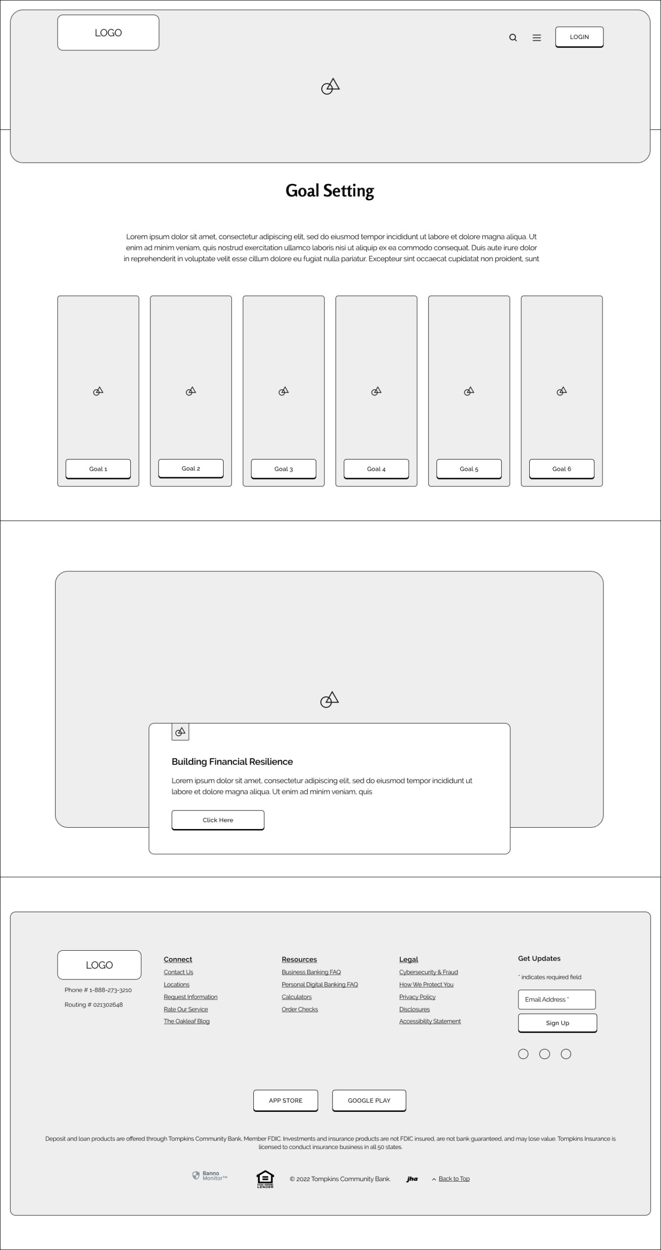
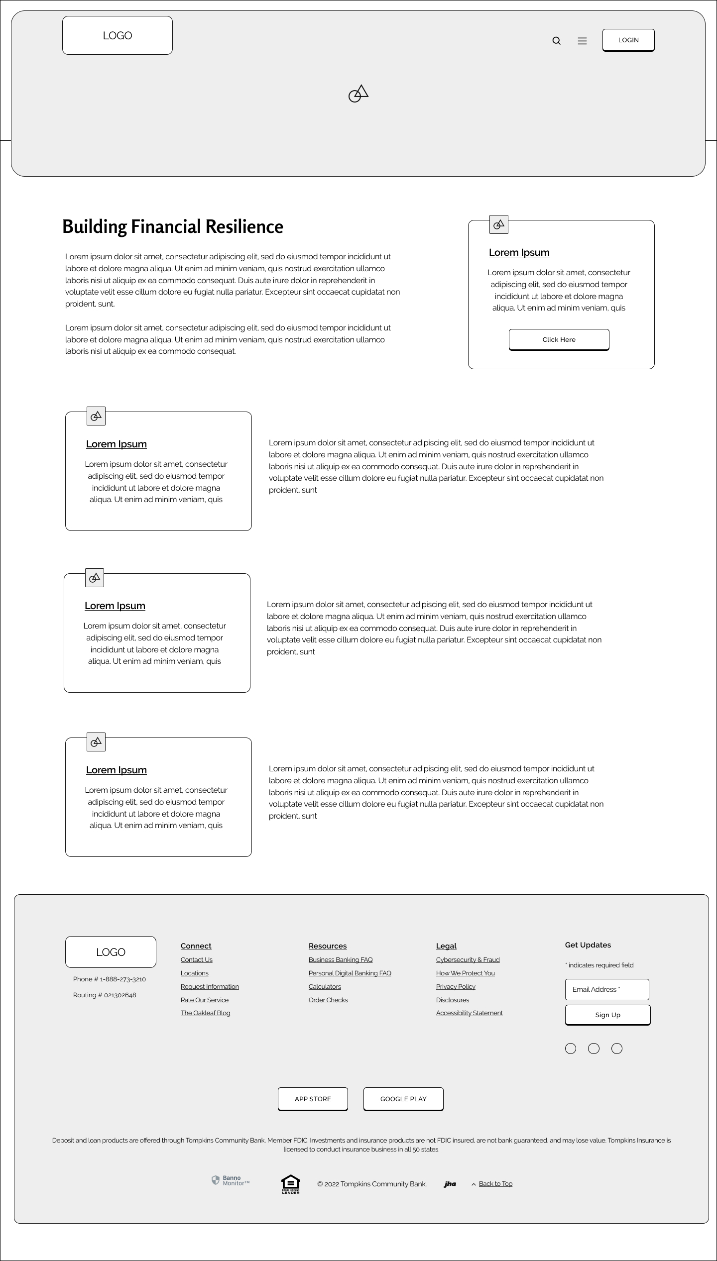
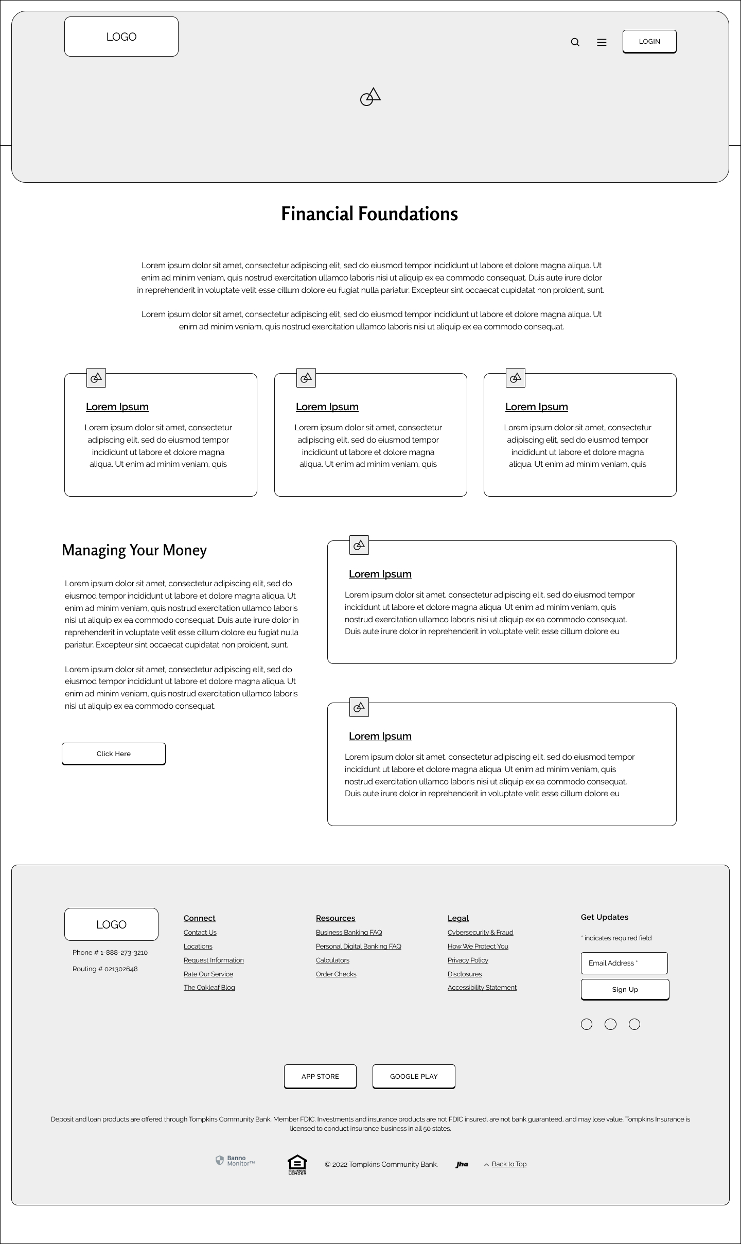
Using the low fidelity sketches, mid fidelity wireframes were created to showcase a sampling of the pages within the new feature. These included the main "Grow Your Financial Knowledge" page, each of the six "branches", and then one subsequent page for each branch.
Main
Investing
Practice Trading
Purchasing a Home
Home Buying Process
Budgeting and Saving
Budgeting Basics
Planning for Emergencies
Em. Savings Calculator
Goal Setting
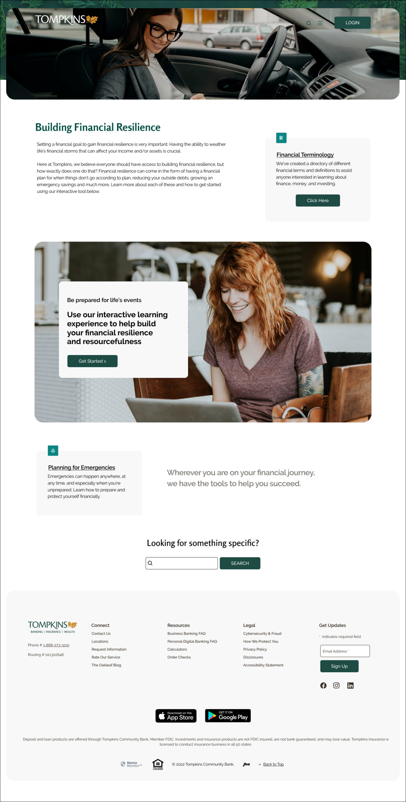
Building Financial Resilience
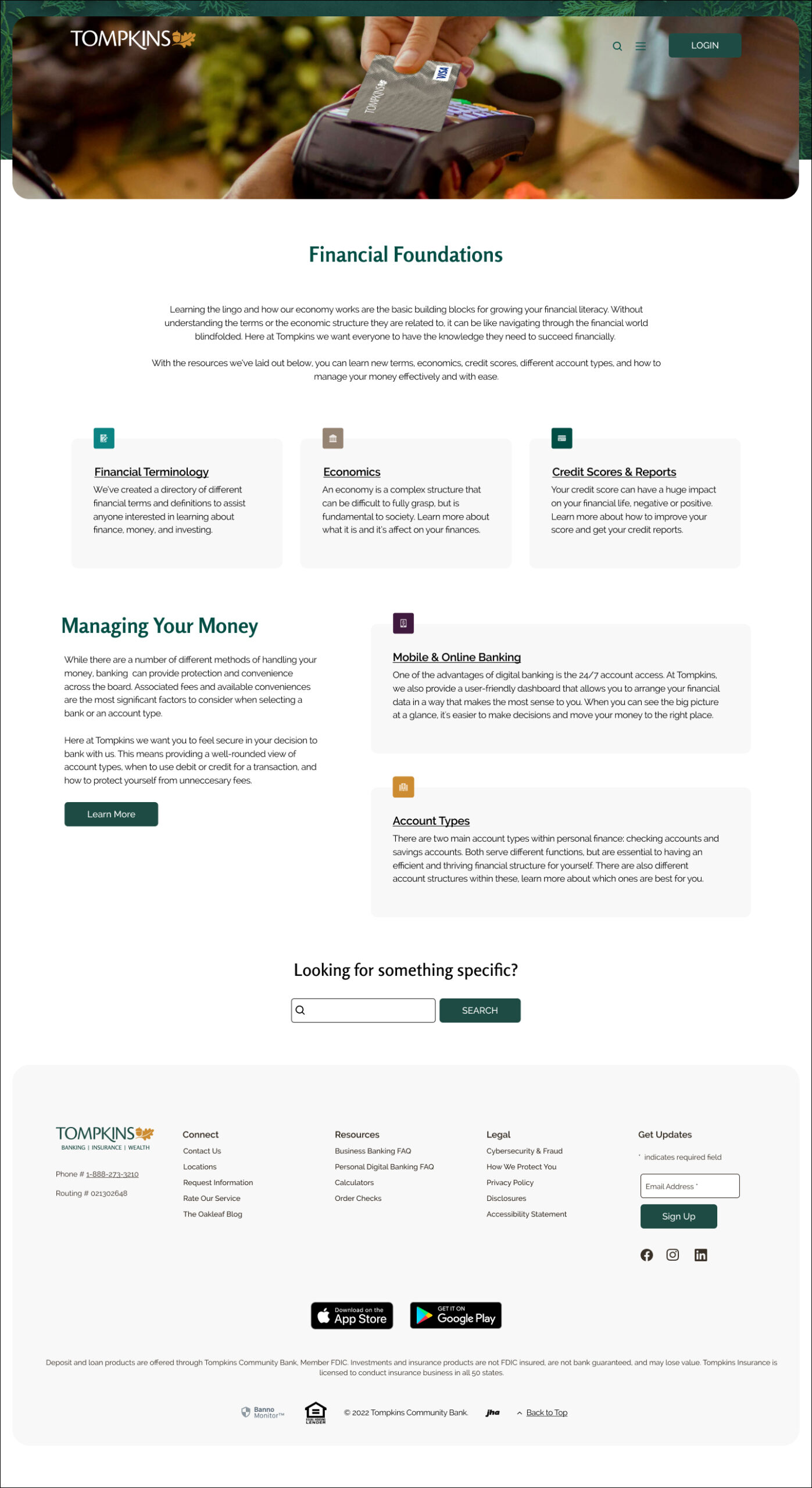
Financial Foundations
INTERFACE
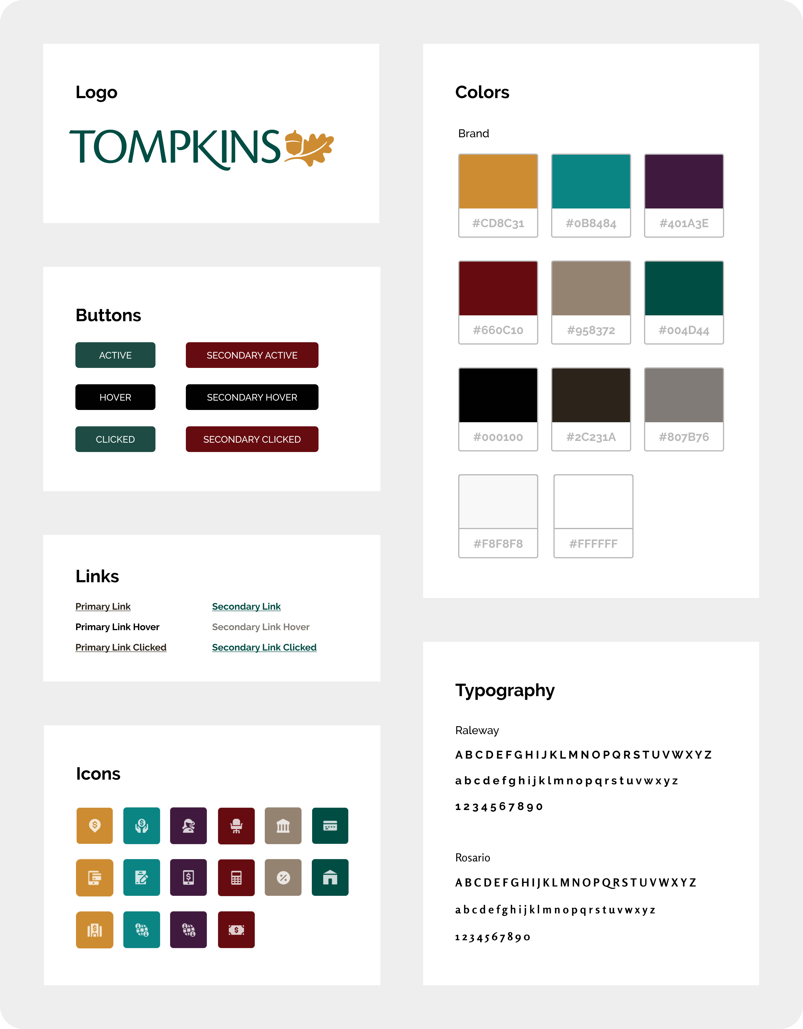
UI Kit
A UI kit was recreated to ensure that the current look and feel of the Tompkins site was apparent in the new feature. This included the color palette, fonts, icons, buttons and link formatting. This assisted in the feature and the rest of the Tompkins site feeling balanced and unified, aesthetically.
IMPLEMENTATION & ITERATION
Hi-Fidelity Wireframes
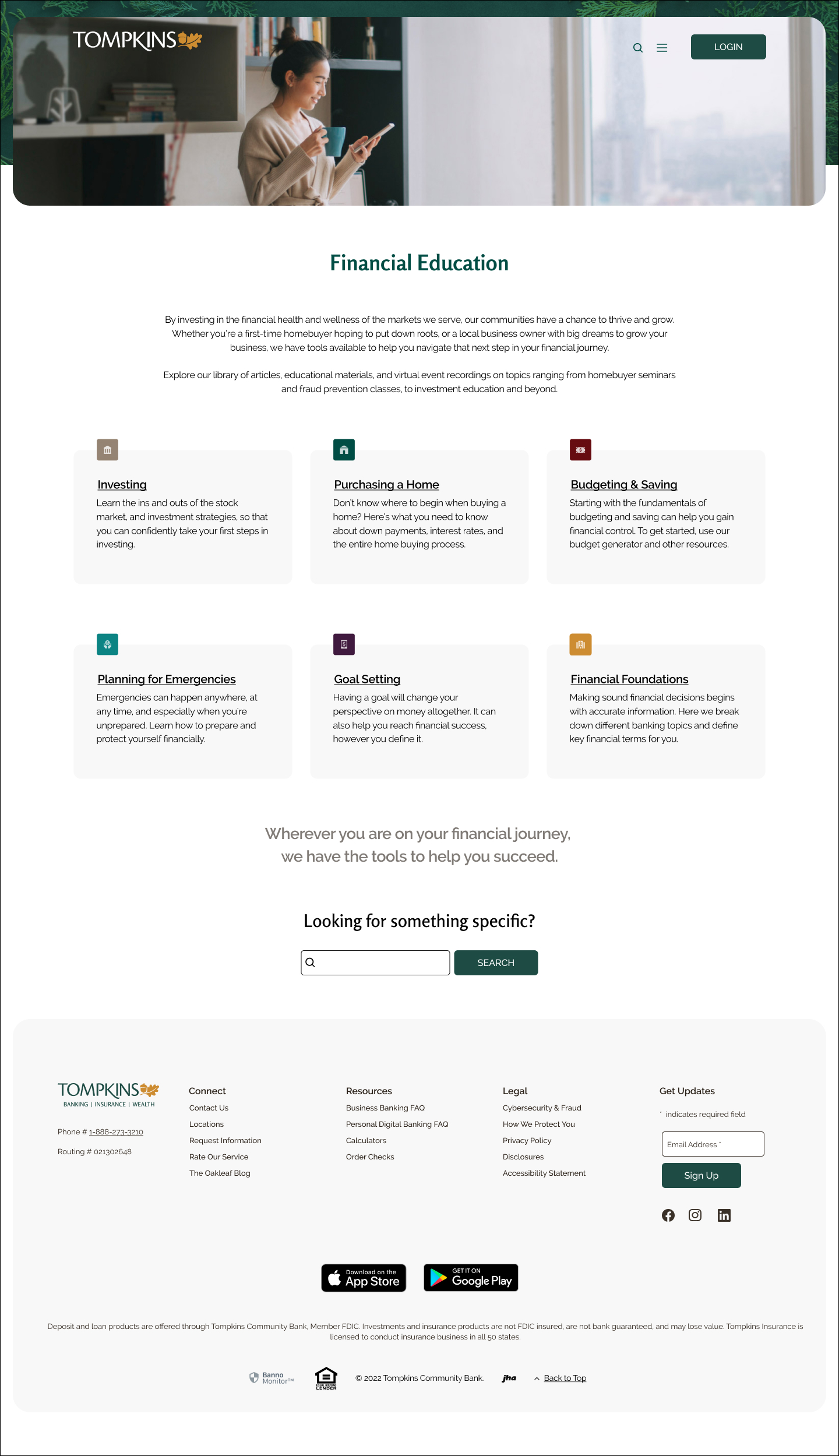
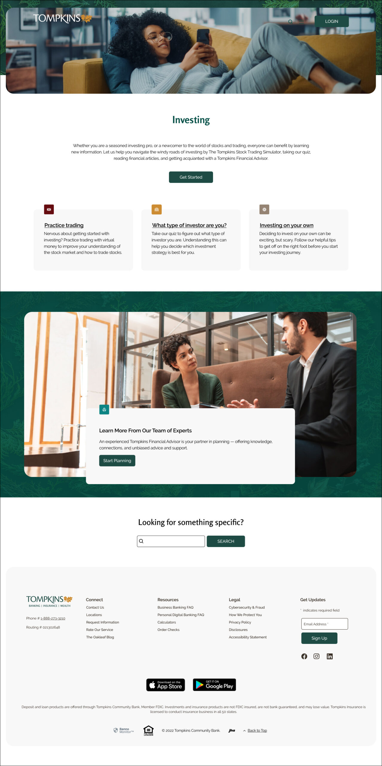
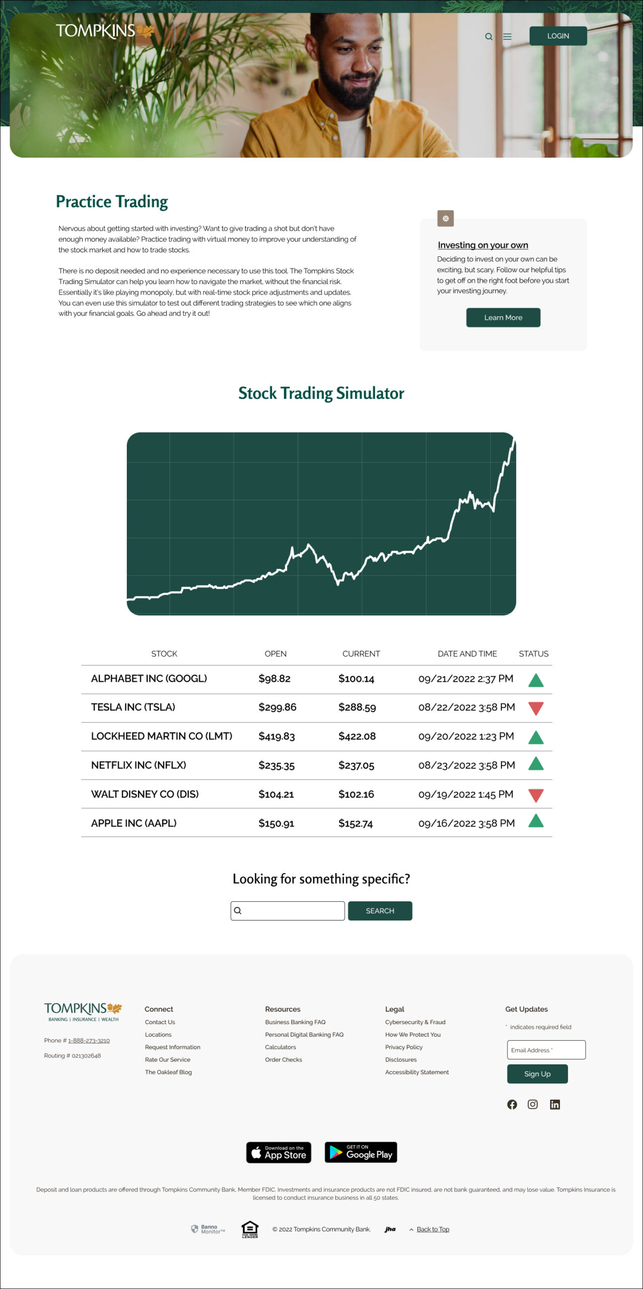
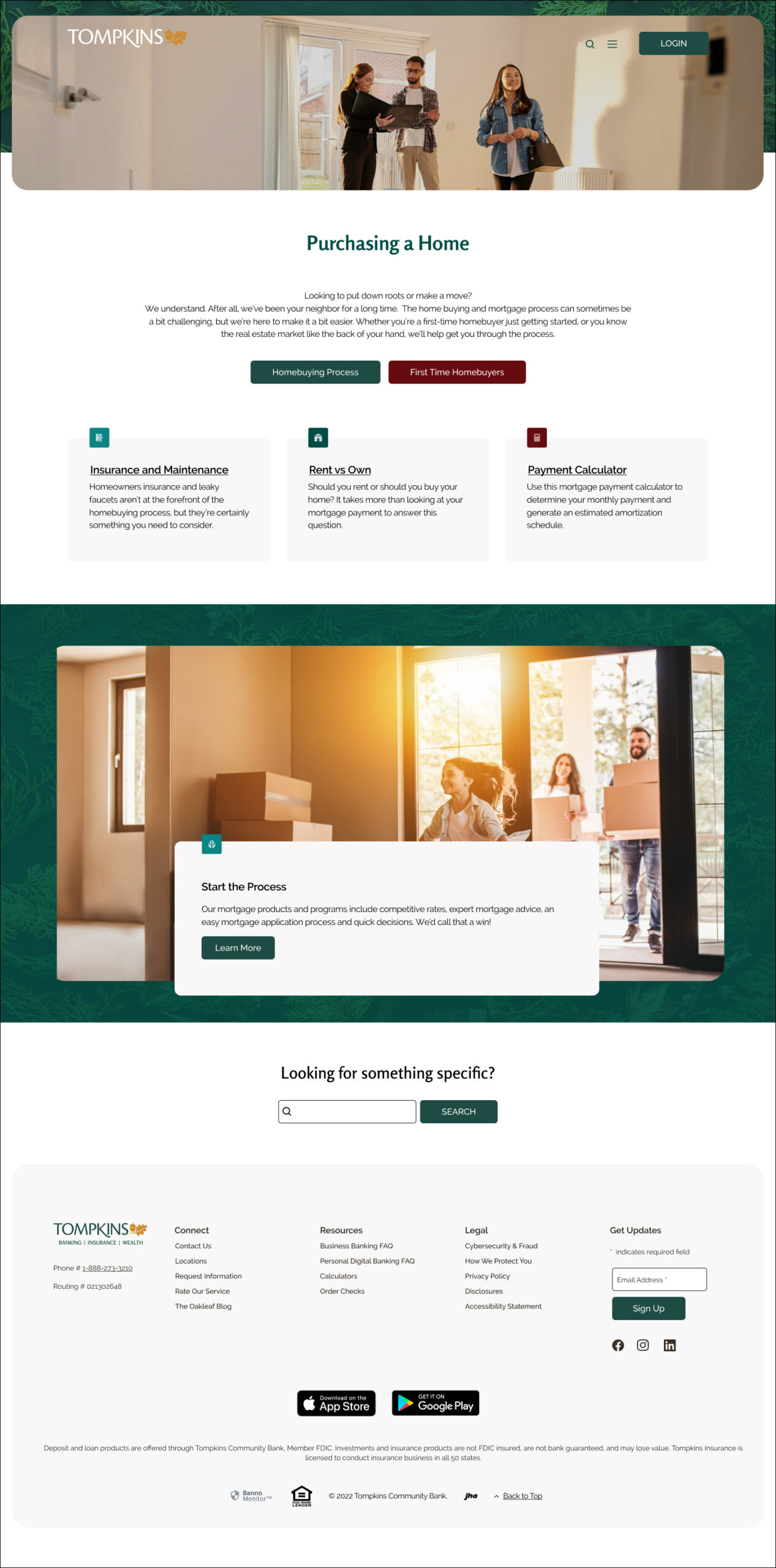
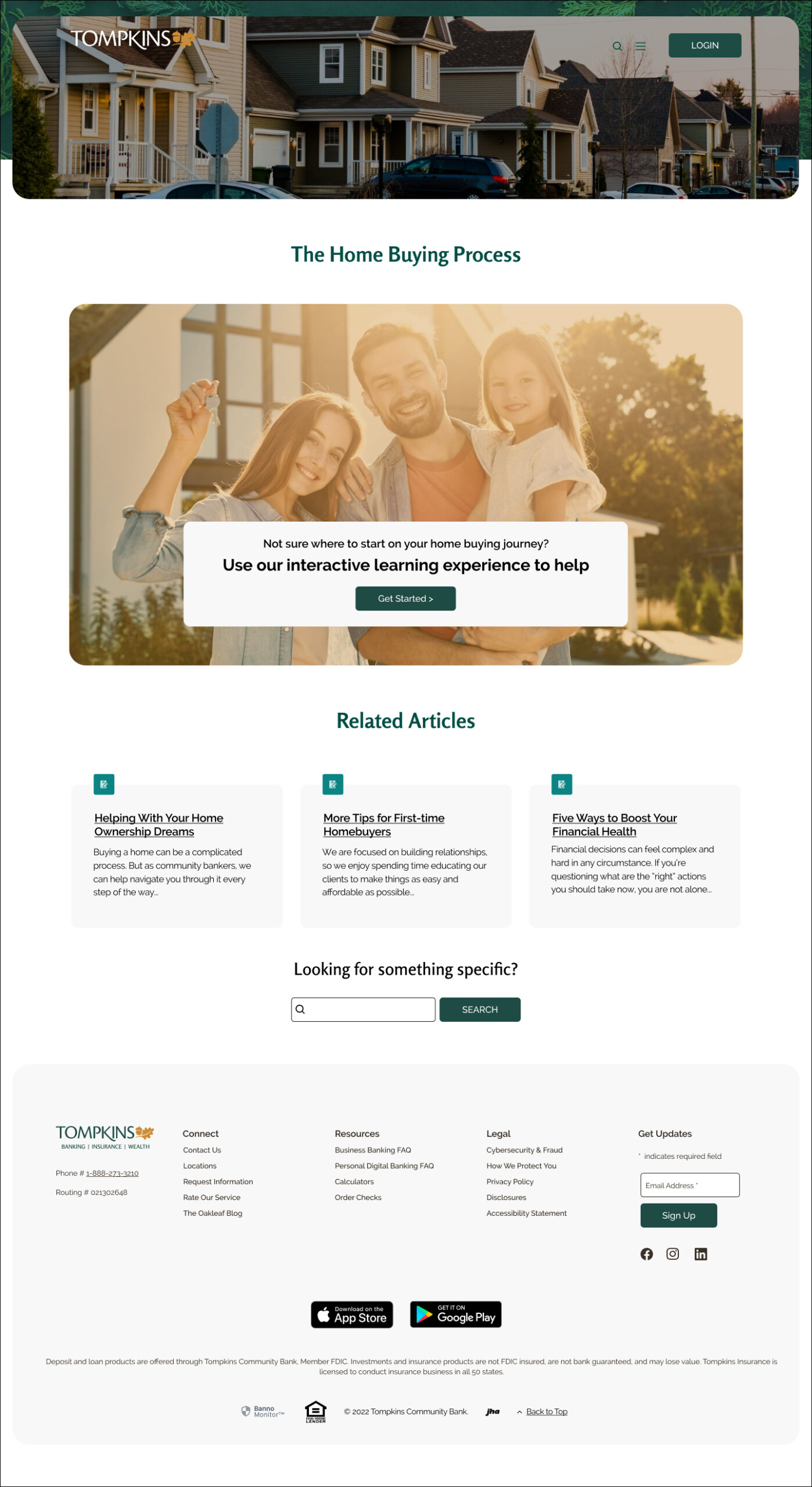
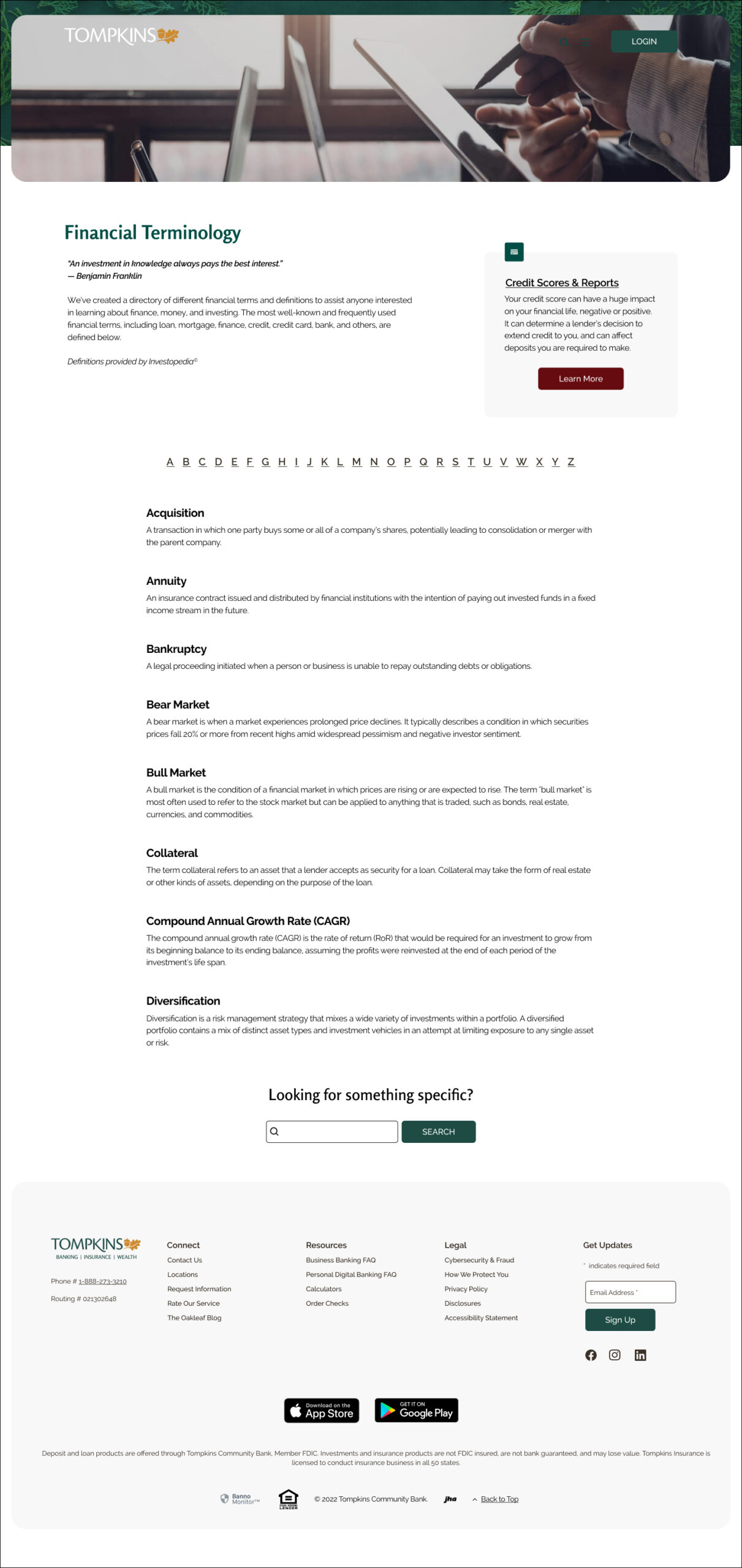
The low fidelity wireframes and the UI Kit elements were combined to create high fidelity wireframes.
Main
Investing
Practice Trading
Purchasing a Home
Home Buying Process
Budgeting and Saving
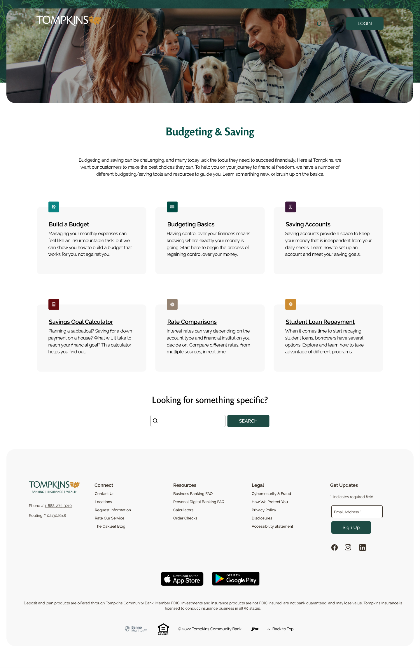
Build a Budget
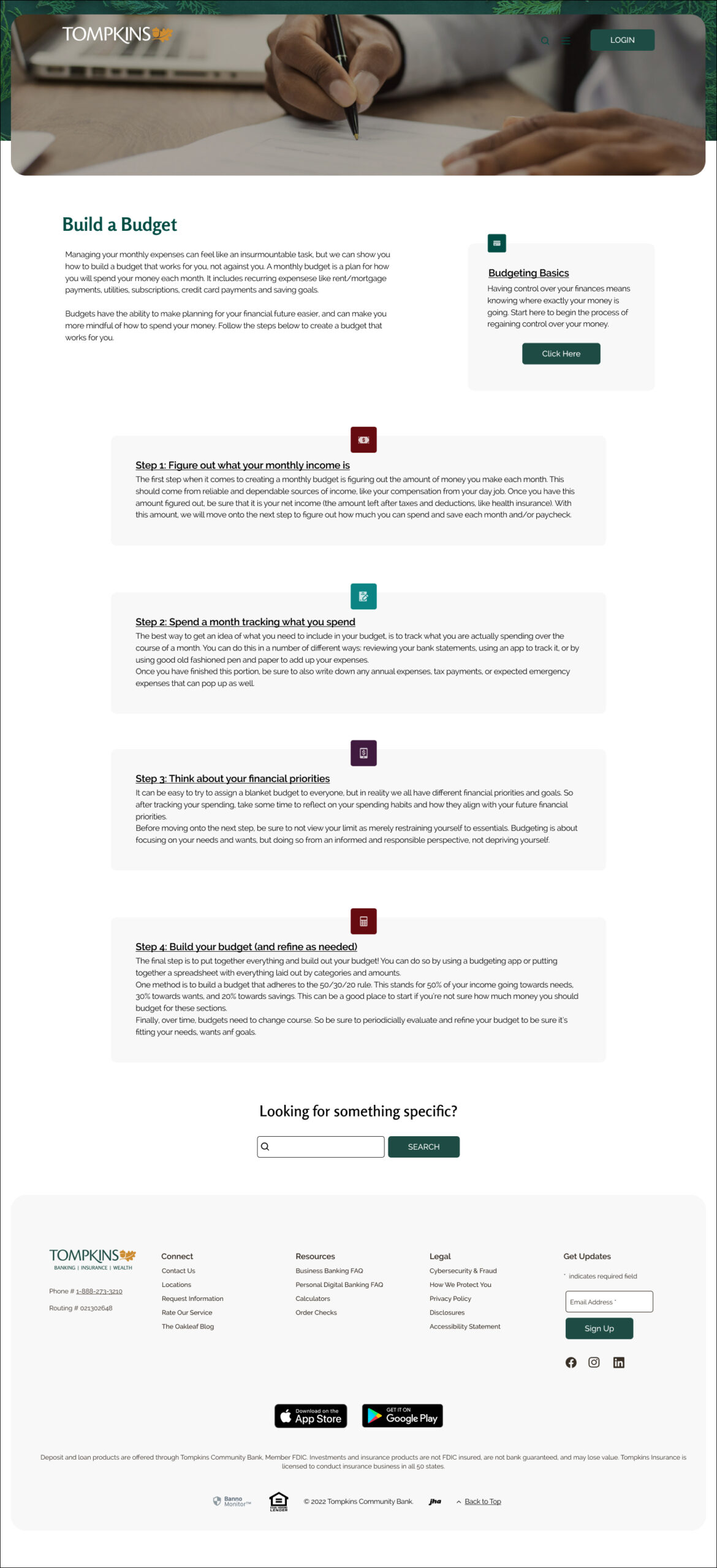
Planning for Emergencies
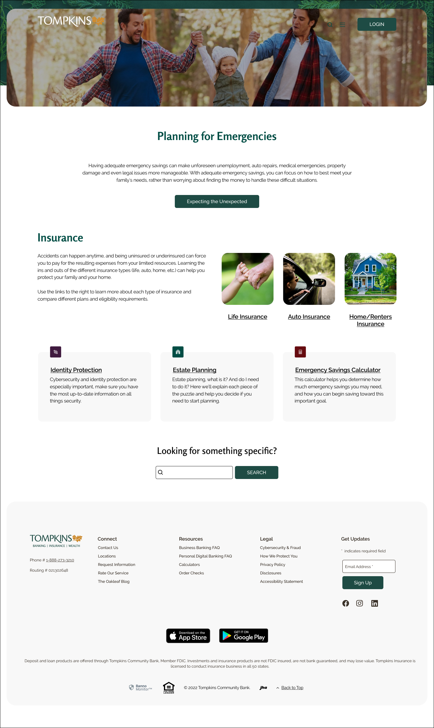
Em. Savings Calculator
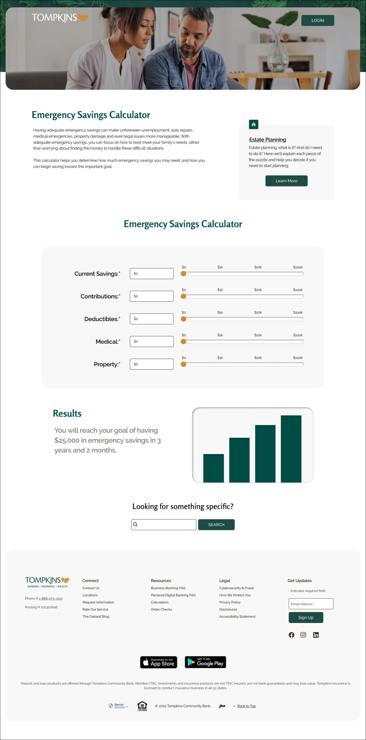
Goal Setting
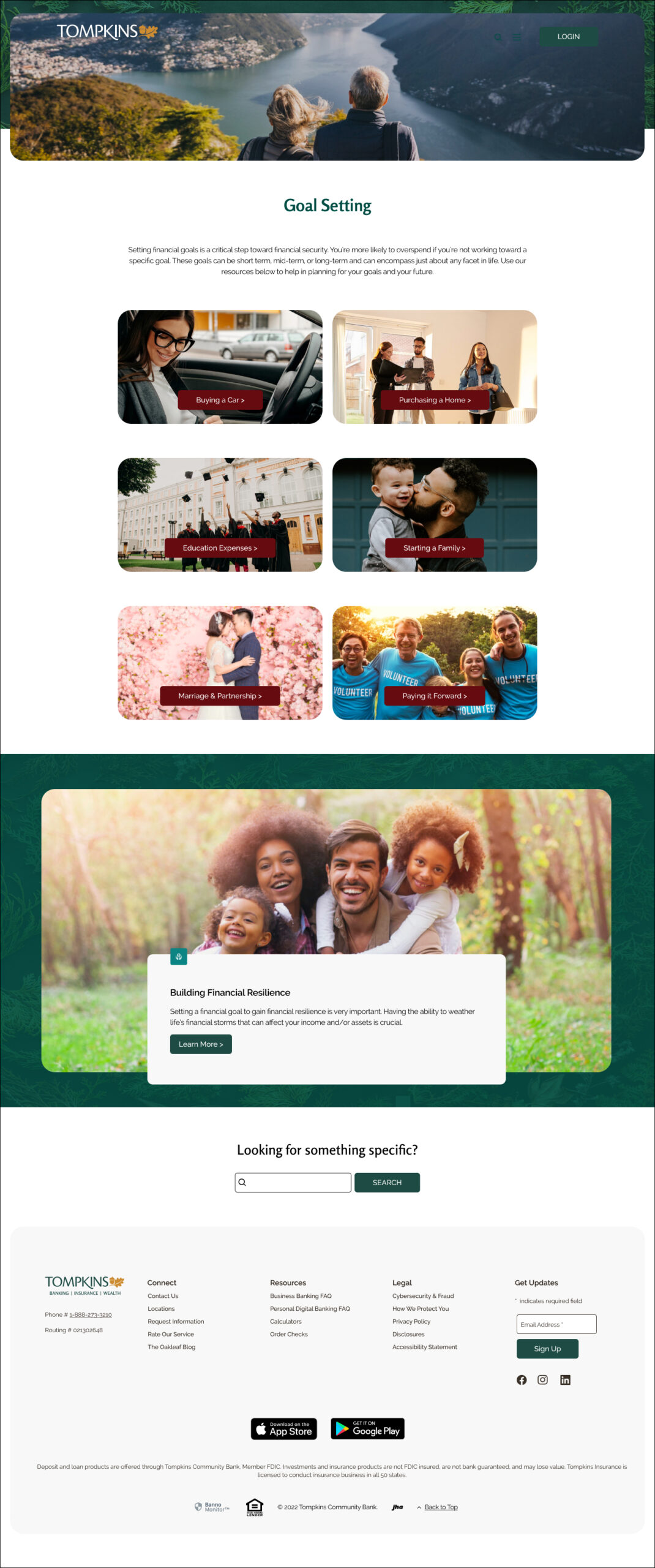
Building Financial Resilience
Financial Foundations
Financial Terminology
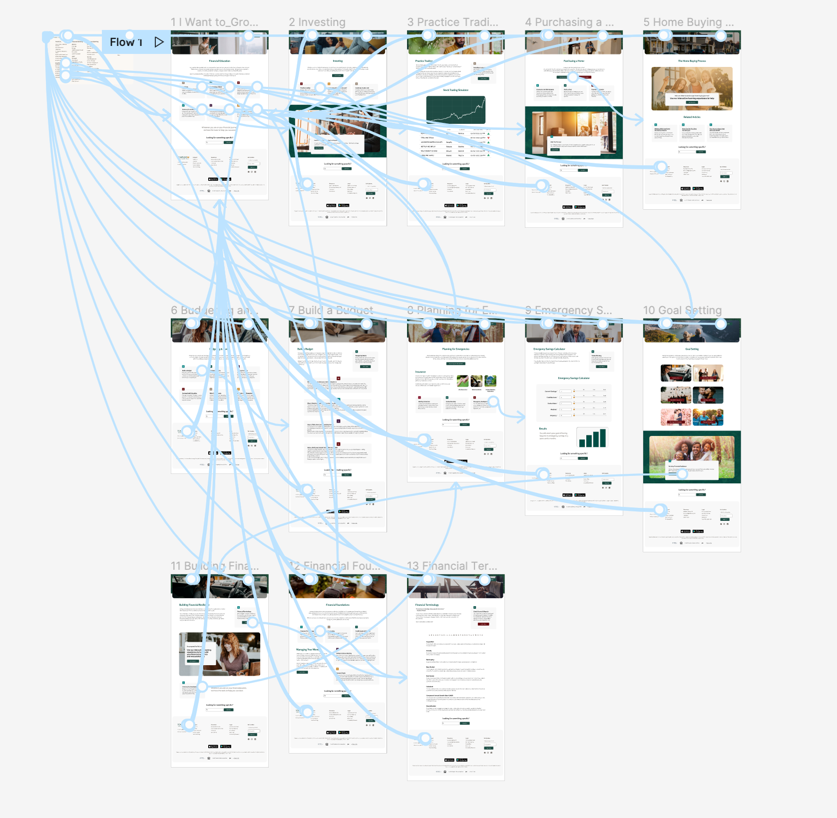
Prototype
Using the high fidelity designs, a prototyped version was created to implement usability testing.
USABILITY TESTING
Usability Testing Objectives
Determine the length of time that it takes a user to follow different task flows.
- Discover any pain points users have when navigating the different sections of the site.
- See if users find the pages to be helpful or useful to their financial needs and goals.
Methodology: Remote testing via Maze
Participants: 11
Demographics: Participants needed to fit within one or more of these groups:
(1) Individuals who reside in Pennsylvania or New York,
(2) Individuals who are embarking on their first sizable financial decision
(3) Individuals who are between the ages of 25 and 35.
Results
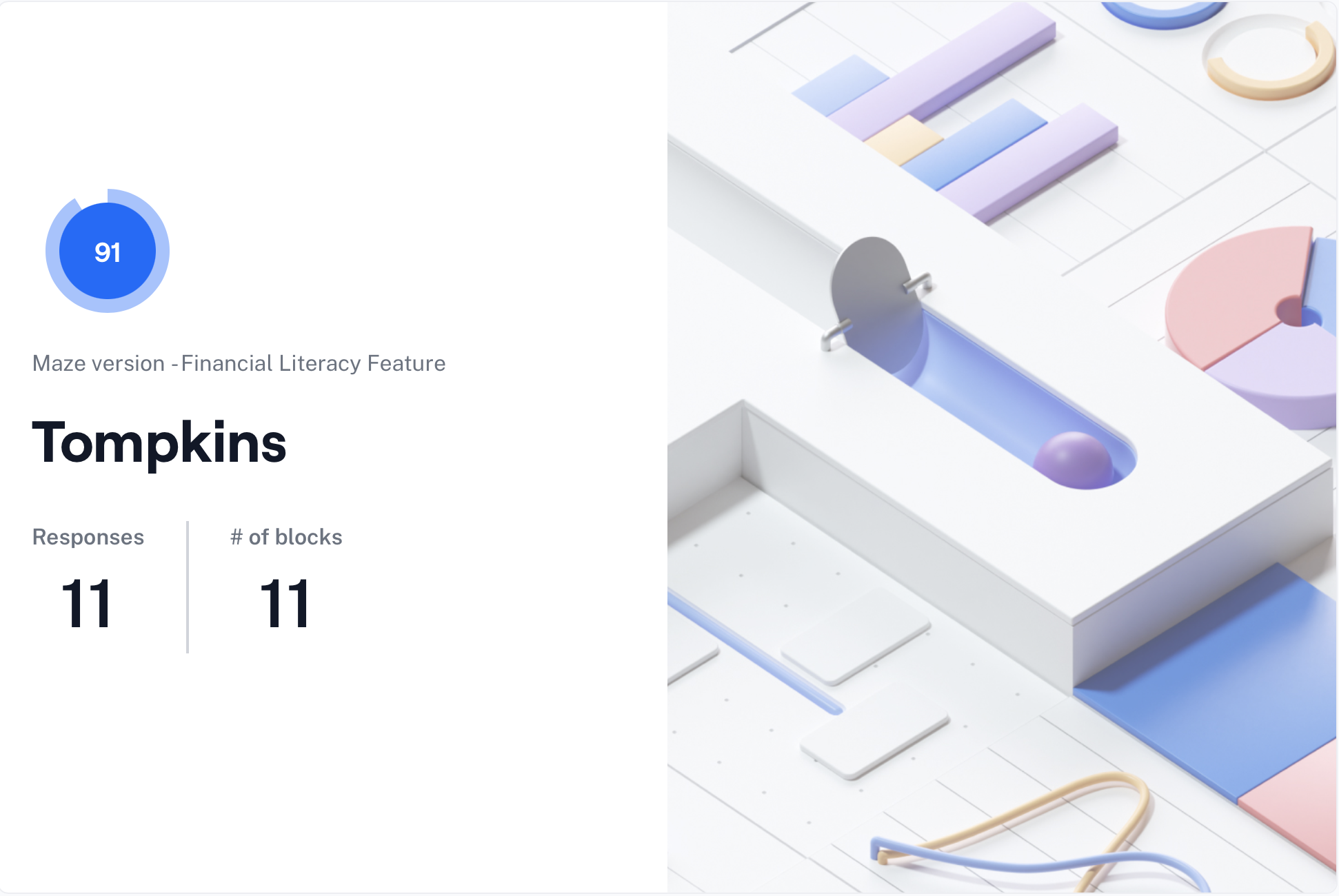
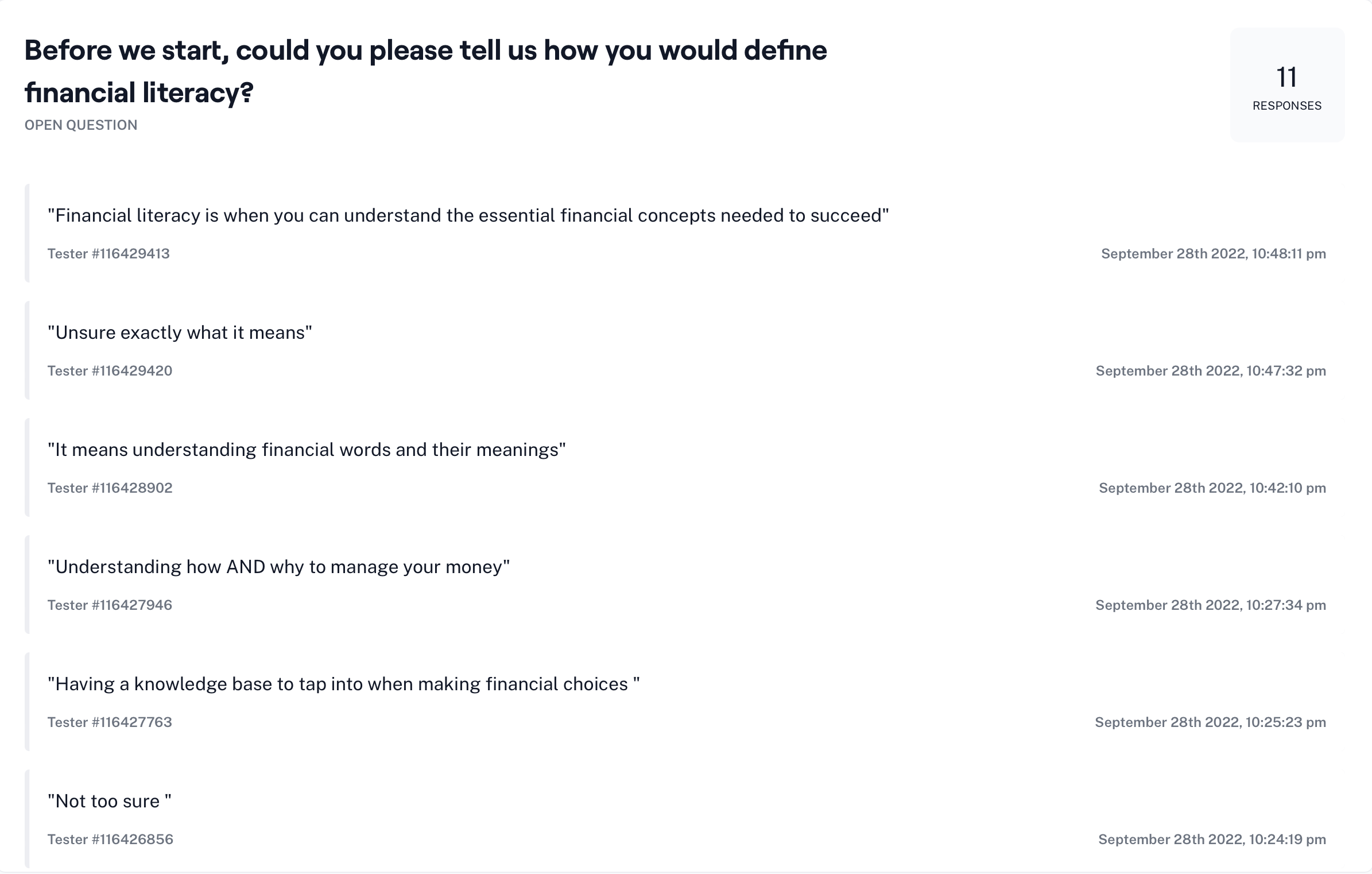

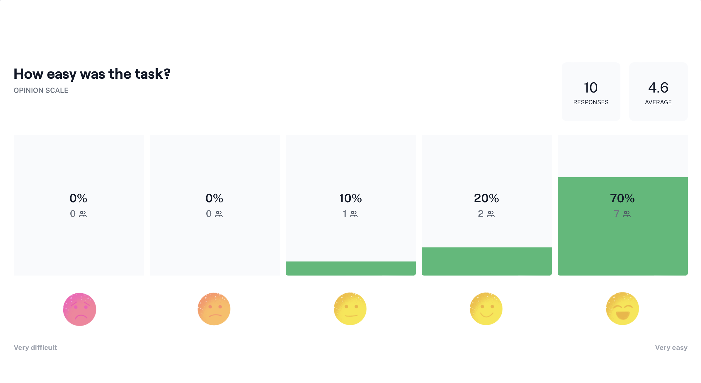
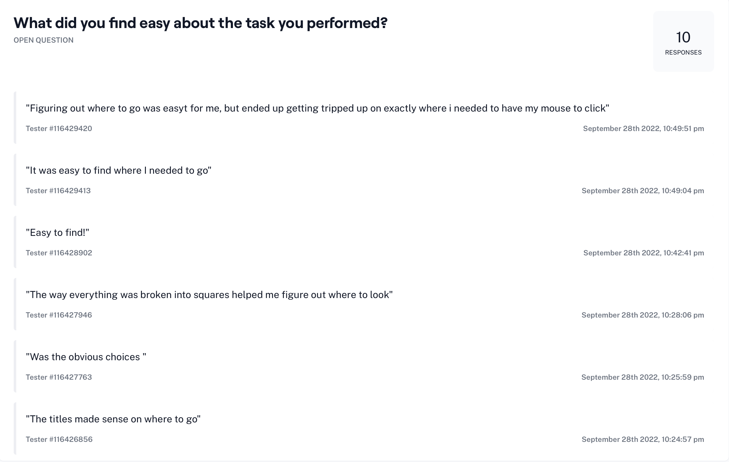
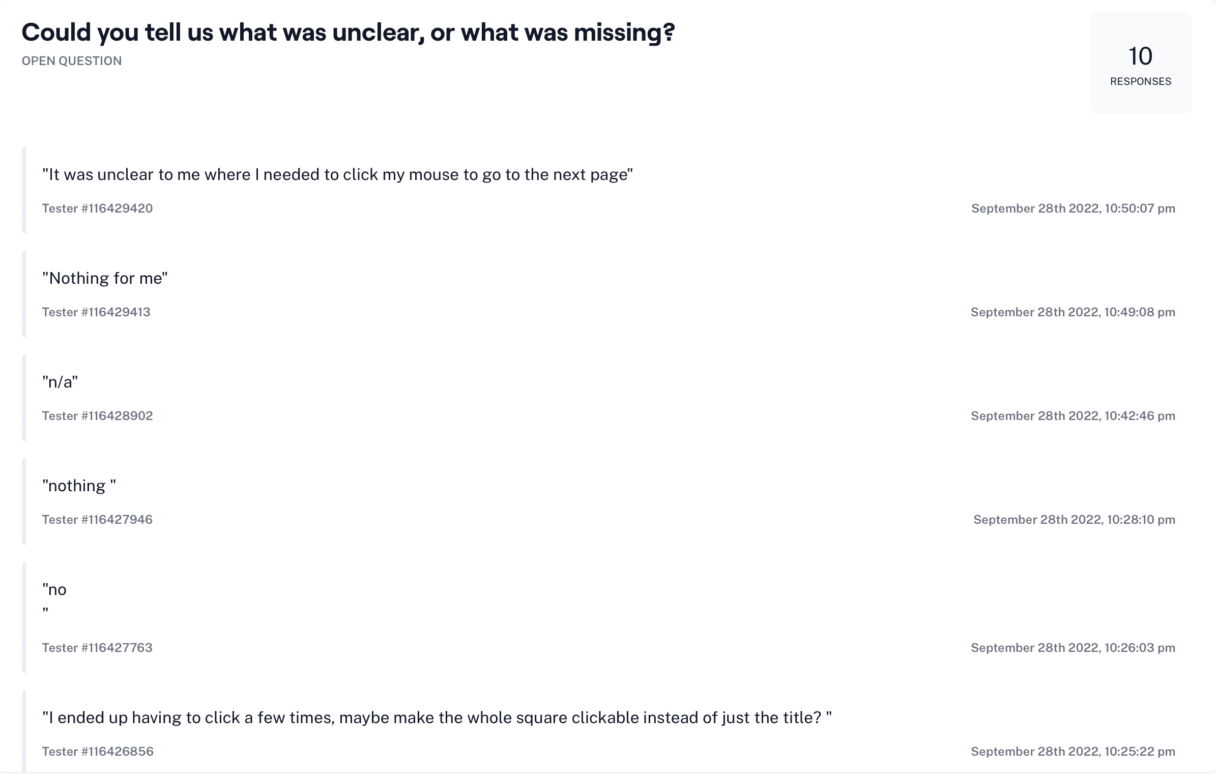

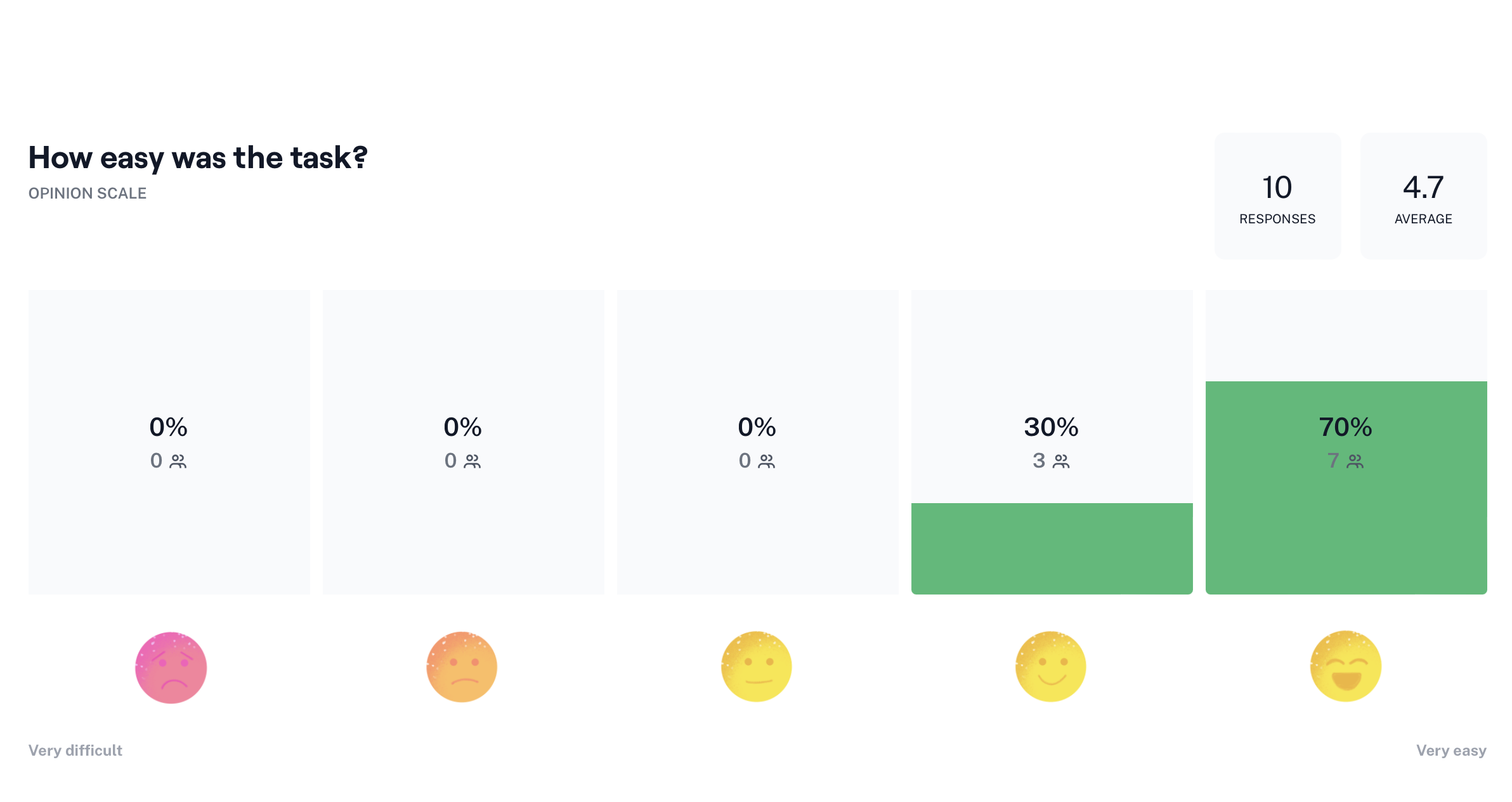
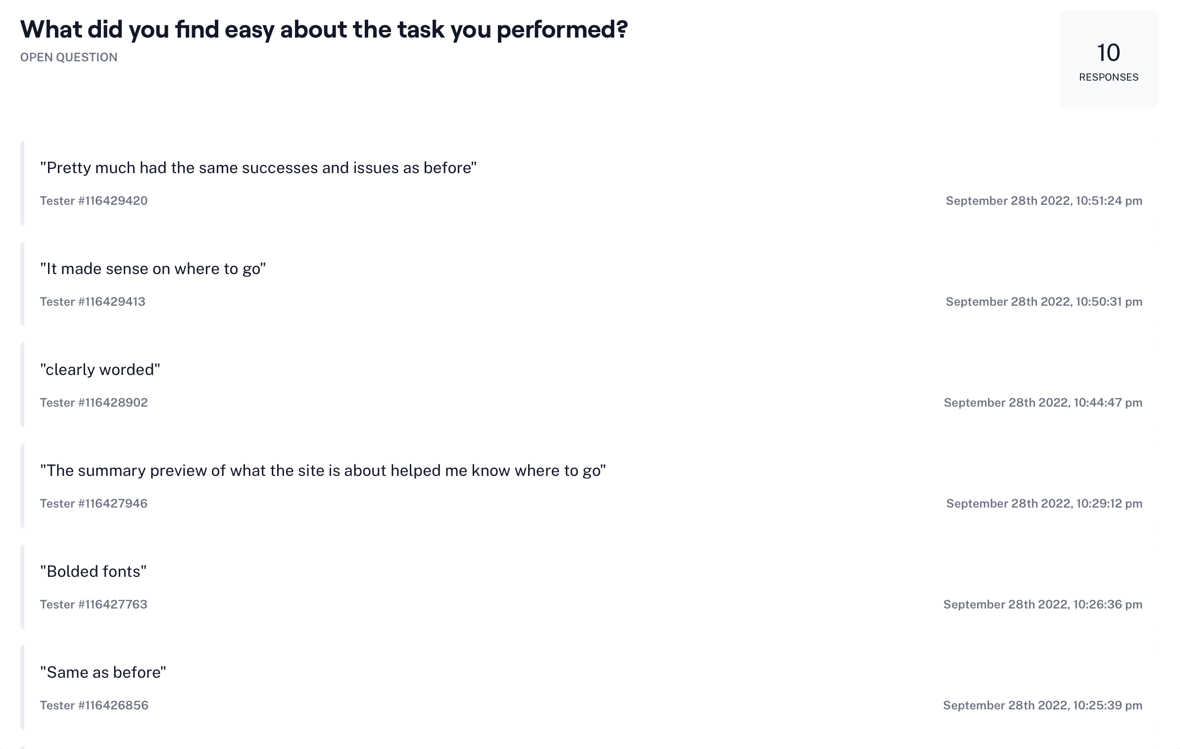
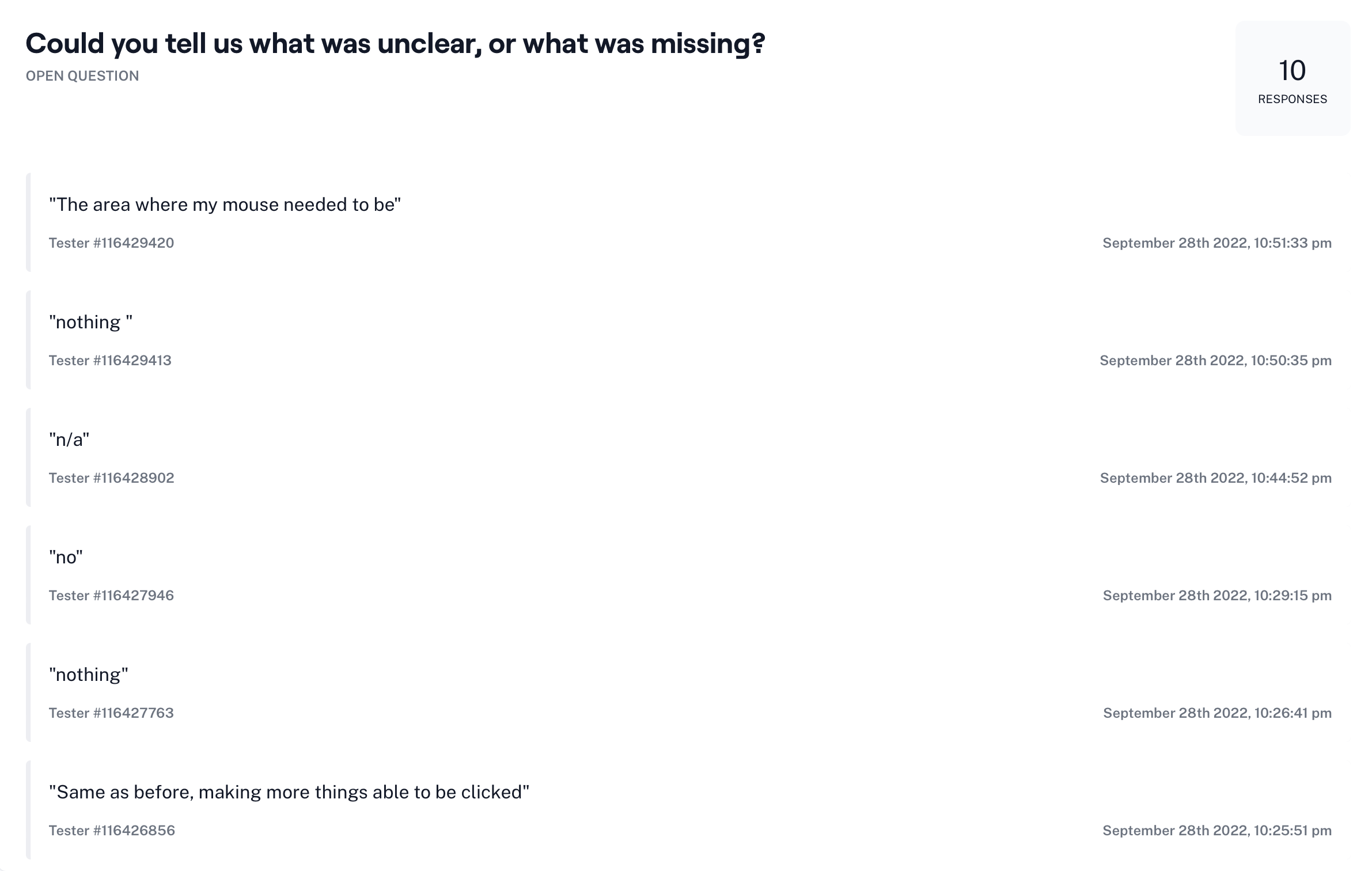
Overall, user feedback was very positive with little to no indication of pain points or hurdles. One concern brought up by a few participants, was to increase the area that is able to be clicked within the cards. After user testing was completed, this was remedied for the final prototype to lower the rate of misclicks.
FINAL THOUGHTS
Future Considerations
Given the option of more time and resources, a few things I would love to explore are:
- Continued development of additional pages, including: Managing your money, renting vs owning, and a student loan repayment page
- Building out the Home Buying Process interactive experience
- Conduct another round of user testing once additional pages are drafted
Key Takeaways

- When working within an existing site, it is important to stay within their established UI. Throughout my design process I continually compared my pages for the new feature with existing pages to ensure that they were cohesive. The goal with this project was to enhance the current site by complementing it, not differentiating it beyond recognition.
☠️ Avoiding Scope Creep
- Staying within the scope of the project was crucial to having it be completed within the targeted timeframe. Although I was tempted to continue iterating additional pages and elements, I continued to remind myself of what was necessary and what could be added in at a later date.
SELECTED WORKS
KinkatopiaProduct Design
Tompkins BankProduct Design
South Florida Wellness NetworkProduct Design
Kaus InsuranceProduct Design

Prosperity ResearchGraphic Design

ARK Resilience AwardsGraphic Design

Total Wealth SymposiumGraphic Design

Profits UnlimitedGraphic Design
