ROLE:
Product Designer —
User Research, Interaction/Visual design, Prototyping & Testing
TOOLS:
Figma, Adobe Creative Suite, Maze, Optimal Workshop, Whimsical
PLATFORM:
Mobile App
TIMELINE:
6 weeks / 80 Hours
OVERVIEW
Who is Kinkatopia?
Kinkatopia is an organization working to combat the lack of information regarding captive kinkajous. They continuously educate that they are not traditional pets. But for those who take on the endeavor, Kinkatopia hopes to provide information so these animals can have the best life possible. The hope is to lessen improper keeping of these animals, impulsive purchasing, and combat the irresponsible relinquishing of kinkajous. Ultimately, to offer a safe haven so kinkajous do not have to succumb to hard conditions.
Kinkatopia is the first of its kind, and the only organization fighting for this cause in the world. They have helped over 100 kinkajous permanently settle since 2018.
But...What is a Kinkajou?
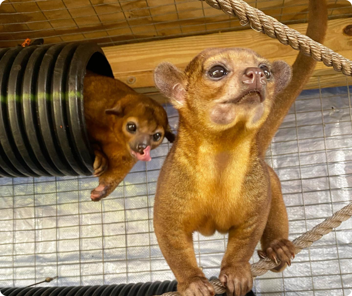
- Members of the raccoon family, kinkajous resemble a mix between a monkey and a bear
- They are found in the rainforest treetops of South and Central America
- They are nocturnal, can live up to 40 years, and are wild animals (ie: not good “pets”)
Problem
Kinkatopia has been spread thin on social media platforms, and wants to funnel their content into one product. This problem has led to a decrease in awareness of sponsorship opportunities for their followers.
Goal
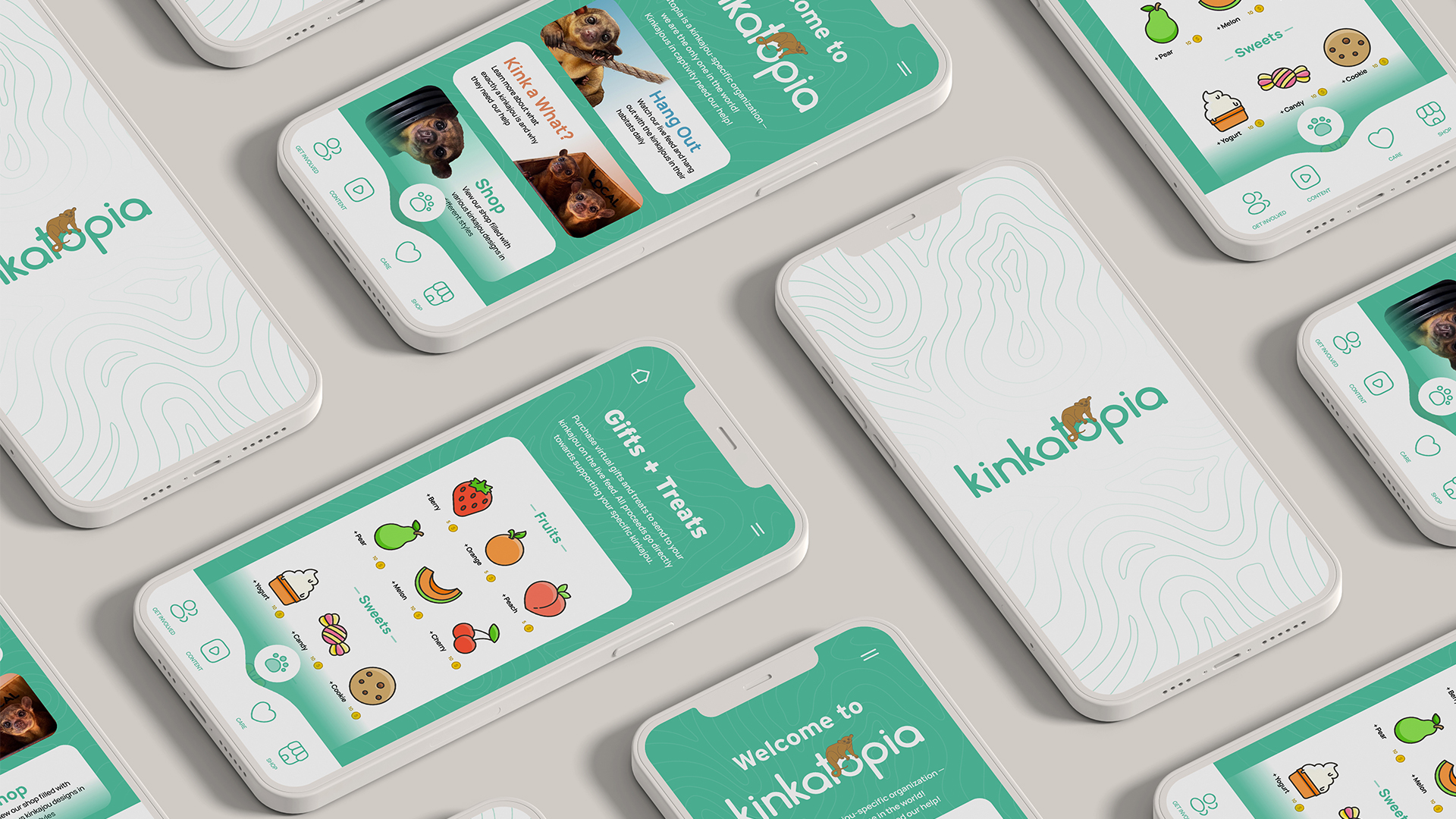
Provide Kinkatopia with a central hub for users to explore sponsorship opportunities, provide educational content, and connect with their users.
DISCOVER + EMPATHIZE
Research Objectives
- Pinpoint supporter’s alternative app usage and preferences to find any similarities that resonate with Kinkatopia's goal
- Identify potential communication barriers and formulate strategic solutions to mitigate these issues
- Discover user perspective on Kinkatopia’s current methods of communication and discovers where improvements could be made
- Research what other successful animal rescues are doing and see how it can be applied Kinkatopia
User Surveys + Interviews
Social media campaigns were used to obtain participants for both the 1-on-1 interviews and the survey:
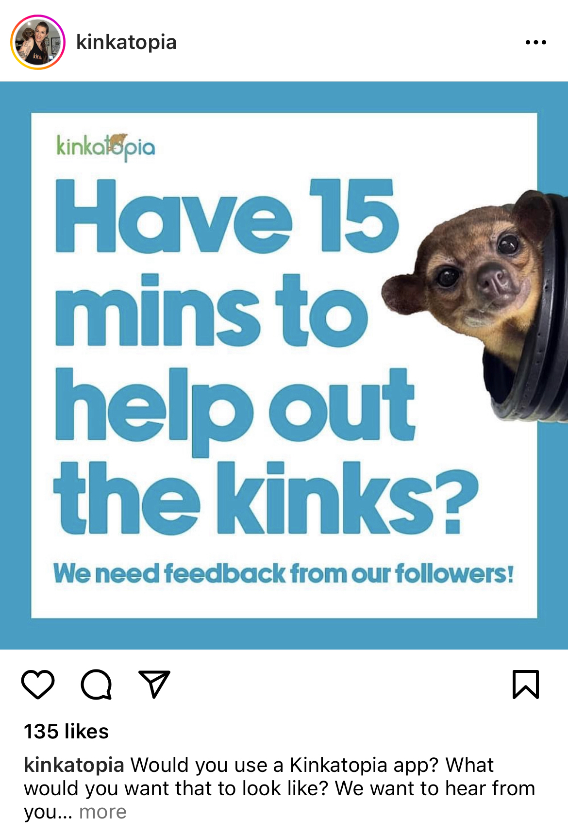
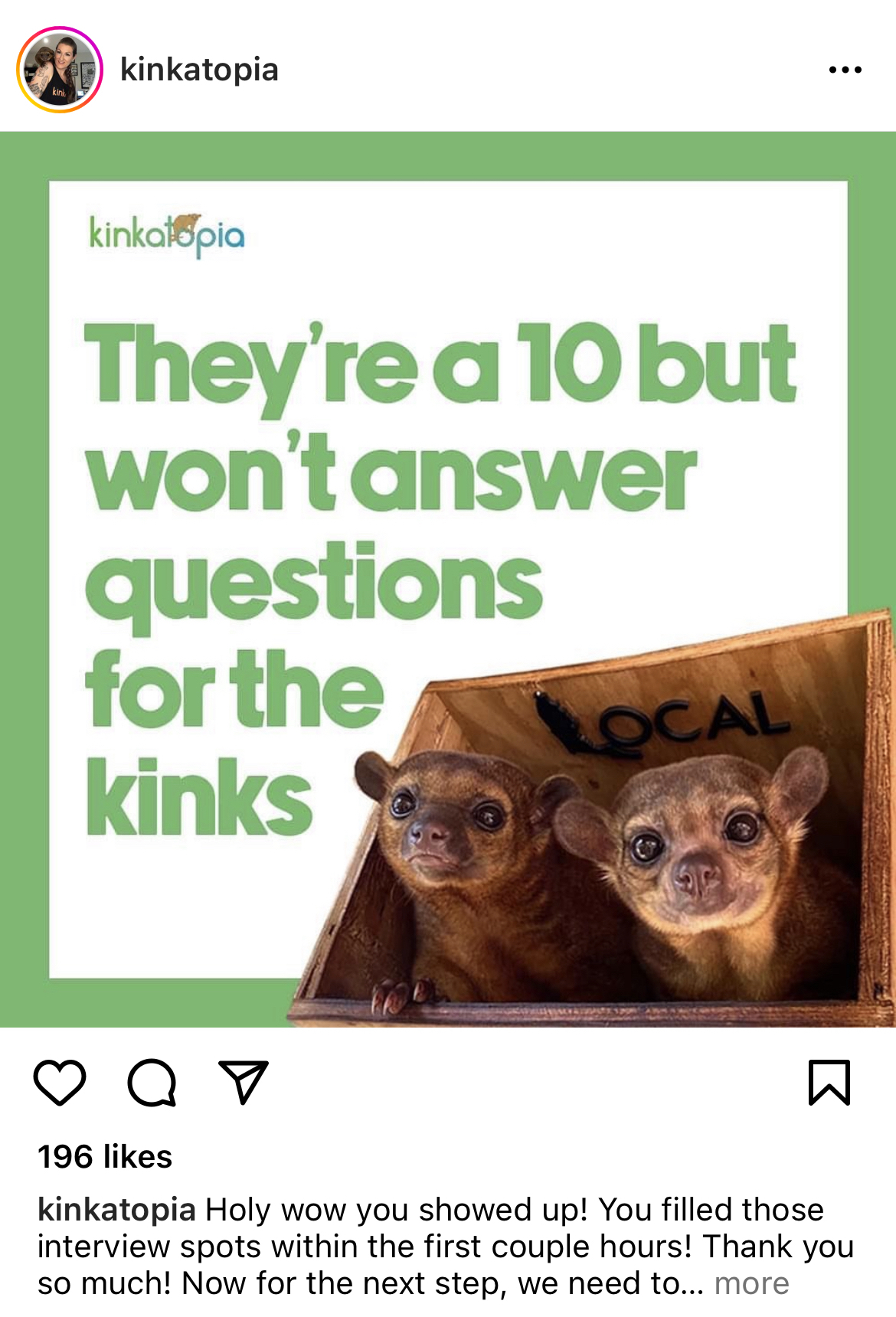
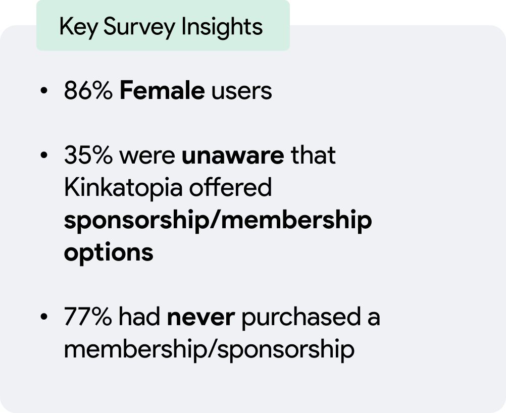
For the survey, insights were gathered from over 150 participants
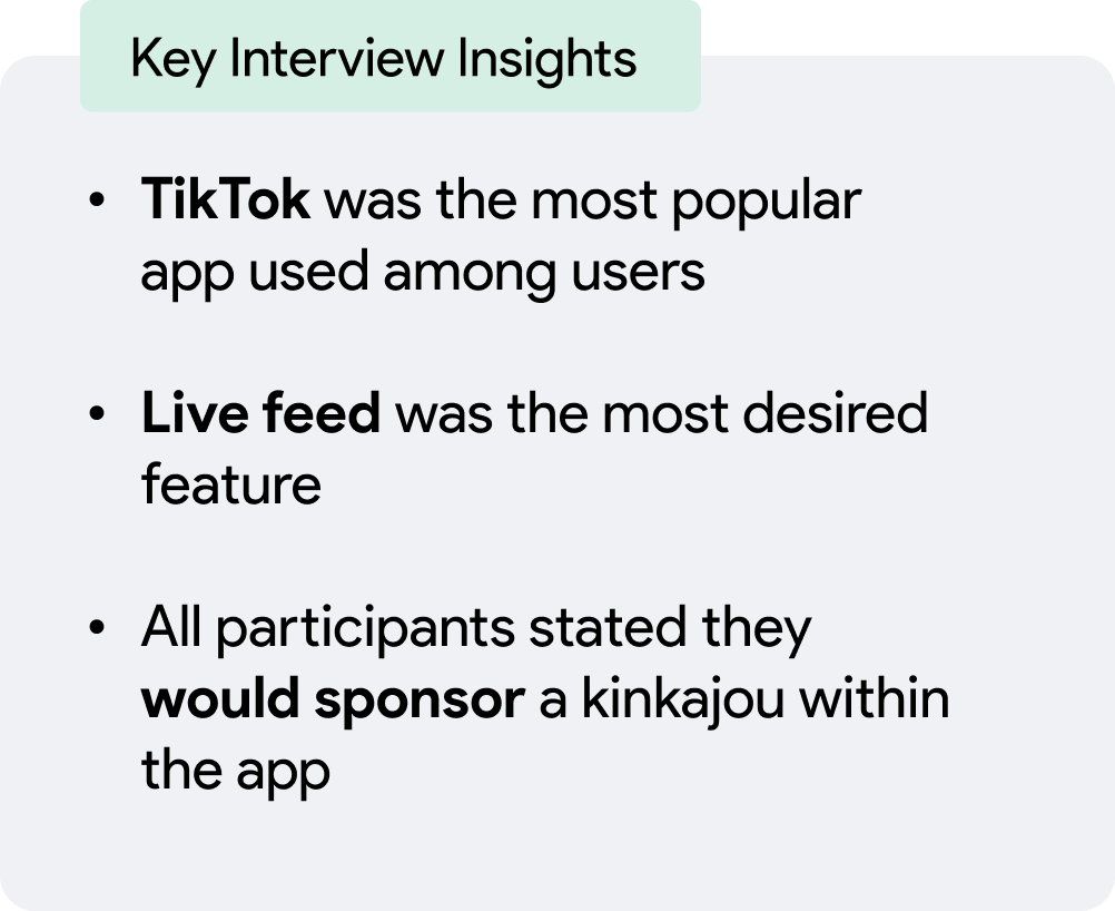
For the 1-on-1 interviews, insights were gathered from 10 participants
When selecting participants, to be included they needed to fit within one or more of these groups:
(1) Individuals who support Kinkatopia on a regular basis
(2) Individuals who interact with Kinkatopia via social media platforms
Empathy Map
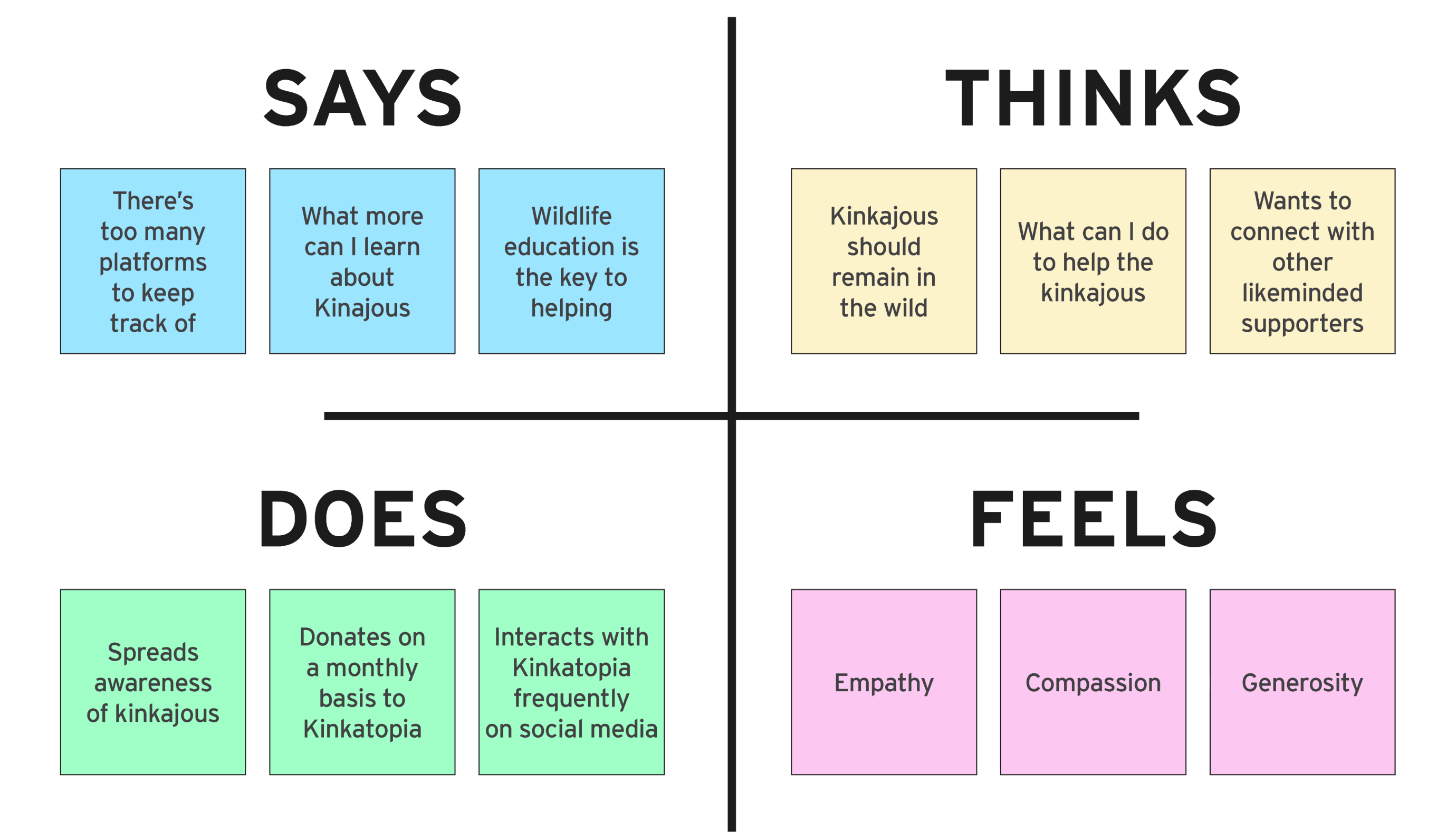
Using the findings from the interviews, an empathy map was constructed.
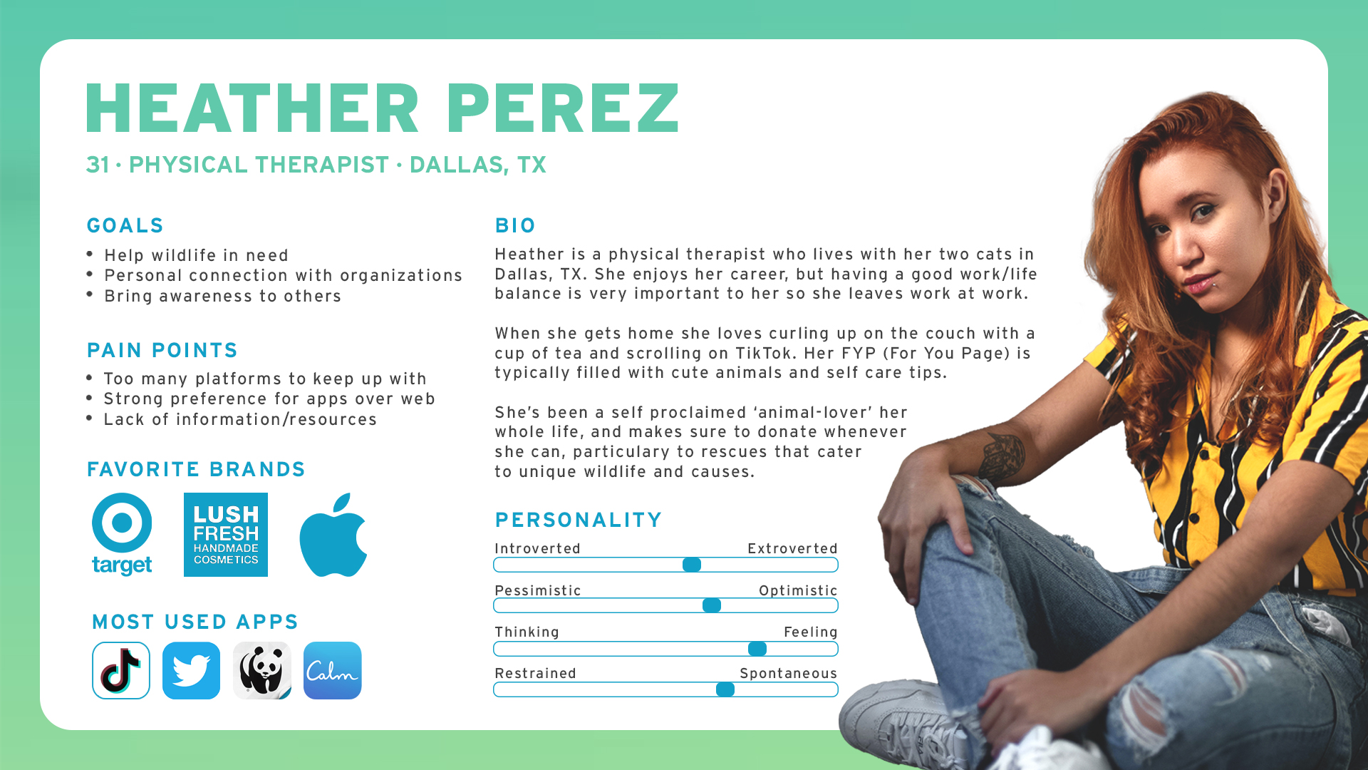
User Persona
With insights gathered, the user persona for Heather was created to identify the target audience’s needs.
CATEGORIZE
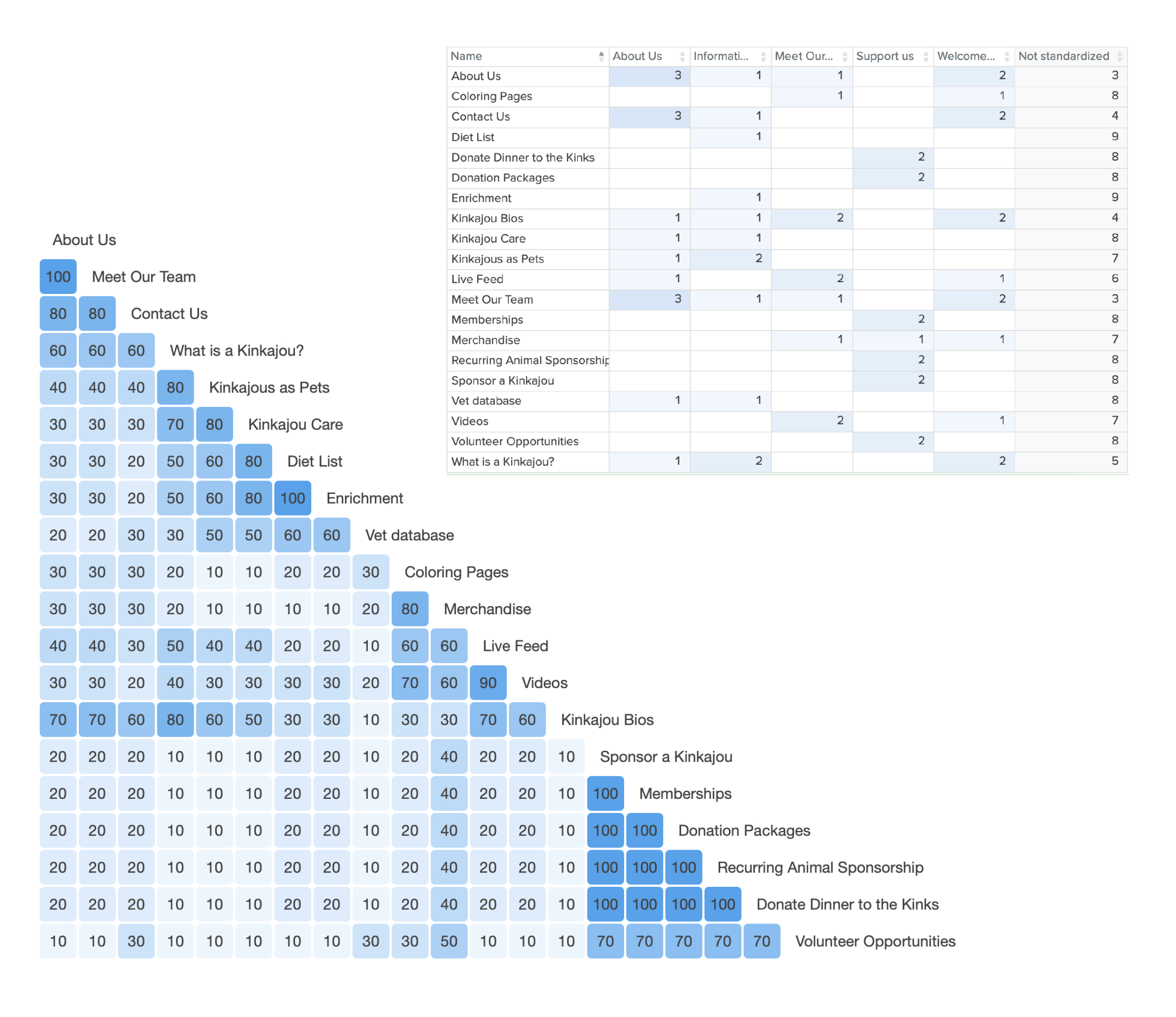
Card Sort
This study was conducted to discover how users would group/organize content that Kinkatopia had on their site, along with a few additional sections.
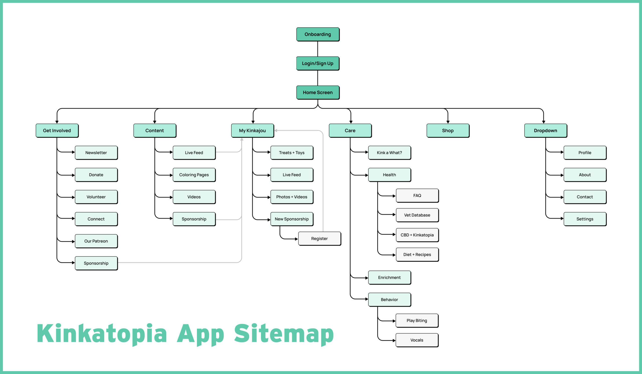
Sitemap
The sitemap is designed to highlight and direct the user to the My Kinkajou section. Ultimately, the goal is to have the user funnel into sponsoring a kinkajou.
The survey data and 1-on-1 interview summary was used in tandem with the card sort to determine the information architecture of the site.
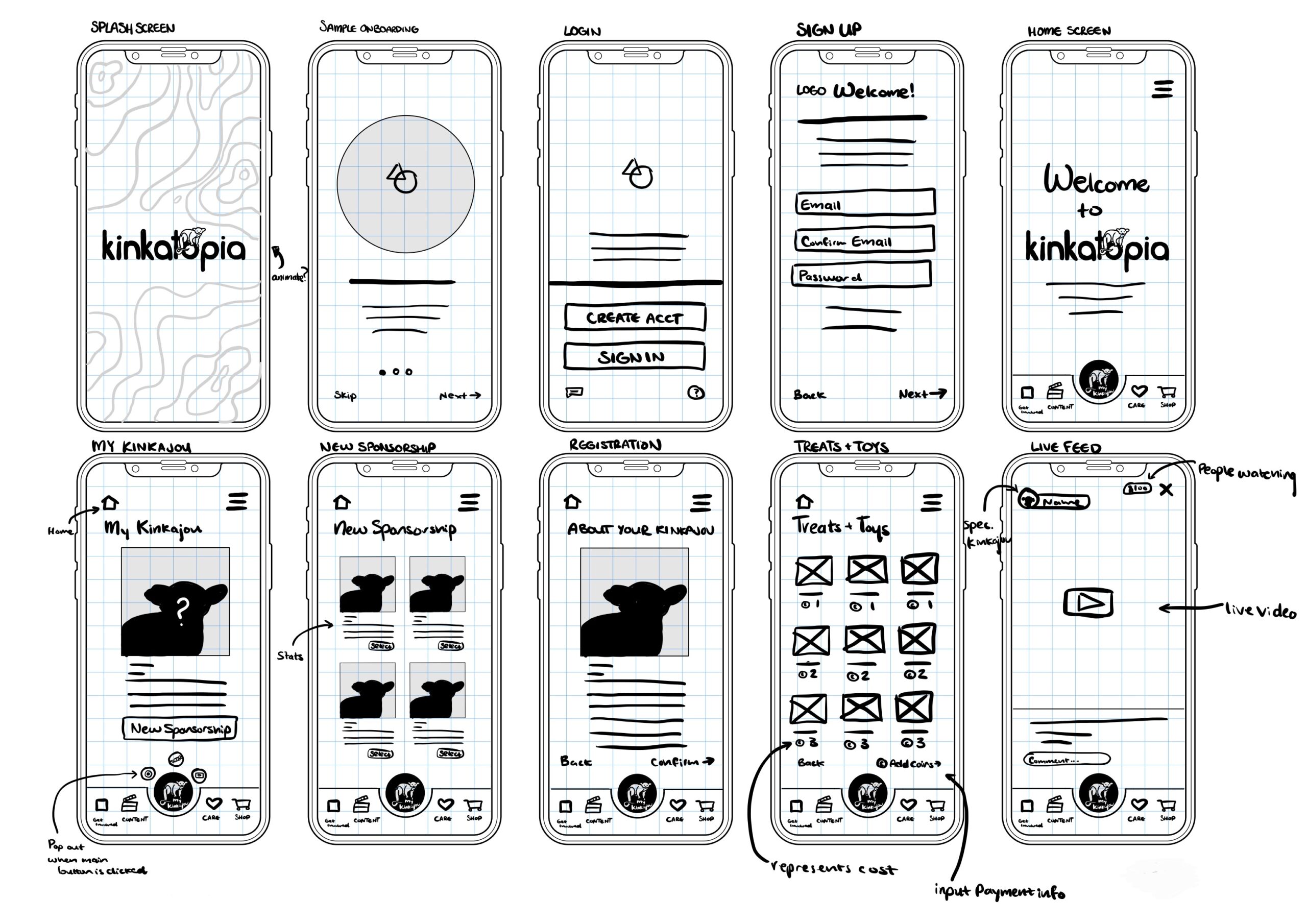
Low Fidelity Sketches
Potential content was ideated and then sorted visually with design drafts. The research and strategies listed above assisted in figuring out the user's priorities, needs, and wants within the app. The culmination of all of the data was drafted into low fidelity sketches to work off of for the rest of the design process.
INTERACTION
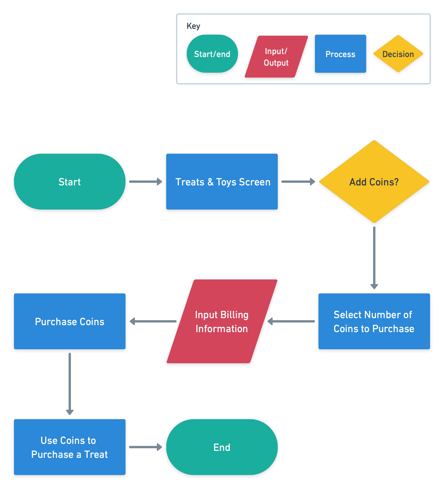
Task Flow
A task flow was created to visualize the task involved in the user story:
As a kinkajou sponsor, I want to add coins and purchase treats, so that I can give them to my kinkajou.
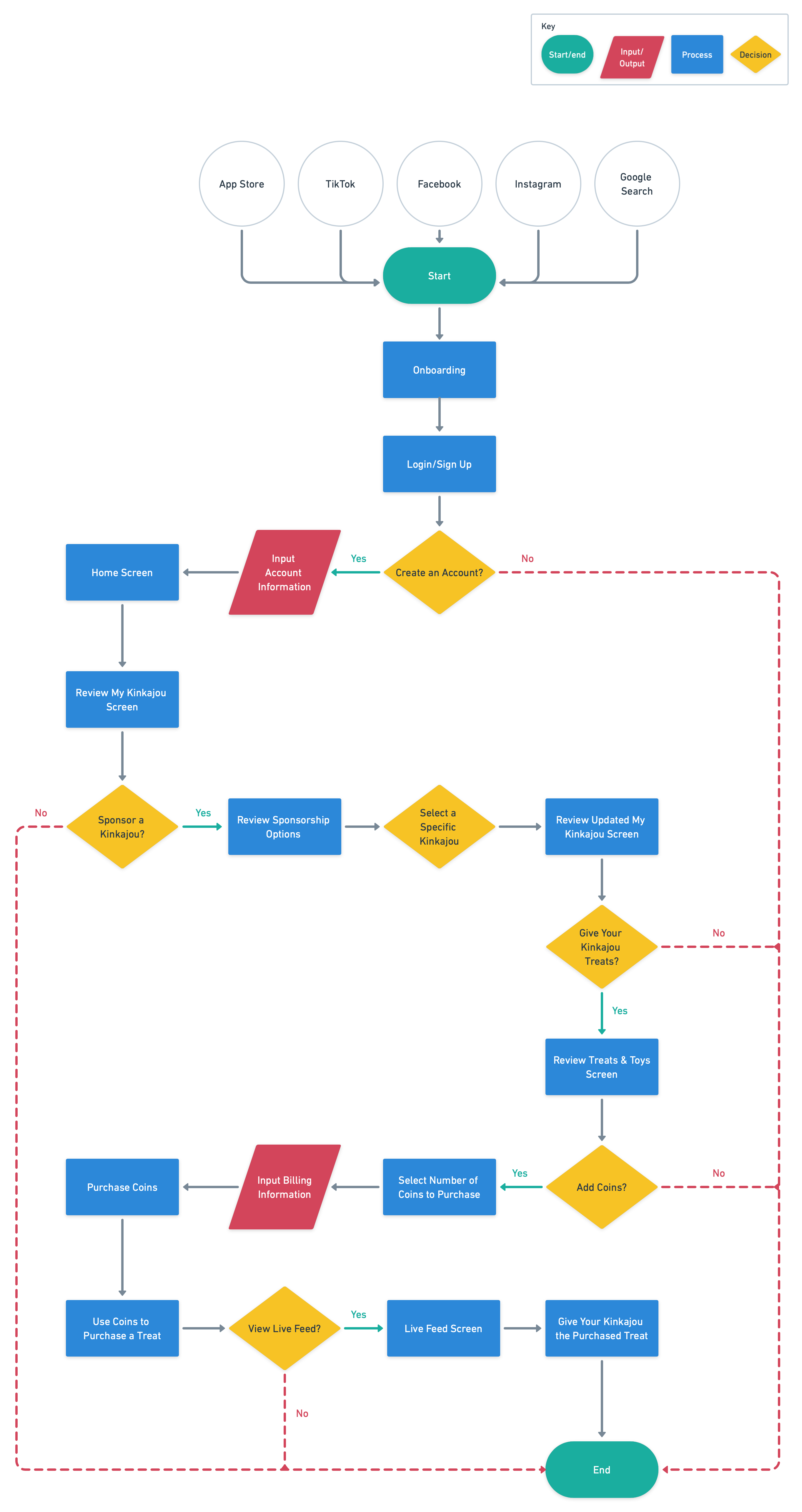
User Flow
A user flow was created to visualize the tasks involved in the user story:
As a Kinkatopia follower, I want to sponsor a kinkajou, so that I can watch their live feed and give them virtual treats.
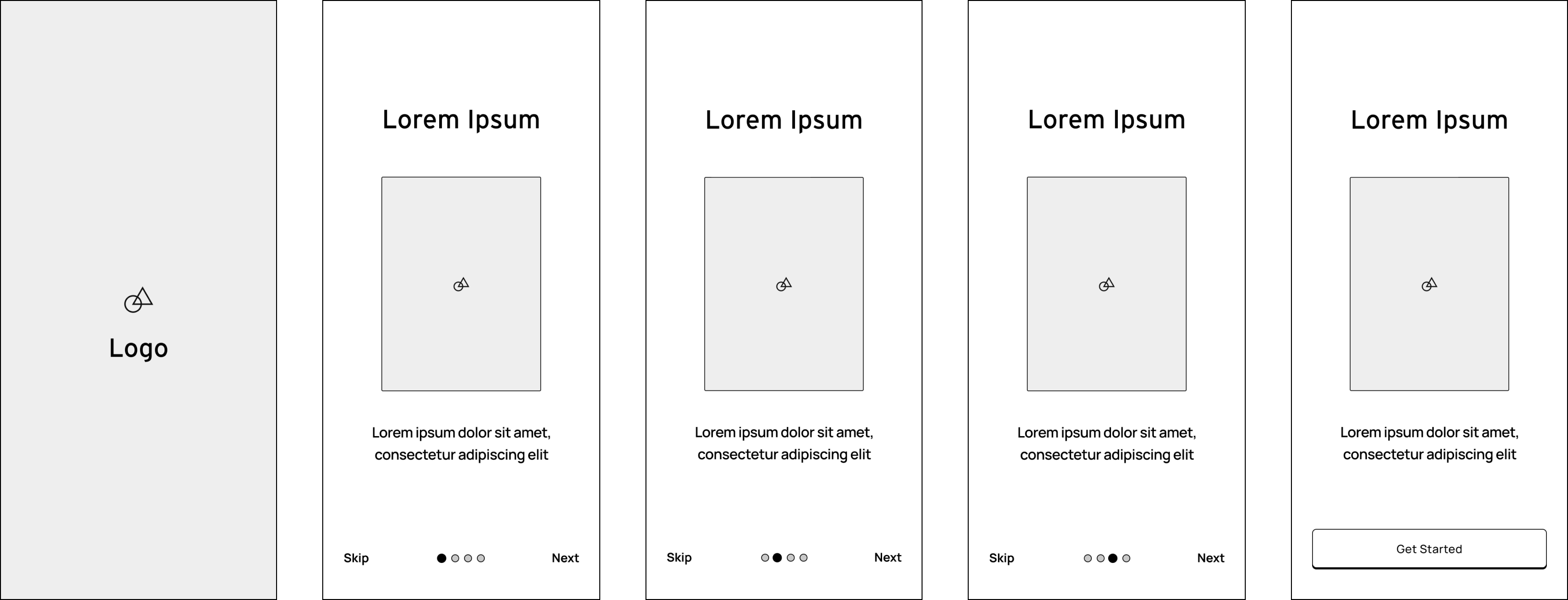
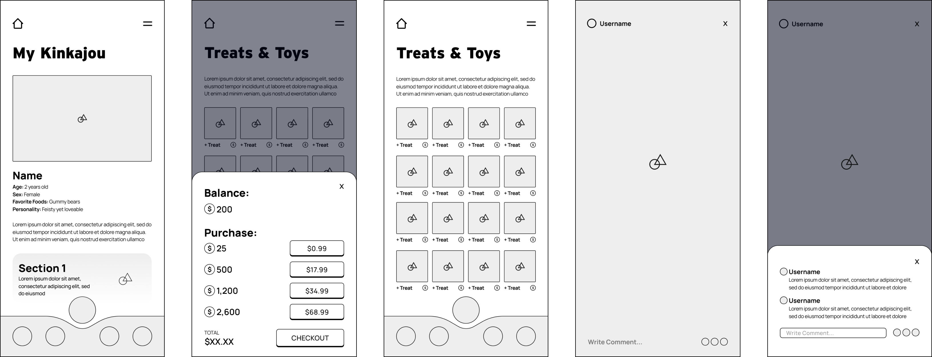
Wireframes
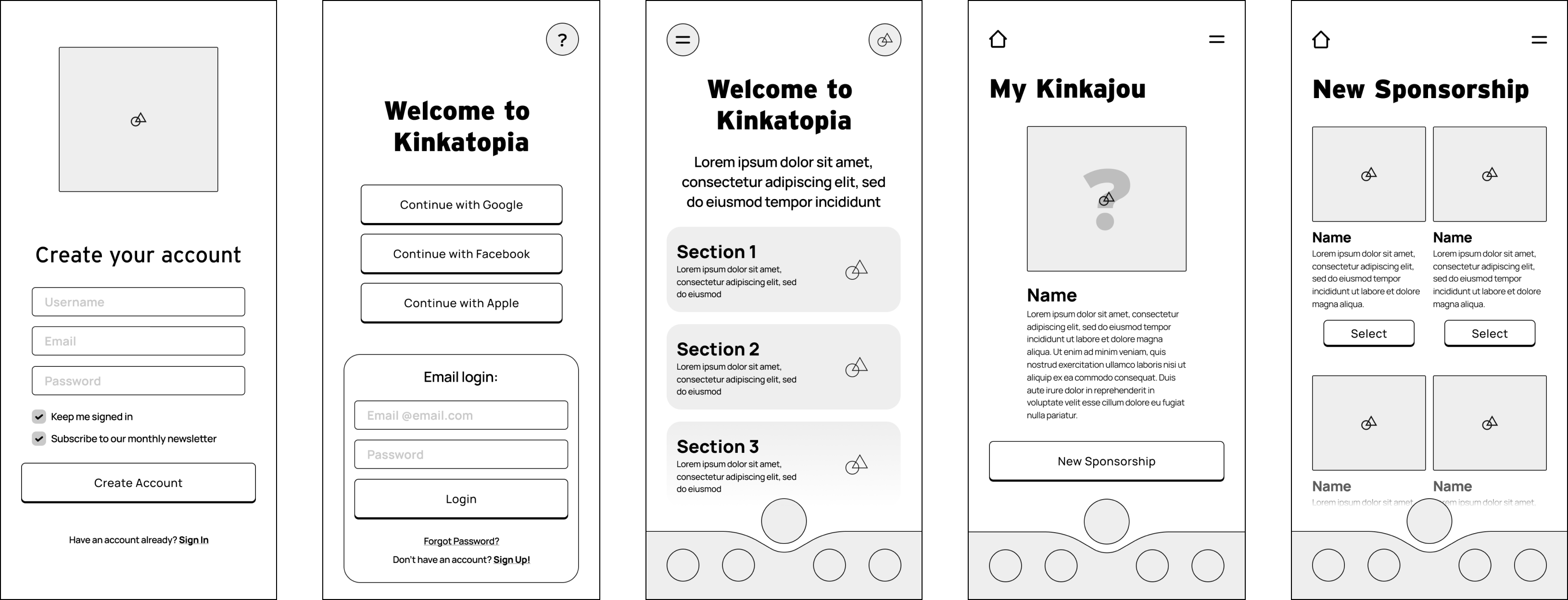
Using the low fidelity sketches, mid fidelity wireframes were created to showcase a sampling of the pages within the mobile app. These included the on boarding and sign up processes, the "My Kinkajou" page, and a few others related to the flows above.
INTERFACE
Mood Board
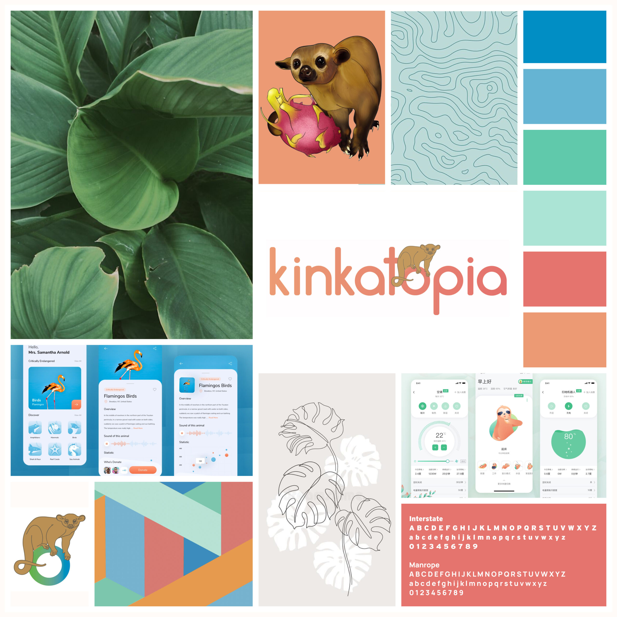
A mood board was created with the following guidelines in mind:
— Tropical color palette
— On-brand/in-line with logo
— Simple and Clean
— Illustrations of Kinkajous
— Fun and playful design
IMPLEMENTATION & ITERATION
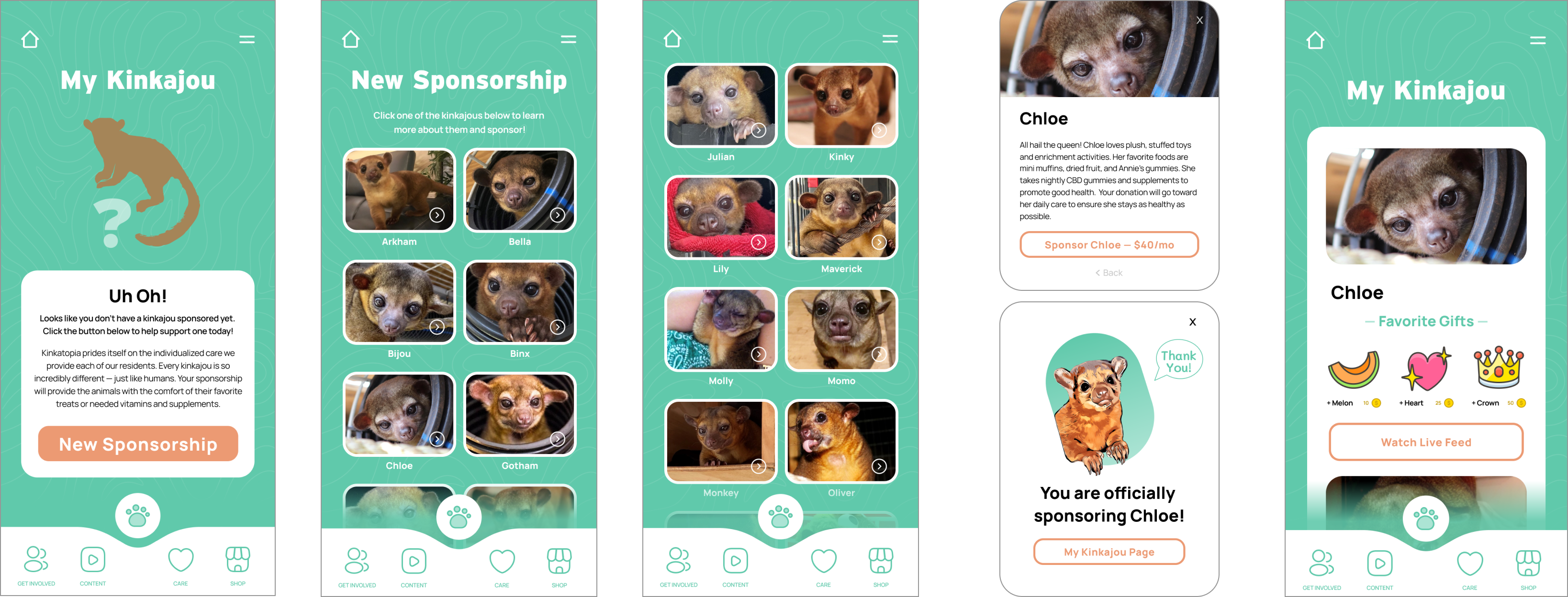
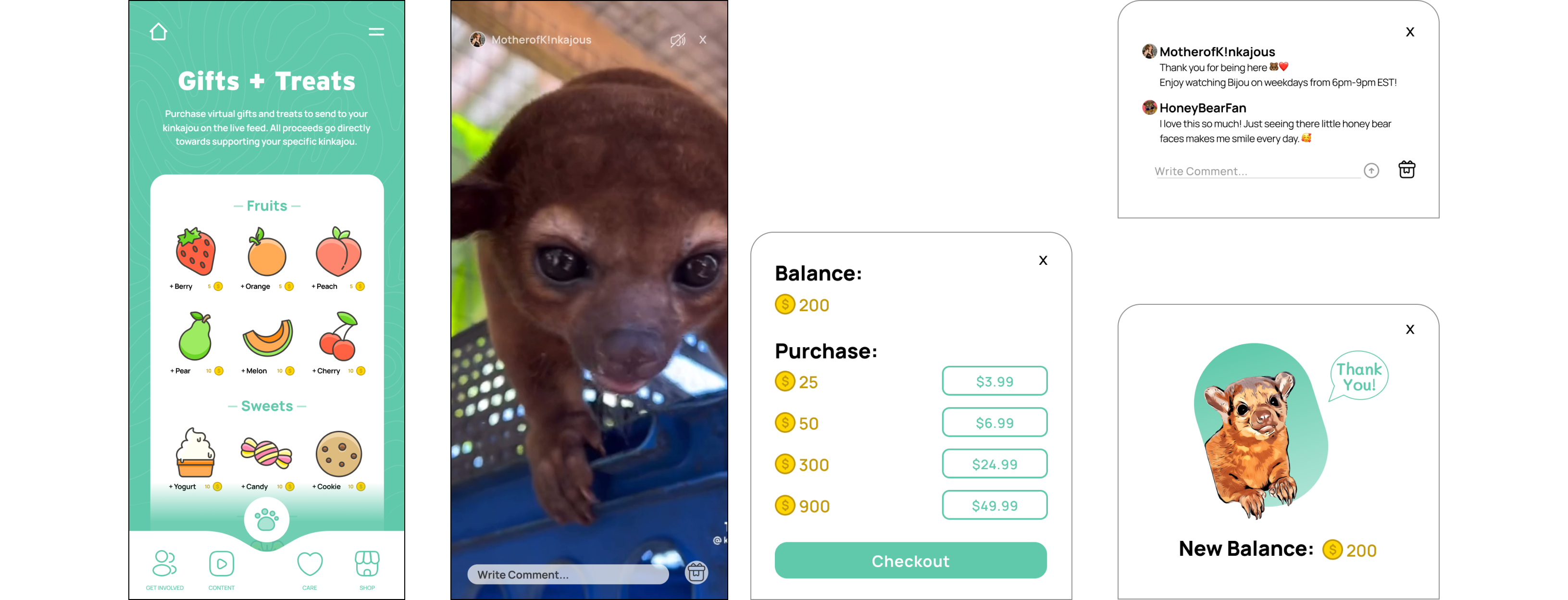
Hi-Fidelity Wireframes
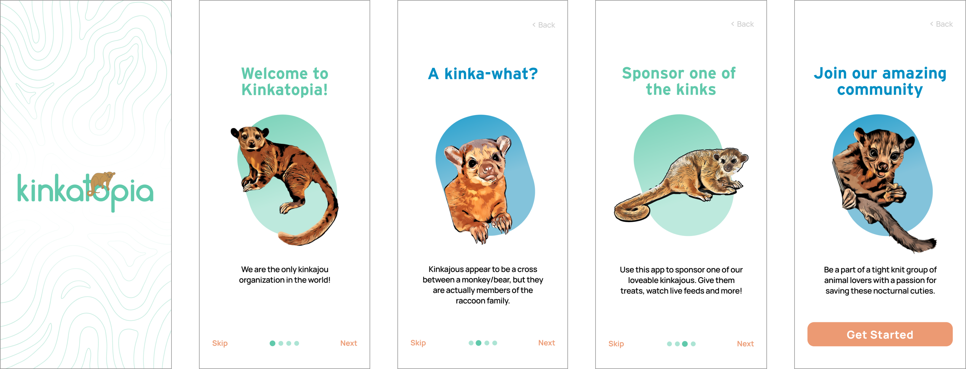
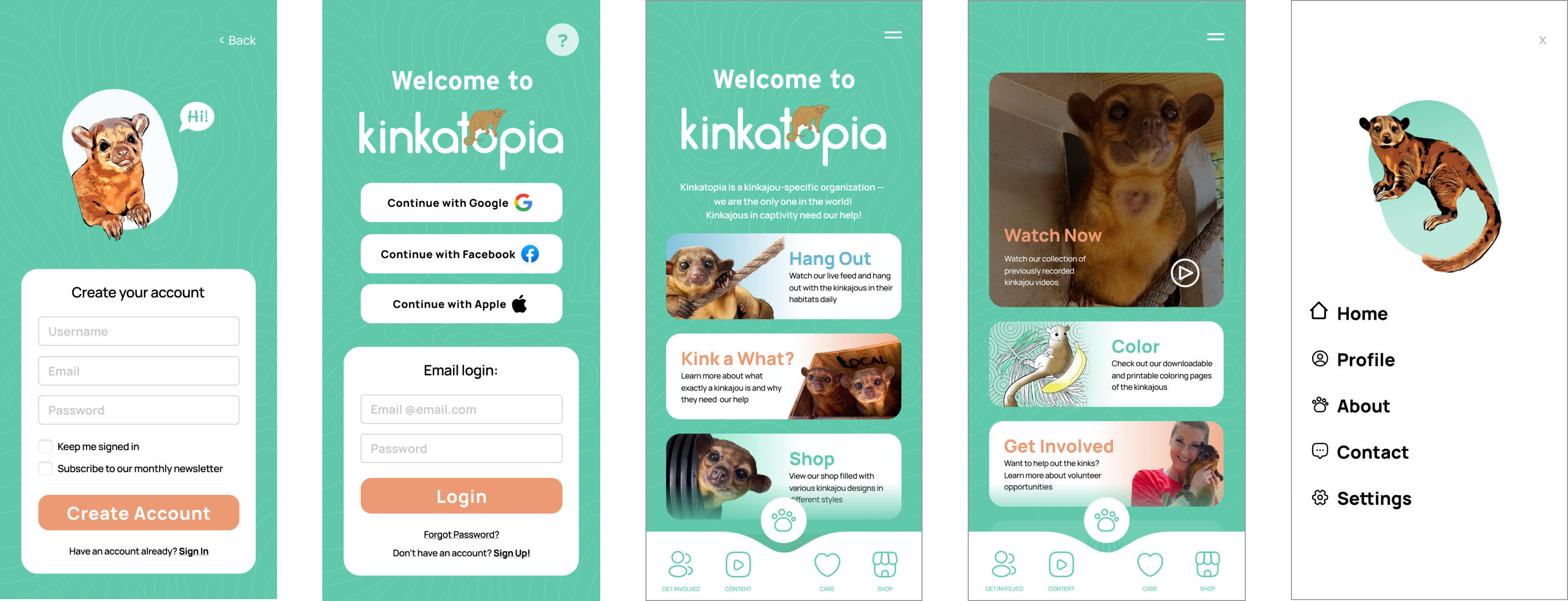
The mid fidelity wireframes and the moodboard aesthetics were combined to create high fidelity wireframes.
Prototype
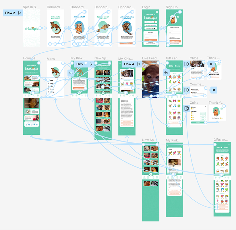
Using the high fidelity designs, a prototyped version was created to implement usability testing.
USABILITY TESTING
Usability Testing Objectives
Determine the length of time that it takes a user to follow the main user flow
- Discover any pain points users have when navigating the different sections of the app
- See if users have any suggestions for improving the experience of the app
Methodology: Remote testing via Maze
Participants: 5
Demographics: Participants needed to fit within one or more of these groups:
(1) Individuals who support Kinkatopia on a regular basis
(2) Individuals who interact with Kinkatopia via social media platforms
Results:
No issues or pain points were indicated. A larger participant pool may highlight potential roadblocks in the future.
FINAL THOUGHTS
Future Considerations
Given the option of more time and resources, a few things I would love to expand upon are:
- Continued development of additional pages, including: a vet database, profile customization, and volunteer opportunities page
- Expand the My Kinkajou section to be more interactive. Potentially adding a game-like element, similar to Tamagotchi
- Conduct another round of user testing with a wider pool of participants
Key Takeaways

- This project had the ability to go in a variety of directions because Kinkatopia could benefit from multiple features. It was essential to have a clear objectives and focus on a few key features than have a bunch of mediocre ones.
🐝 Bee Patient & Resourceful
- A unique challenge presented itself when the founder of Kinkatopia (along with some of the kinkajous) were attacked by Africanized Killer bees. This, understandably, completely halted the progress on this app on her end which led to me having to think outside of the box to gather information. Though an unfortunate circumstance, I am grateful for the skills and knowledge I gained.
SELECTED WORKS

KinkatopiaProduct Design
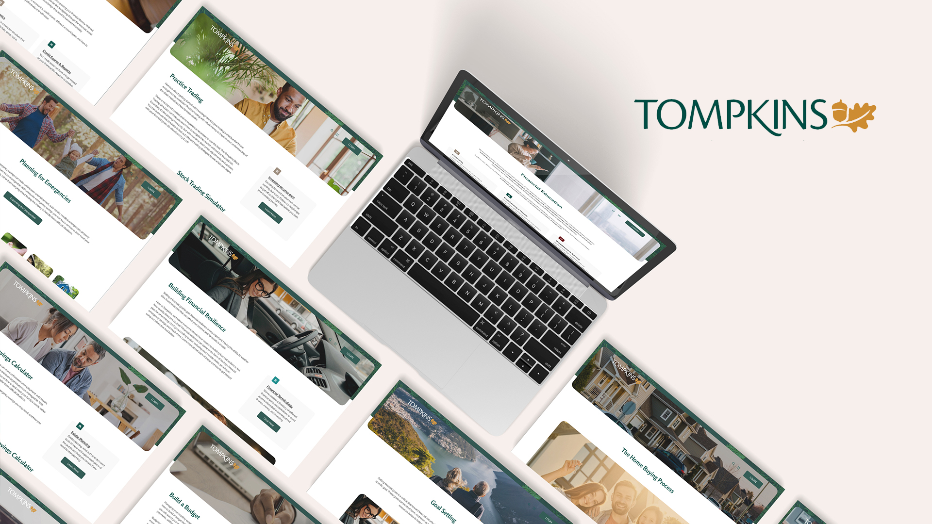
Tompkins BankProduct Design
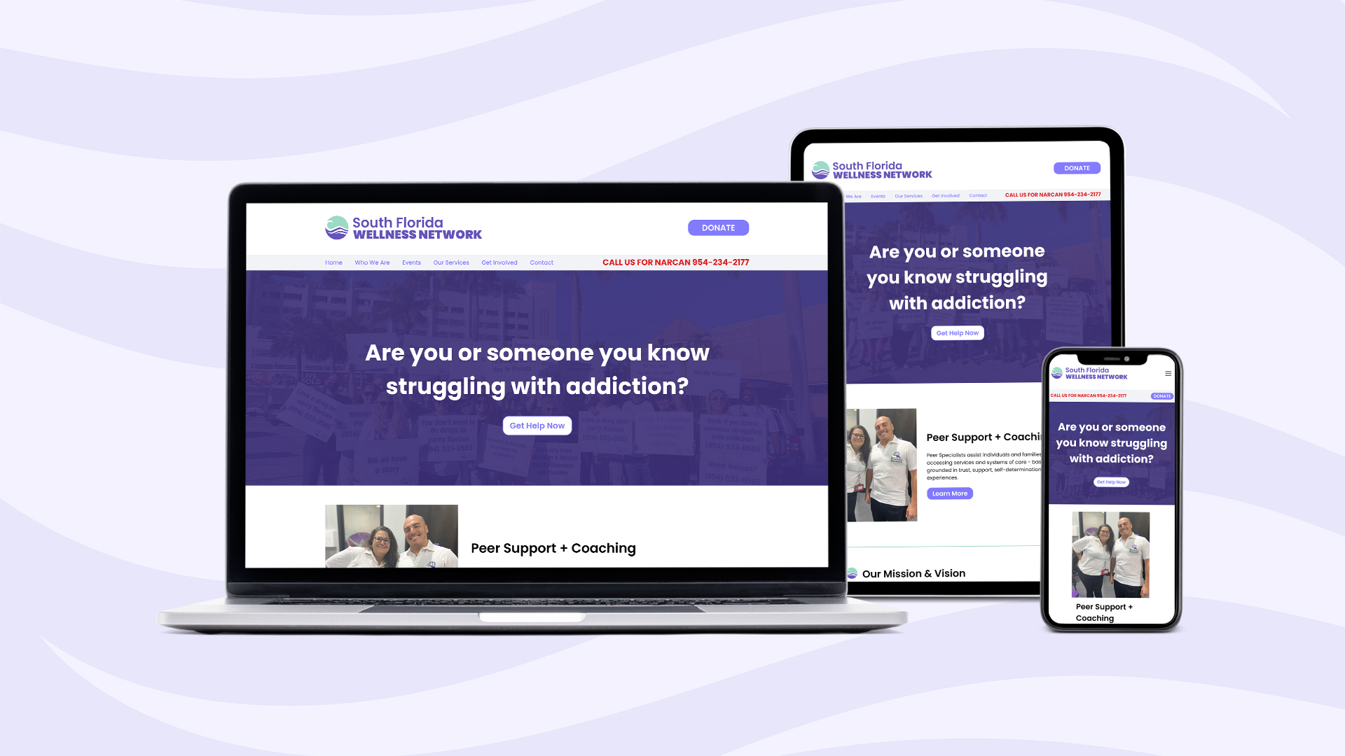
South Florida Wellness NetworkProduct Design
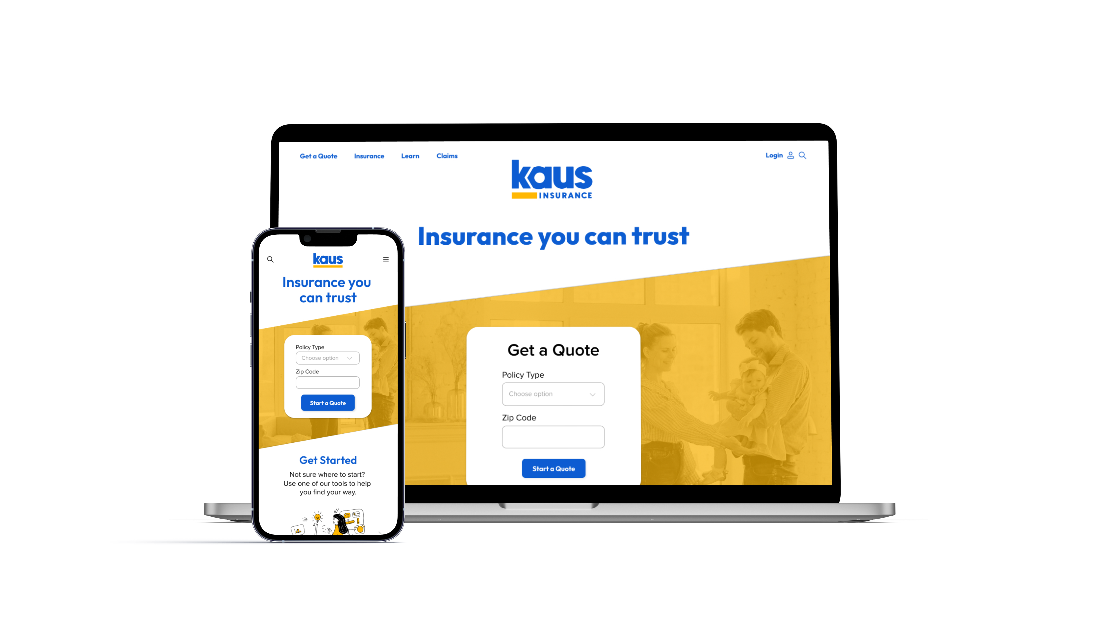
Kaus InsuranceProduct Design

Prosperity ResearchGraphic Design
ARK Resilience AwardsGraphic Design

Total Wealth SymposiumGraphic Design

Profits UnlimitedGraphic Design
