ROLE
Product Designer
Branding
User Research
Interaction/Visual design
Prototyping & Testing
TOOLS
Figma
Whimsical
Optimal Workshop
Maze
PLATFORMS
Desktop
Mobile
Tablet
TIMELINE
6 weeks
(20 hours/week)
OVERVIEW
Who is Kaus?
Kaus is a well established insurance company that has been providing policies for over 30 years. They offer several packages for different insurance types: property, motor, liability, marine, aviation, life, heath, and protection. Kaus sells through regional agents offering optimized insurance packages to ensure easy solutions at lower costs.
*This is a conceptual project completed as part of my design portfolio.
Problem
The process of purchasing insurance can be difficult, and with the rapid evolution of the internet, the market is always changing. Kaus is committed to providing simple solutions for their customers while expanding their online presence.
Goal
To create an end-to-end streamlined, informative, and accessible experience for Kaus' users, from purchasing an insurance policy to accessing their account.
DISCOVER
Research Objectives
- Understand and define the various products offered by the insurance sector
- Identify and analyze current pain points are within the insurance buying process
- Understand user motivation and intention when choosing an insurance policy
- Research successful competitors' techniques and formulate an implication strategy for Kaus
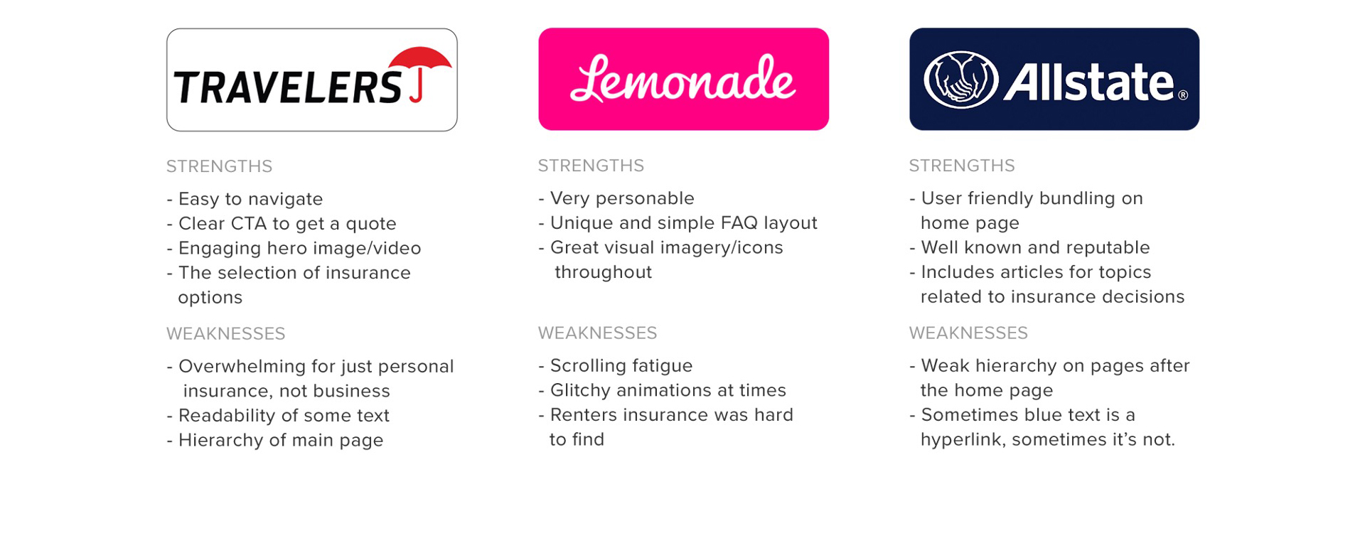
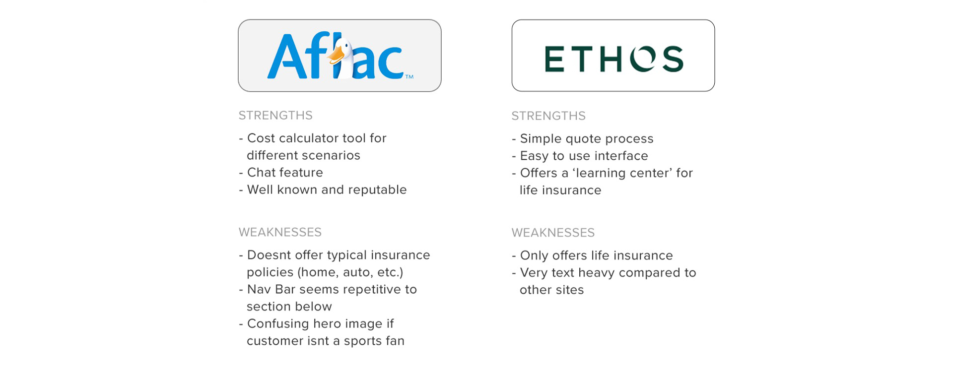
Competitive Analysis
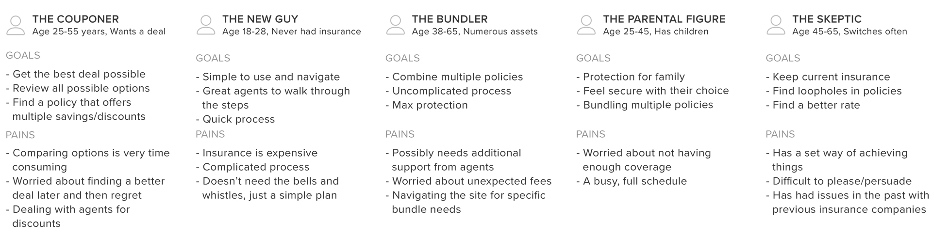
Research was conducted based on Kaus' direct and in-direct competitors. This process provided valuable insight by identifying the companies strengths and weaknesses. The data collected was then used to created several provisional personas.
Direct Competitors
Indirect Competitors
Provisional Personas
Summary of Findings
The insurance industry is predominantly filled with household names (State Farm, Travelers, etc.). However, recently there have been new companies disrupting this market (Lemonade, Ethos, etc.) by appealing to more young and tech savvy clientele. These companies achieve this by:
- Offering robust app-based communications and records for their customers.
- Using AI-powered platforms to lower costs and then passing those savings onto the consumer.
- Removing long wait times and tedious procedures, making it a more enjoyable experience overall.
Who will benefit?
- Millennial and Gen Z
Why will they benefit?
- Have financial barriers
- Increased ability to adapt to new technology
Current Challenges?
- Switching Perspective
The current market mainly uses apps as a secondary feature, and generally rely on people over AI to complete tasks for consumers. Short term there will be some pushback from the larger insurance companies. However, long term most companies will switch their models to include more AI and increased reliance on apps. - Red Tape
The insurance industry is also filled with a variety of regulations and laws at all levels of government: national, state, and local. This affects what is offered to clients based on their location, and removes the “one size fits all” policies.
- The Balancing Act
There are numerous needs within the insurance space: health, pets, life, auto, home and more. Bundling different policies is also fairly common in this space.
EMPATHIZE
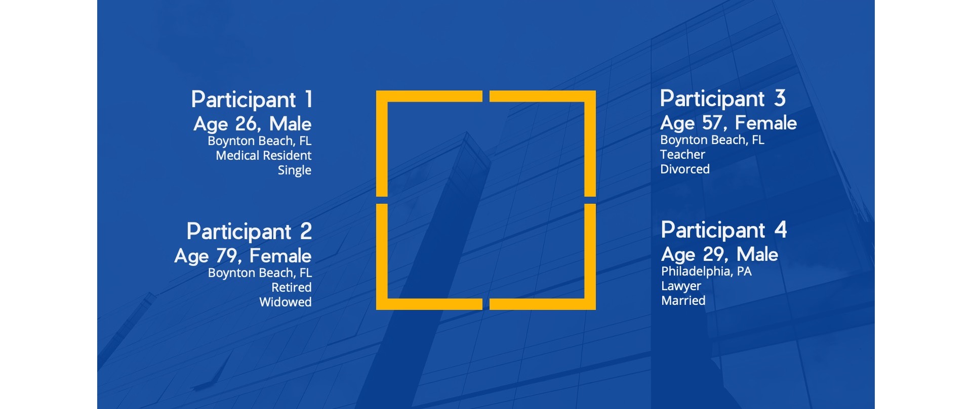
User Interviews
Four individuals from different locations and varying ages were interviewed about their experience with insurance. Patterns involving cost and level of protection, ease of use, and online accessibility of the insurance buying process were apparent in these findings.
Key Findings
- All participants purchased their policies online, and stated their preference was to do things online/in the app
- All participants had, at some point, compared different insurance companies when purchasing
- All participants had multiple policies, with auto and home/renters being the most predominant
- 3 out of 4 participants stated cost and level of protection were the biggest factors when purchasing insurance
- 2 out of 4 participants had bundle insurance policies with ease of use and cost being the main contributors
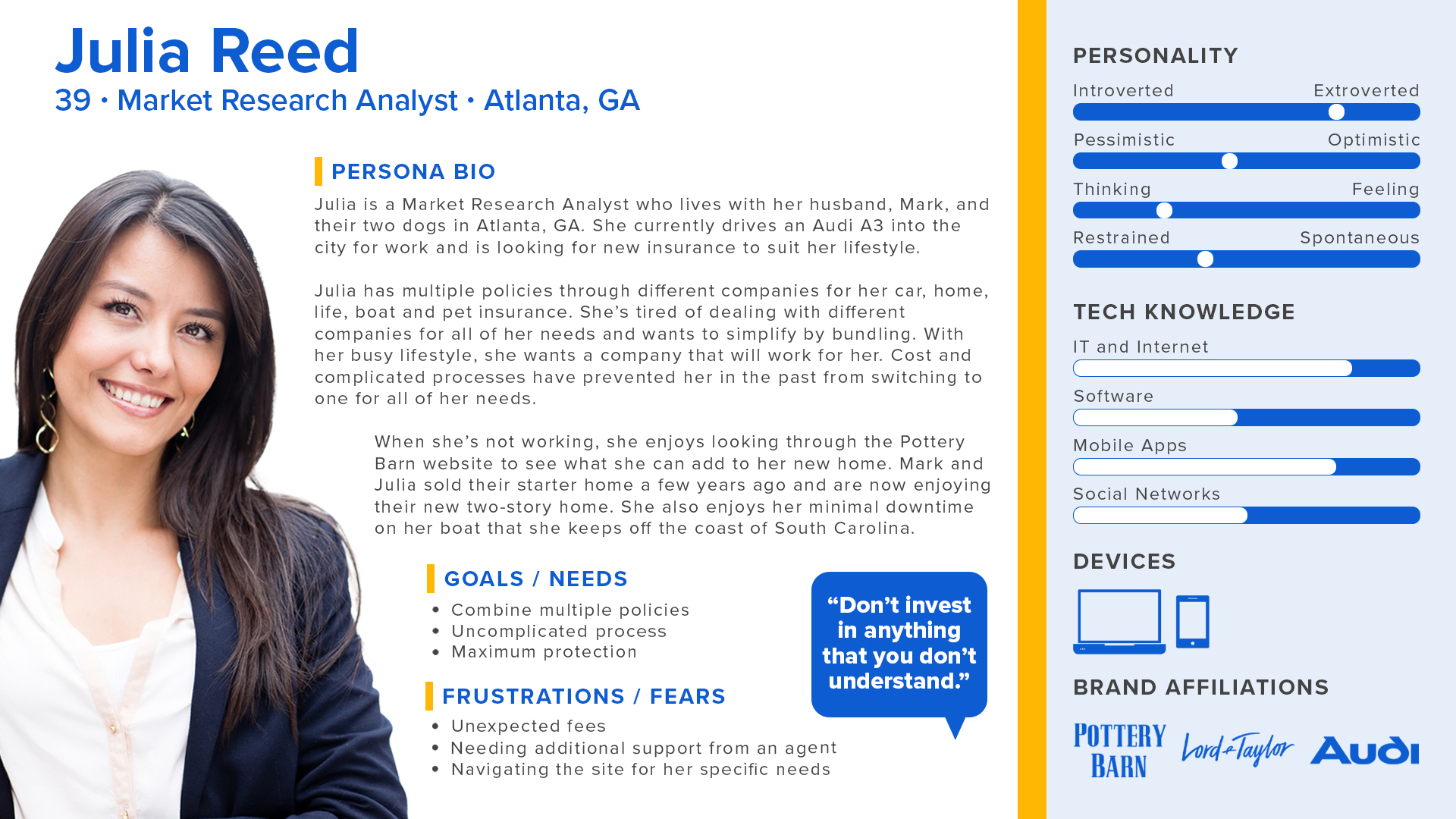
User Persona
With insights gathered, the user persona for Julia was created to identify the target audience’s needs.
CATEGORIZE
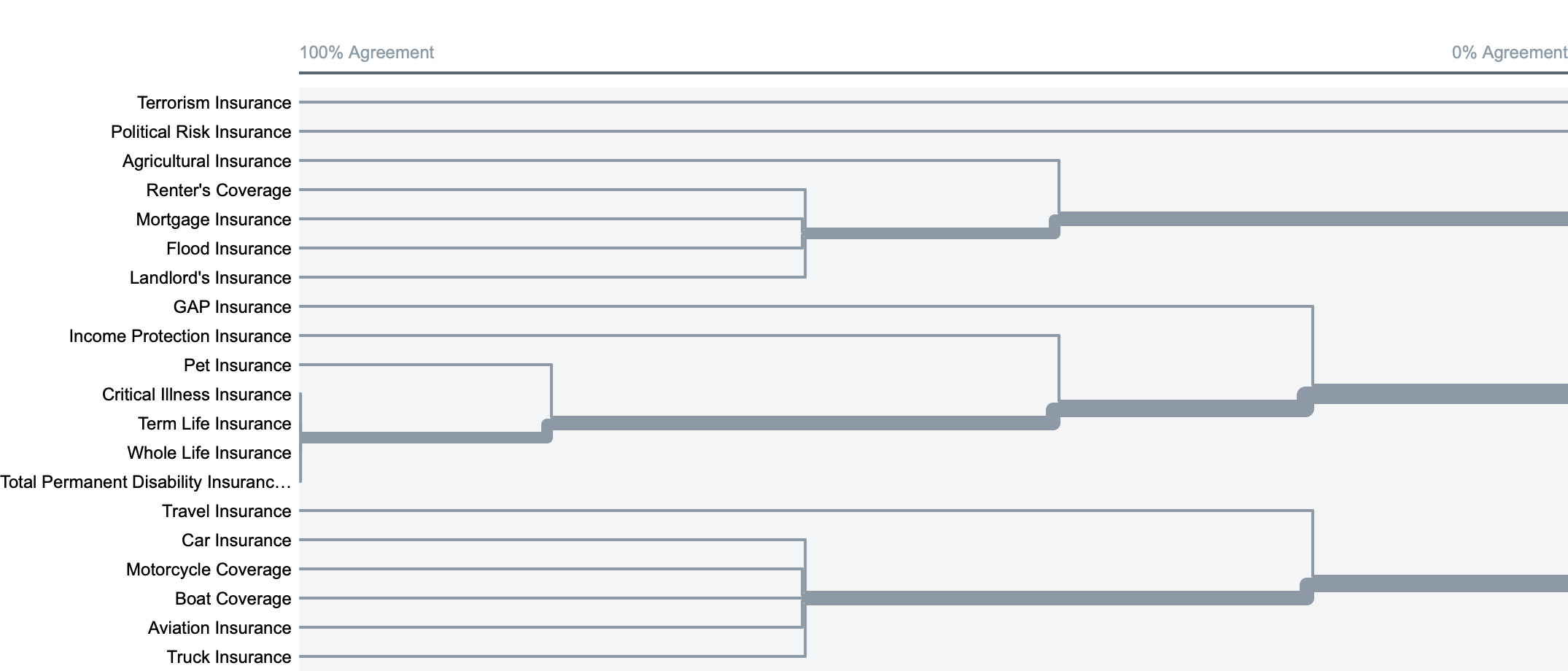
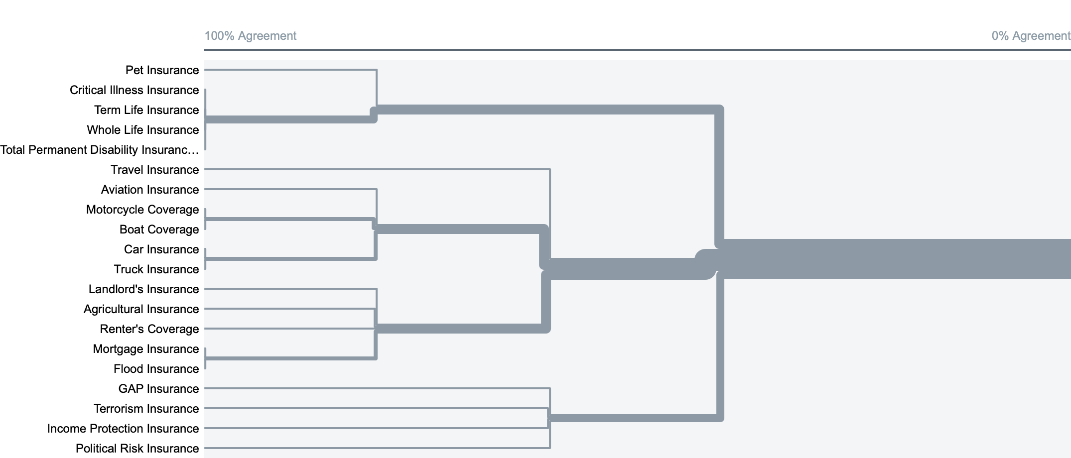
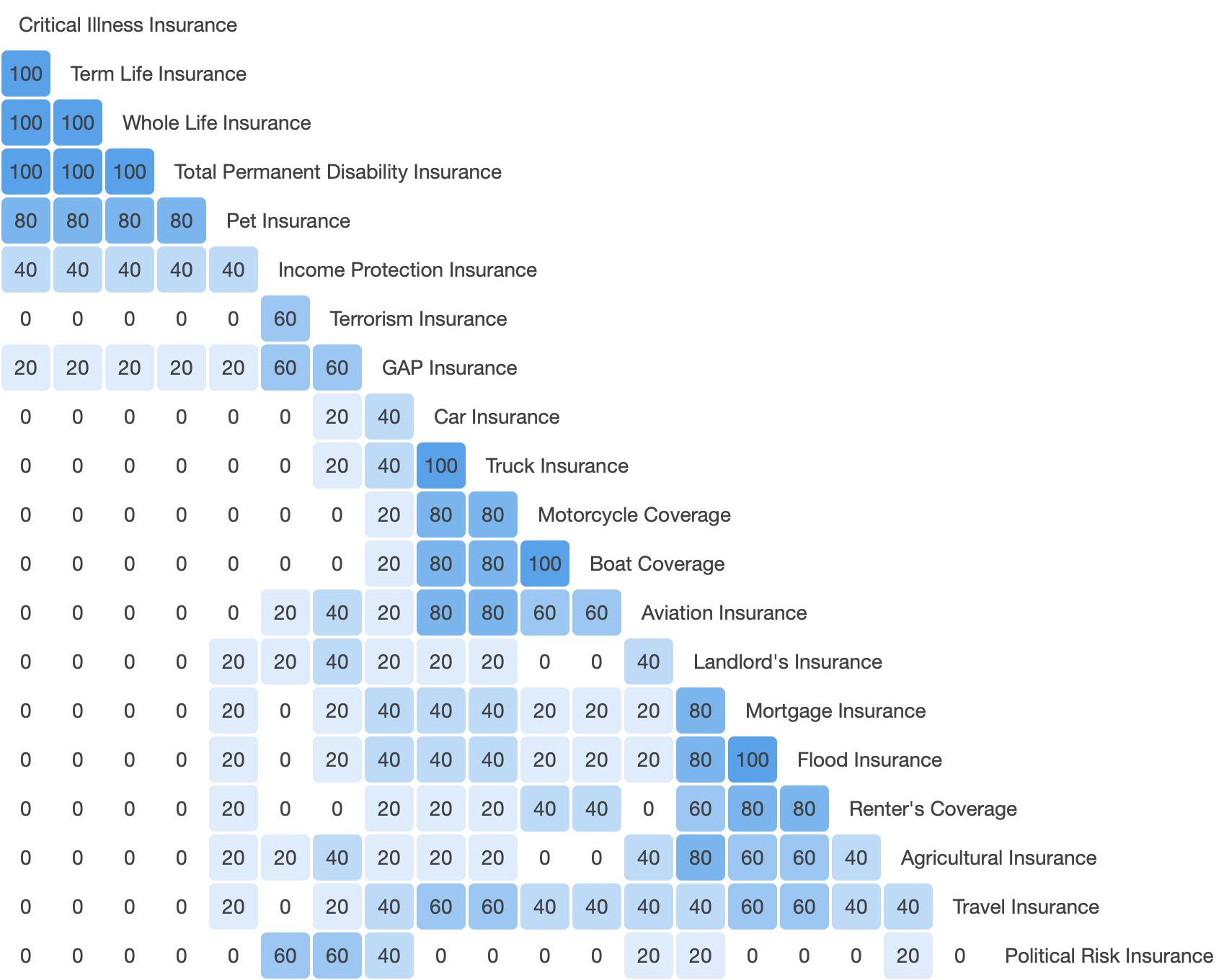
Card Sorting
This study was conducted to discover how users would group/organize insurance related content.
METHOD
Open Card Sort
FORMAT
OptimalSort
PARTICIPANTS
5
LOCATION
Virtual/Online
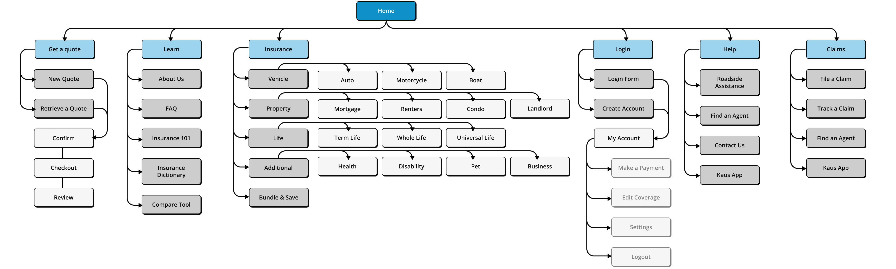
Sitemap
The sitemap is designed with ease of use as the main priority. The open card sort data in tandem with the interview findings were used to determine the navigation and information architecture of the site.

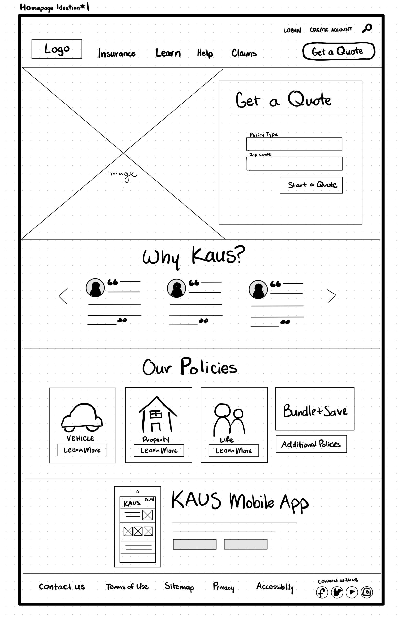
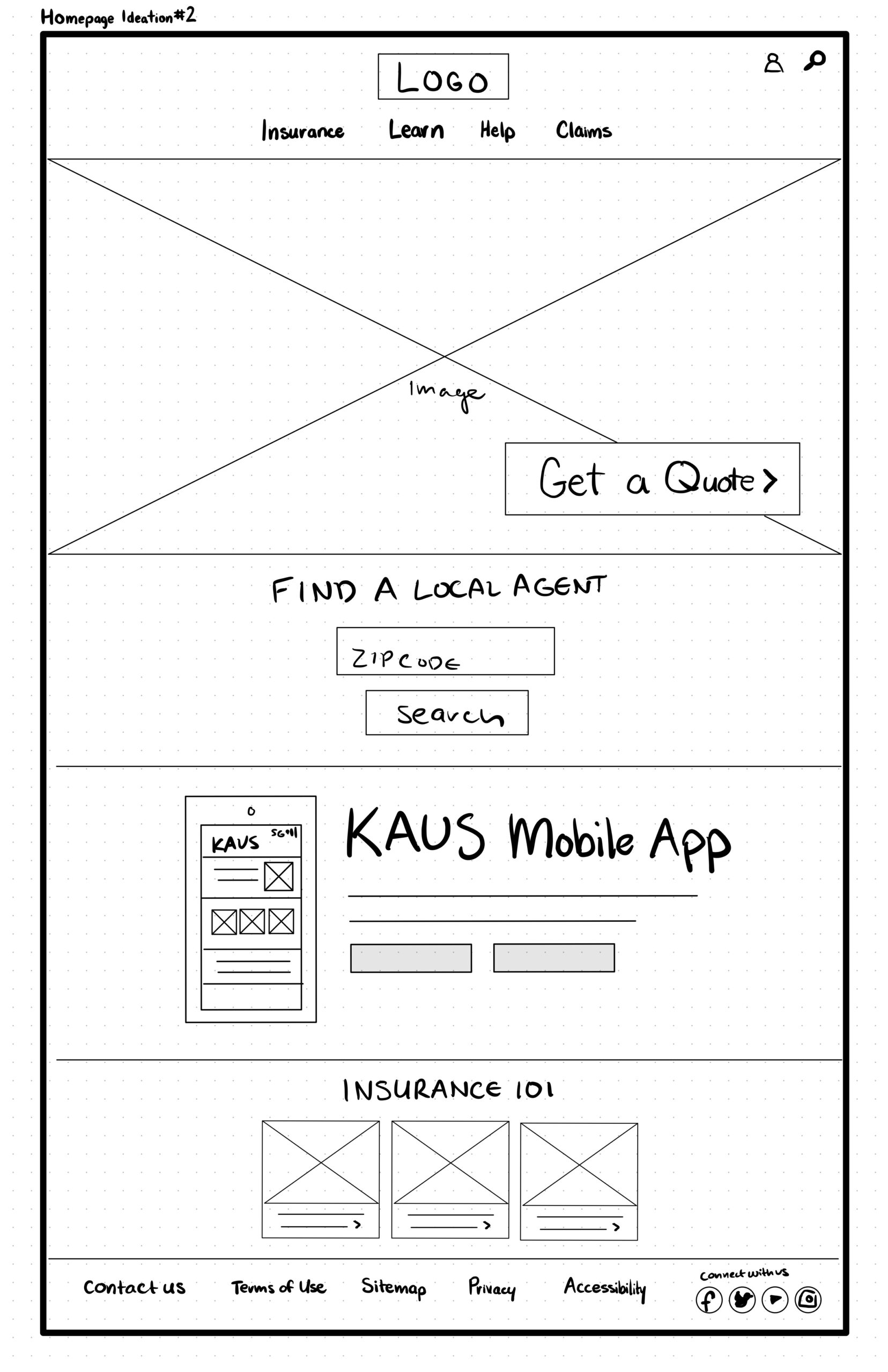
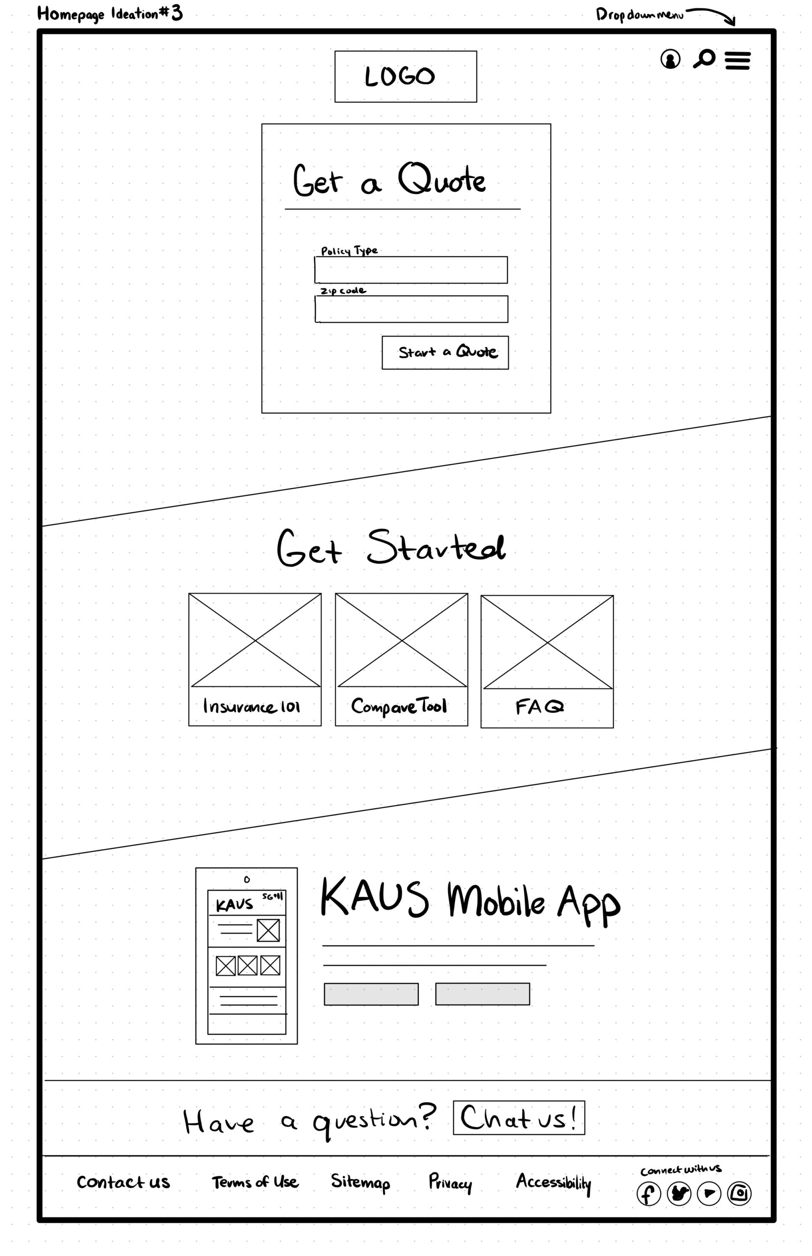
Homepage Sketches
Potential content was ideated and then sorted visually with design drafts. The card sorting and sitemap above assisted in figuring out how users viewed content about insurance information and the best way to present and organize it.
INTERACTION
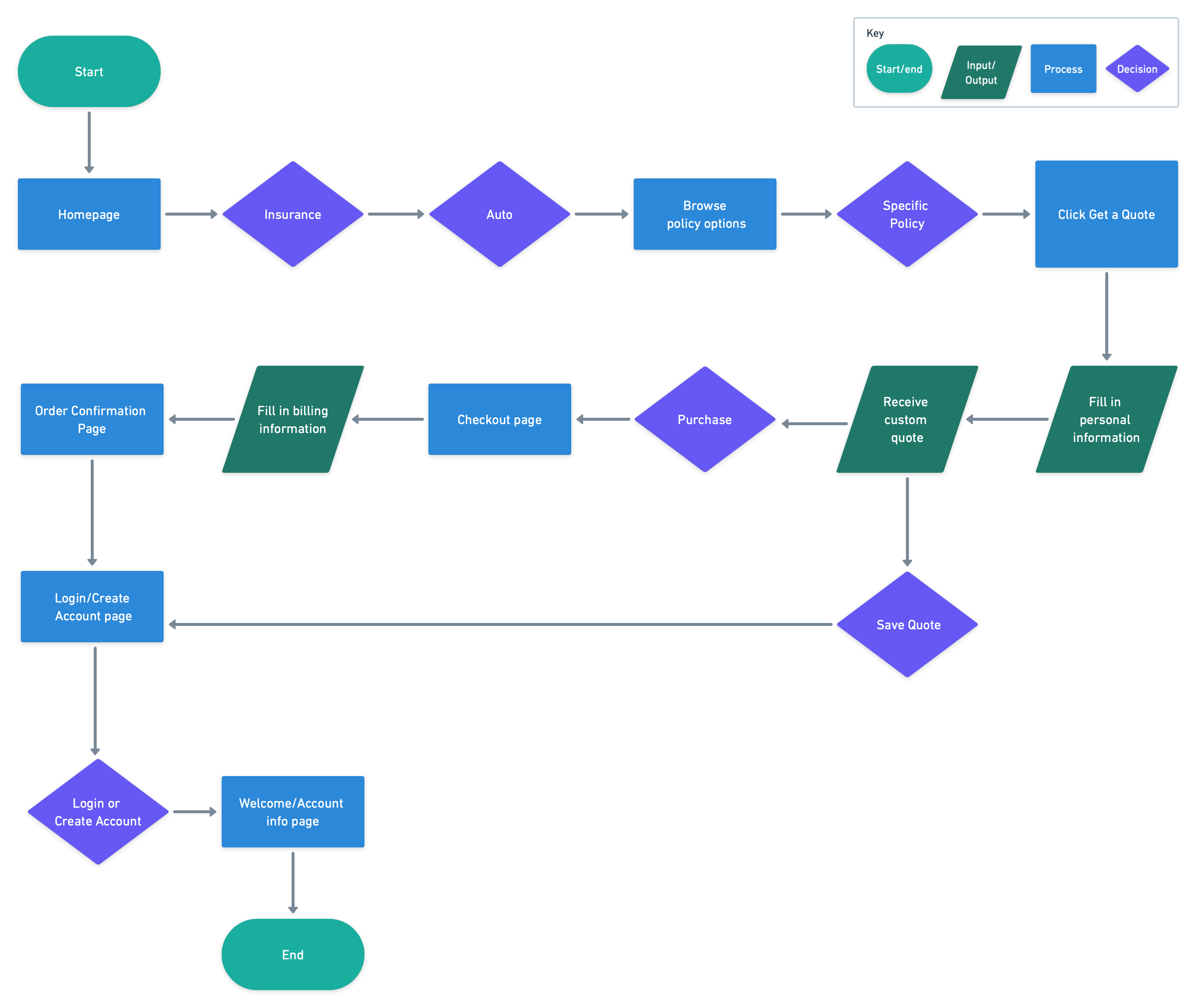
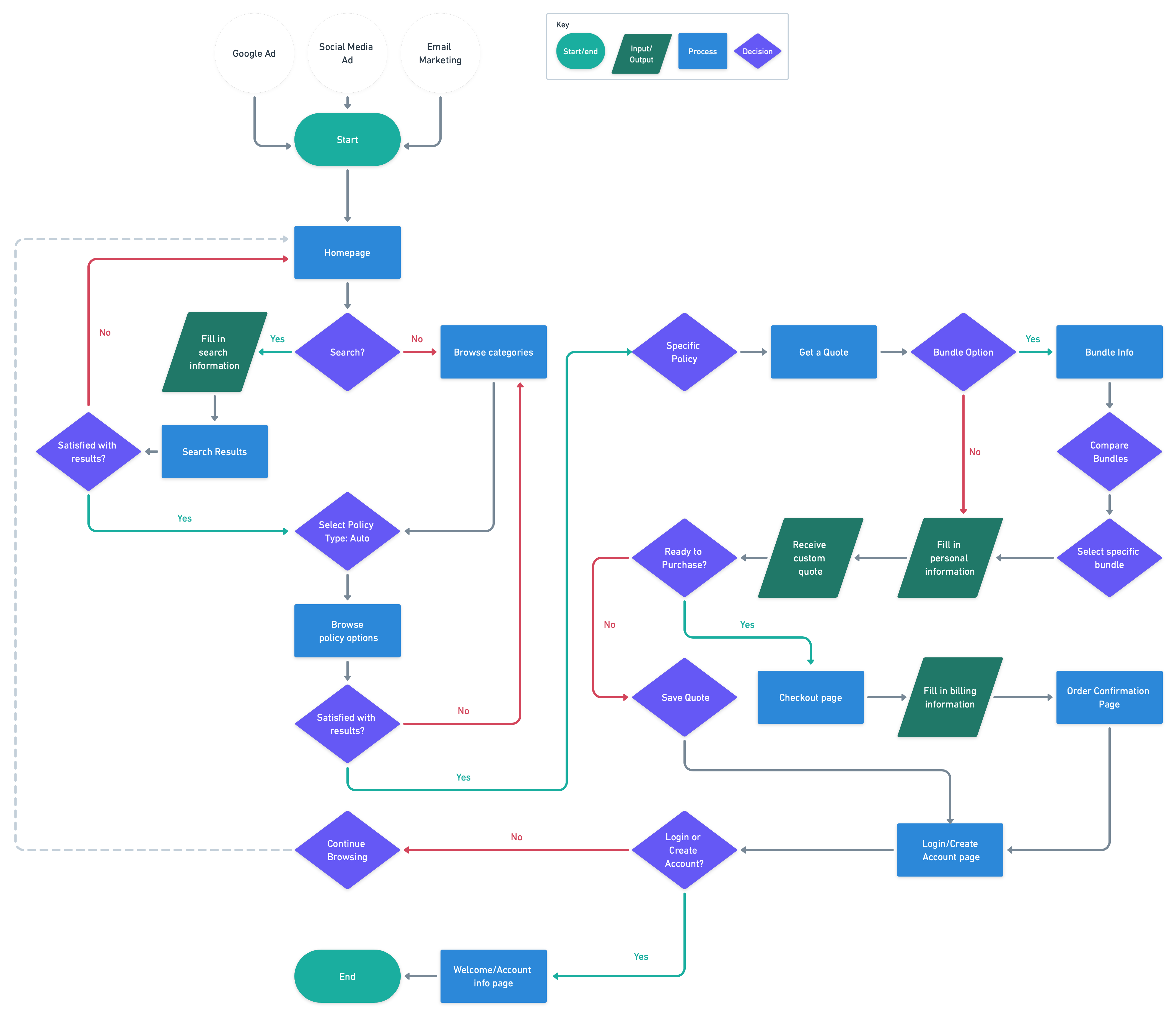
Task + User Flow
To understand the viewpoint of the user, a task flow and user flow were created to visualize the steps taken to complete basic tasks.
Task Flow
User Flow
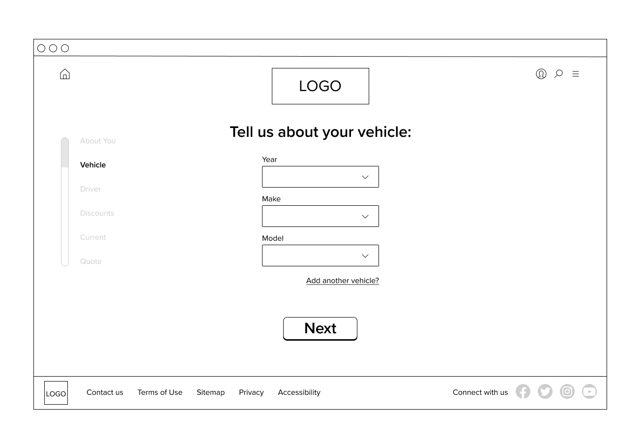
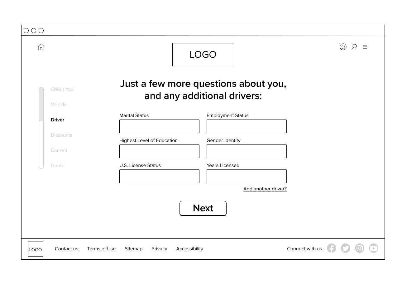
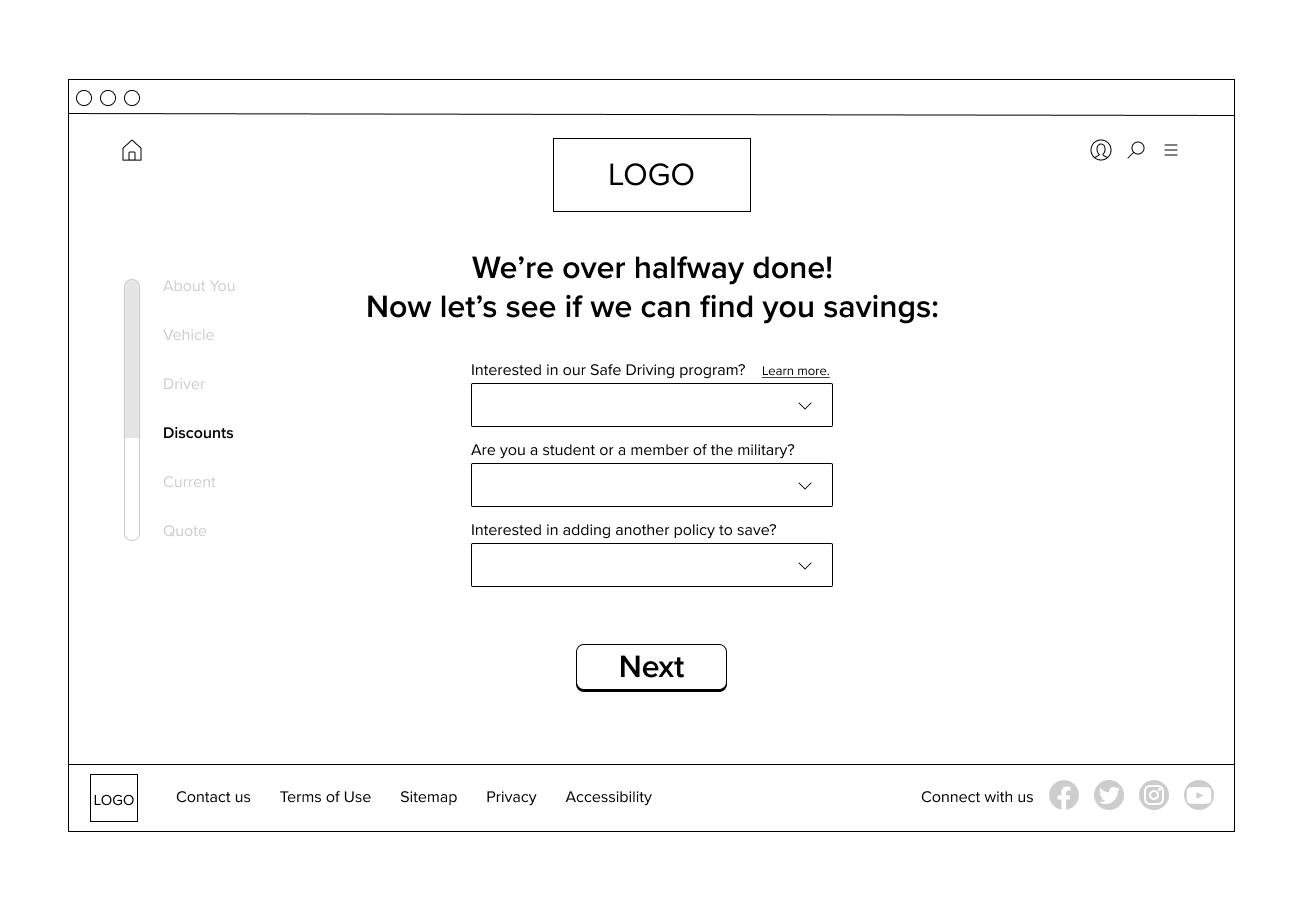
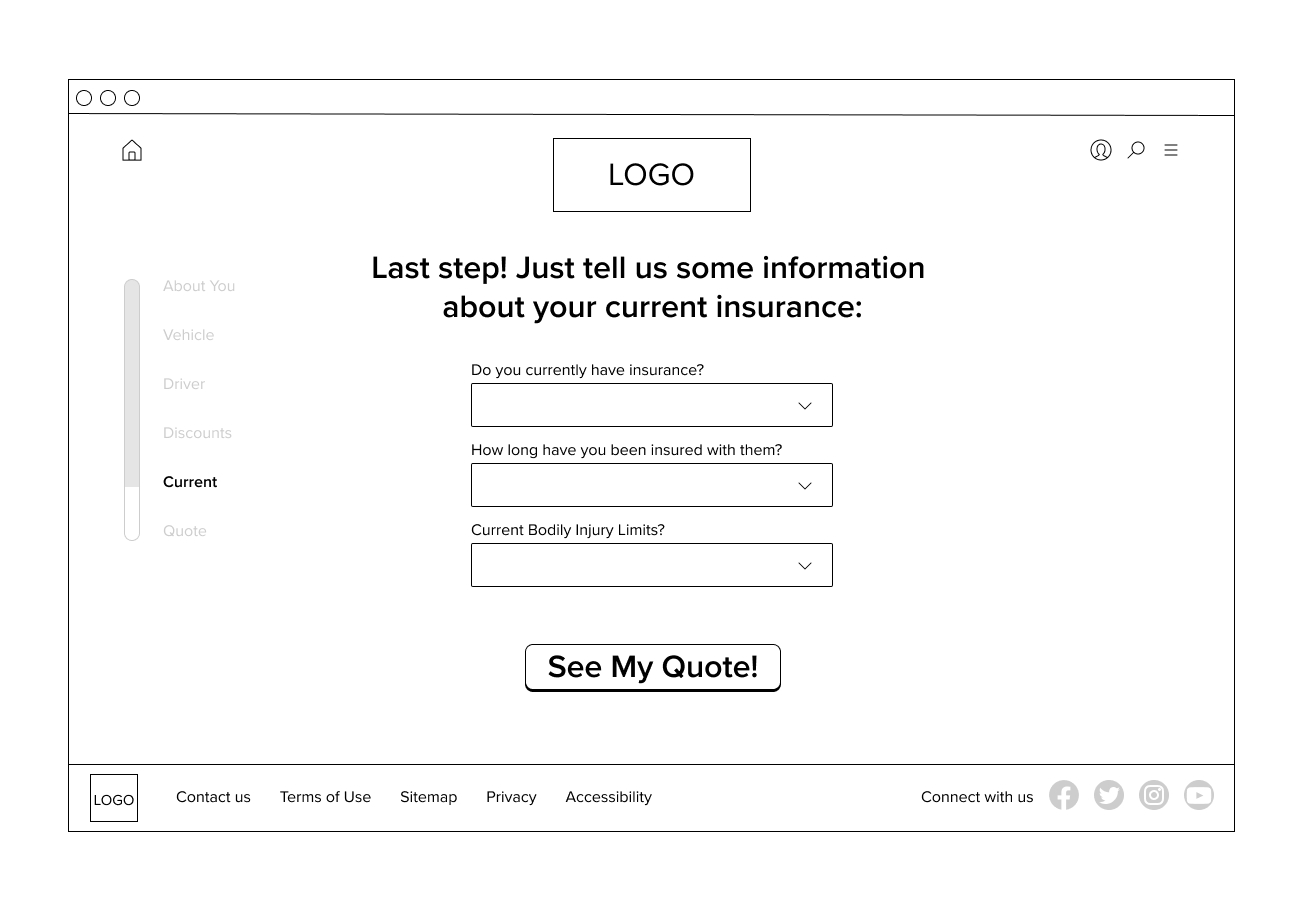
Wireframes
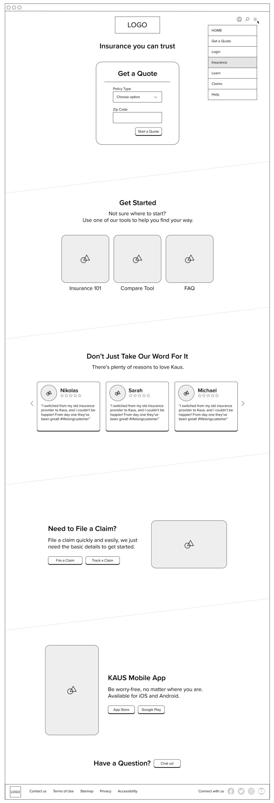
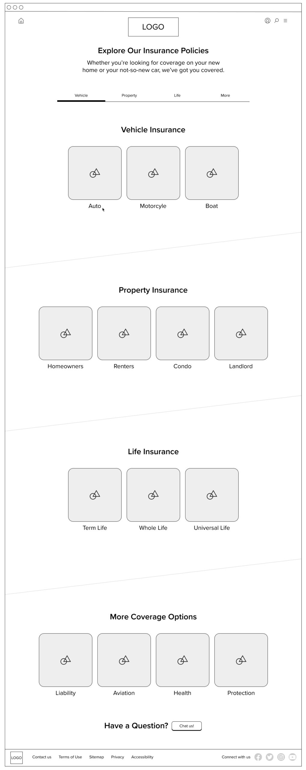
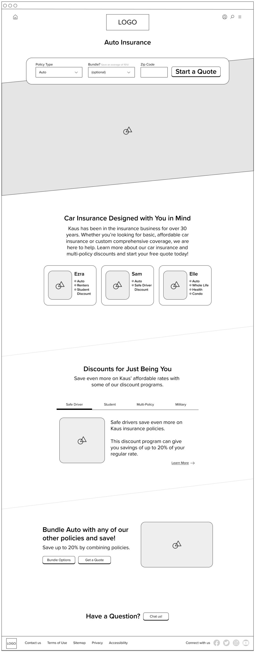
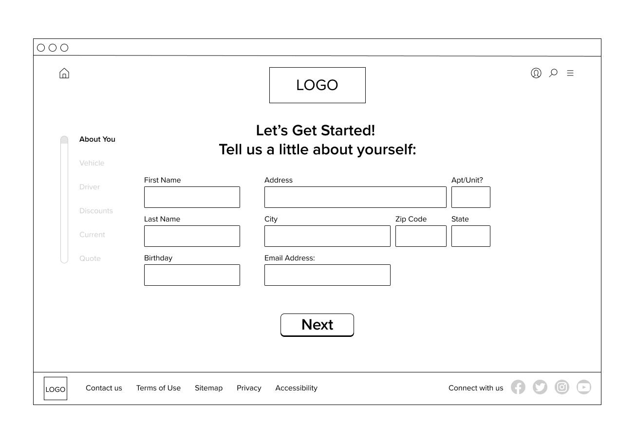
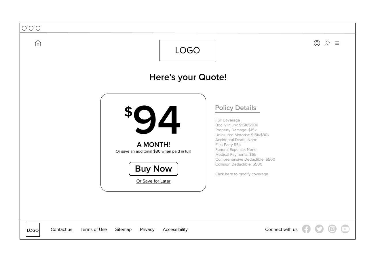
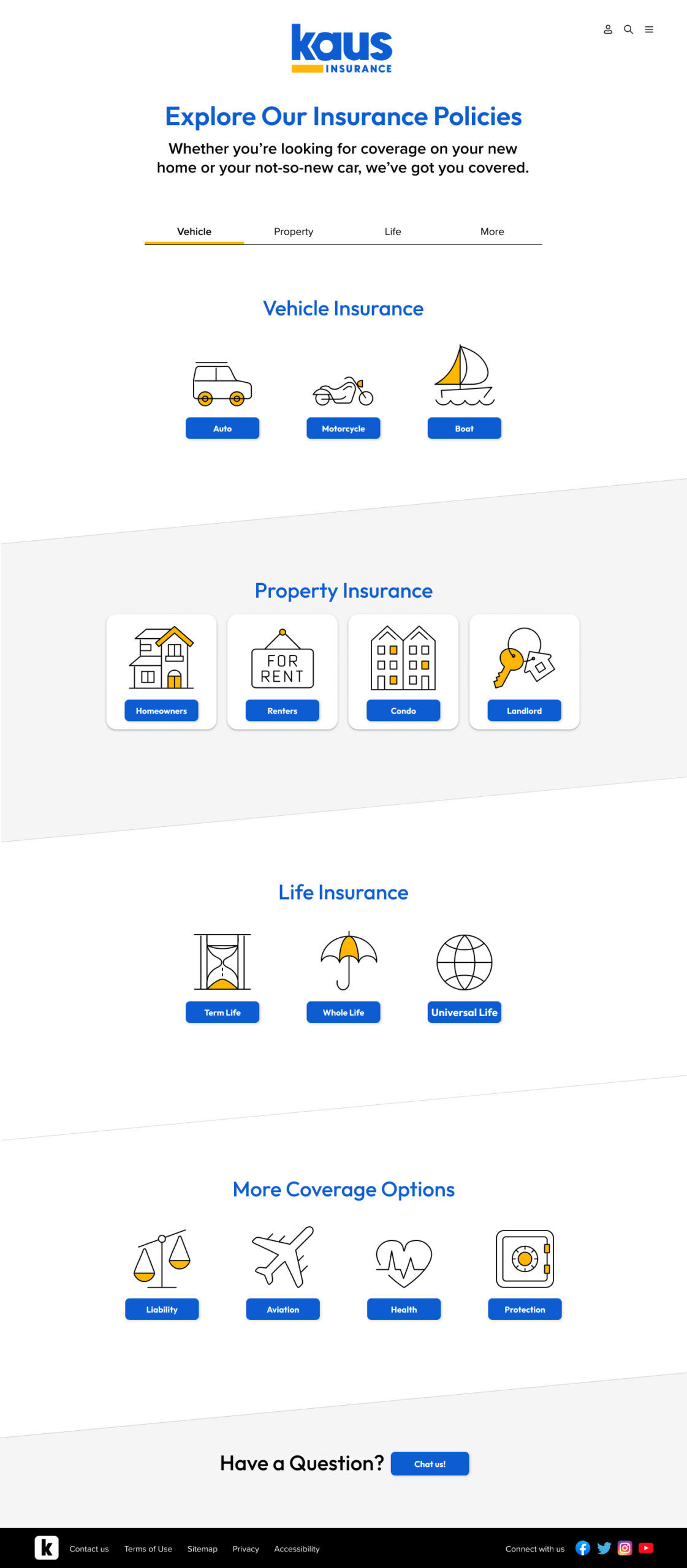
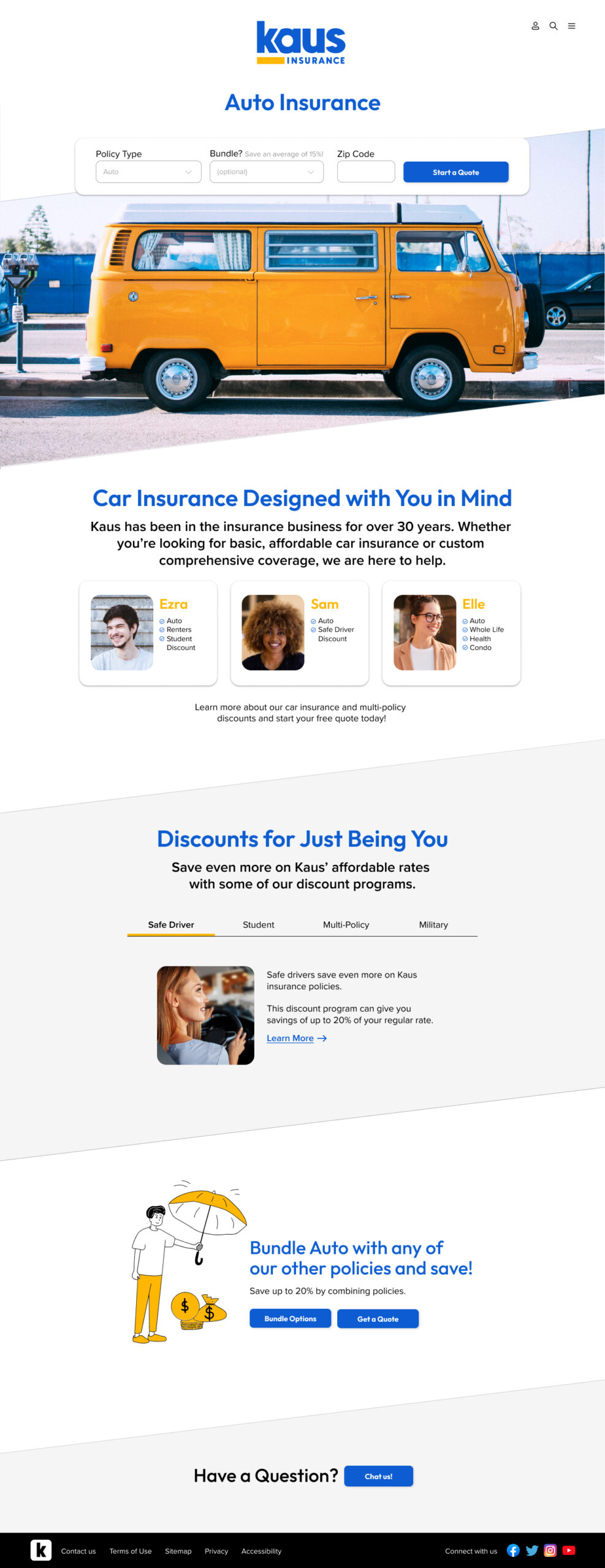
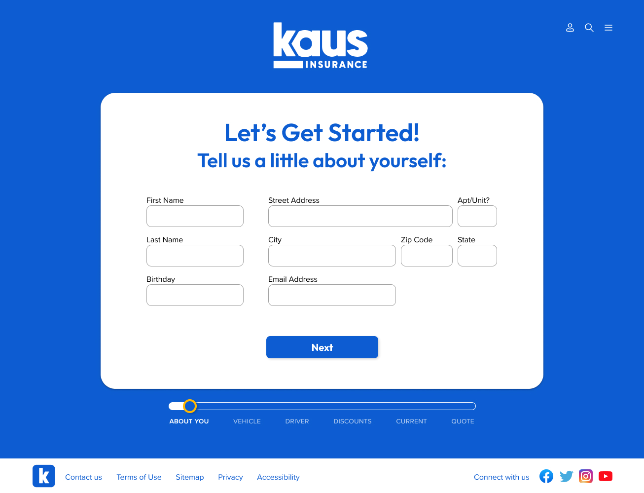
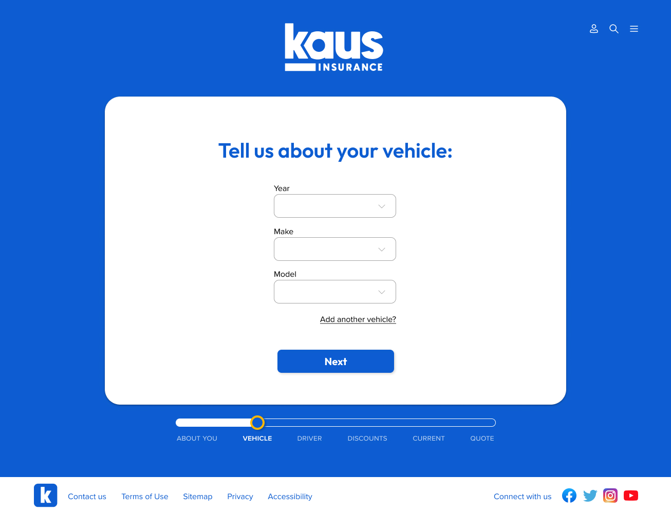
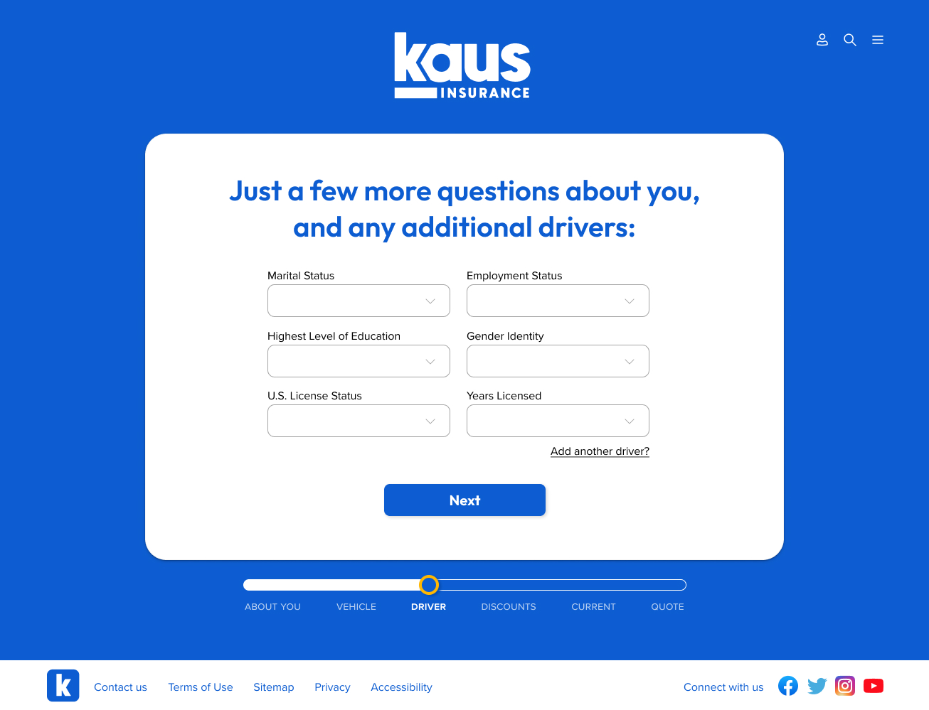
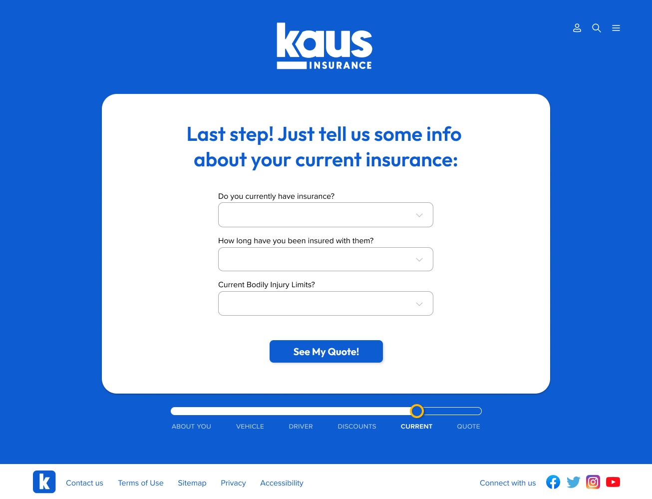
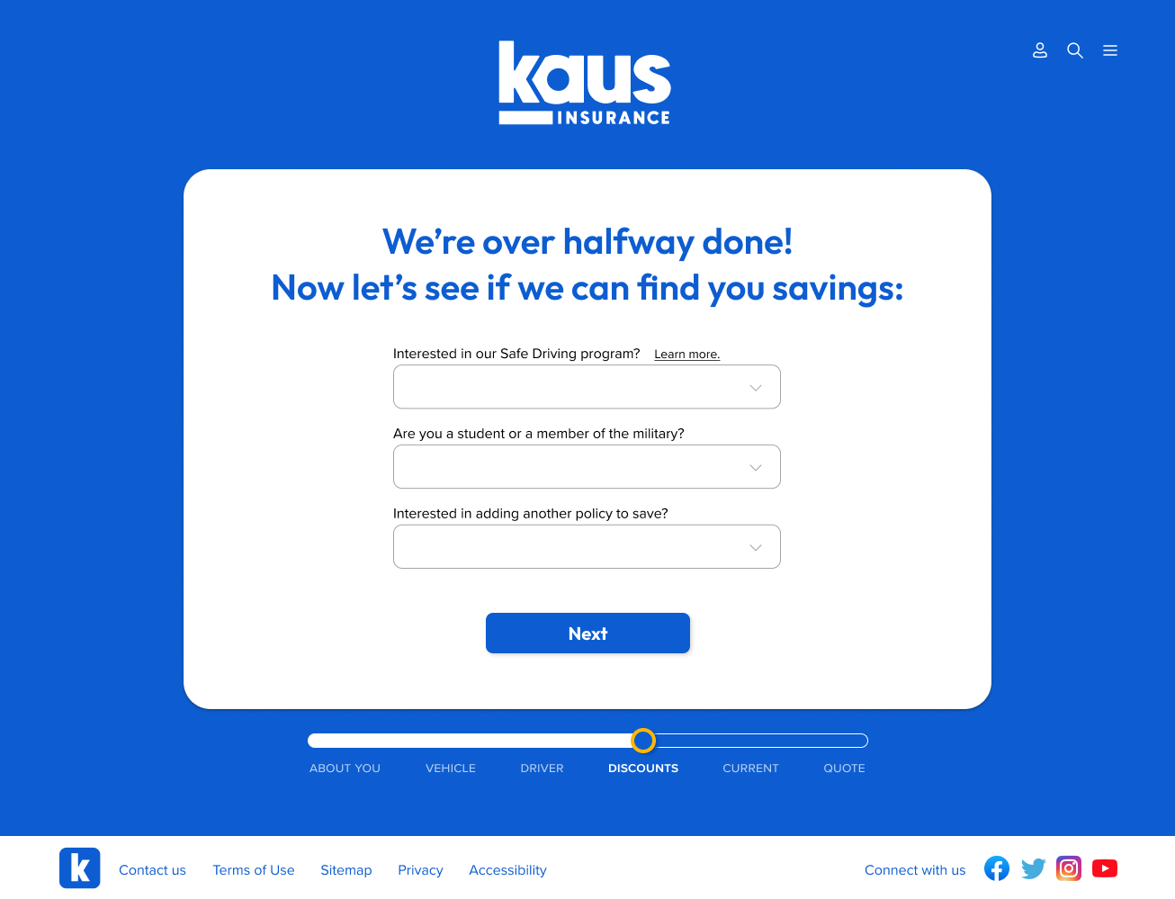
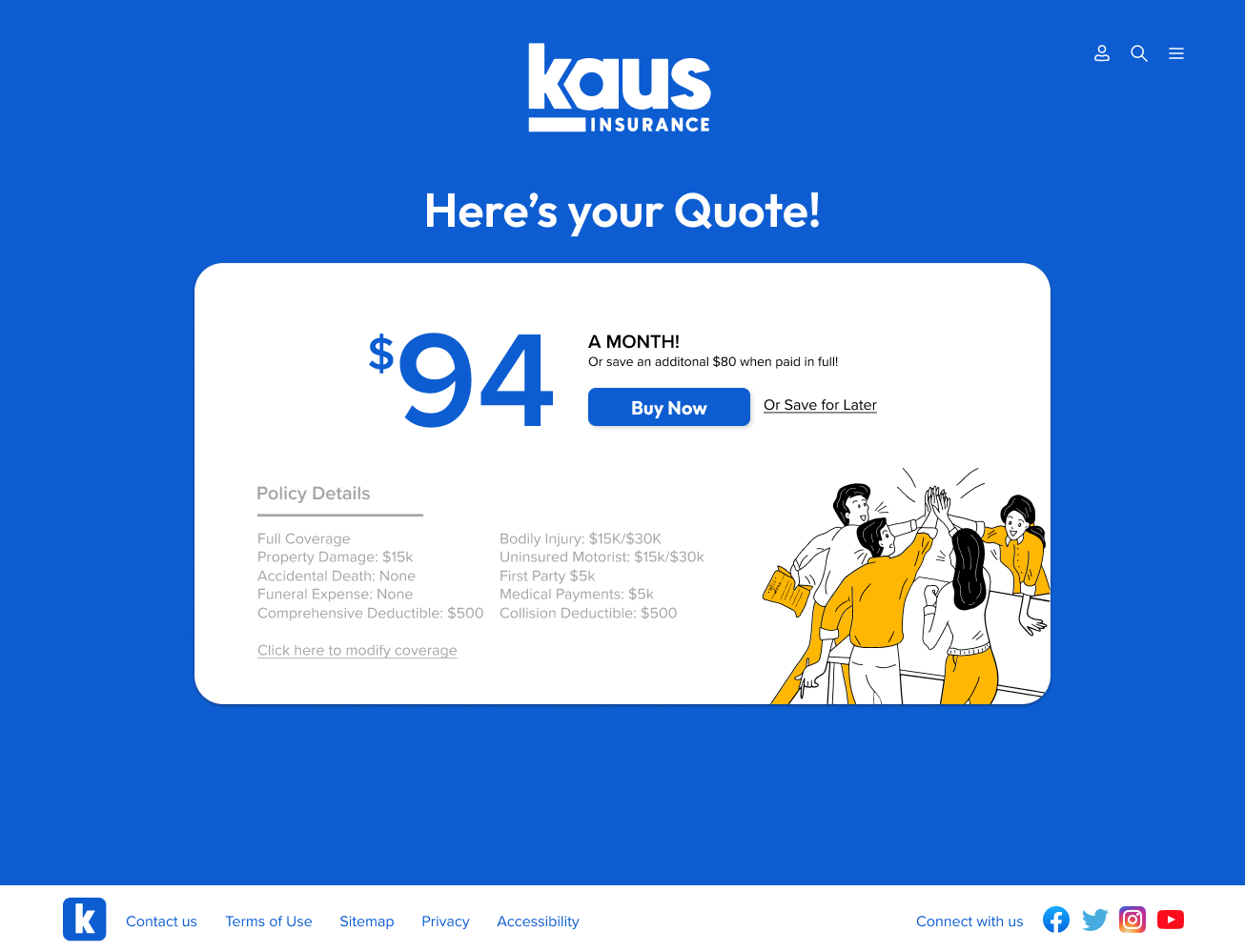
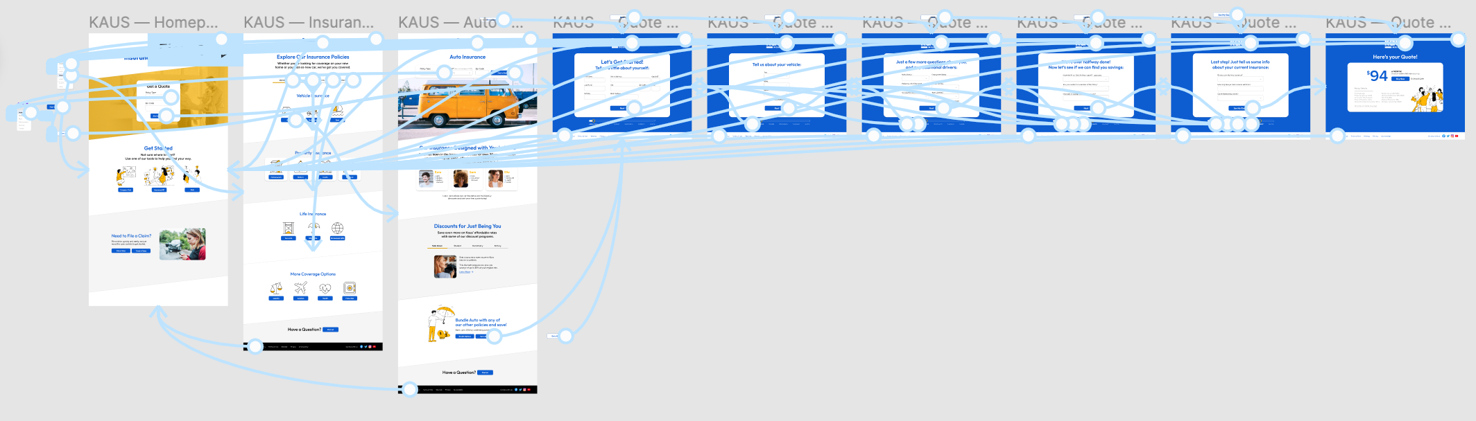
These wireframes show the user's process of exploring coverage options and then obtaining an auto insurance quote.
Flow: Homepage → Insurance → Auto Insurance → Start a Quote → Quote Wizard
Homepage
Insurance
Auto Insurance
Quote Wizard
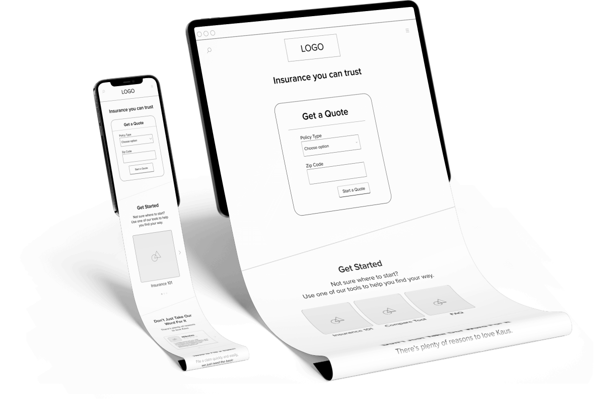
Responsive Wireframes
Responsive versions of the homepage were also created for both mobile and tablet devices.
INTERFACE
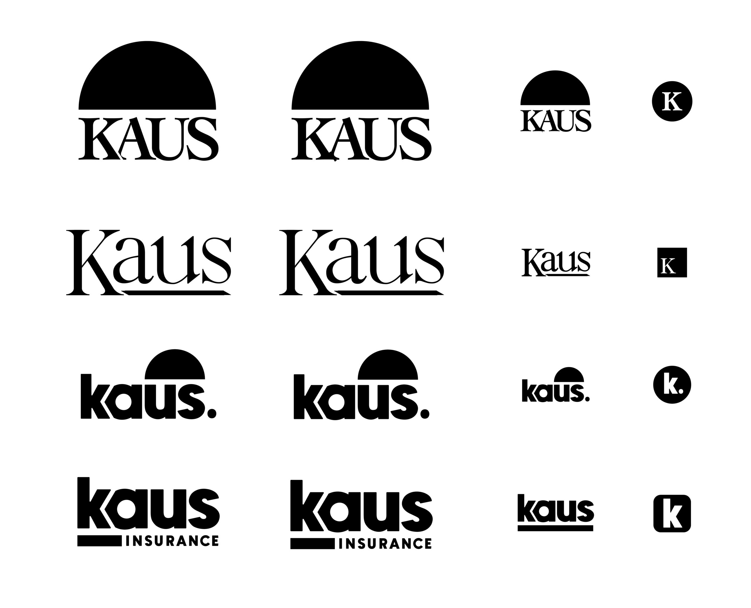
Branding
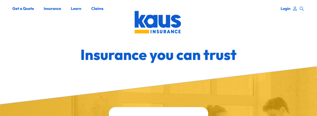
Kaus' brand style is trustworthy, affordable, and safe. The idea behind the new branding style was to incorporate the trustworthiness of Kaus with a more modern and playful appearance.
This was achieved through experimenting with serif and sans serif styles and a few different color palettes. Ultimately the chosen branding was comprised of bright blues and yellows paired with a heavy weighted sans serif font.
Final Branding
Branding Design Concepts


UI Kit
After the branding elements were completed, a UI kit was built to balance the branding and style with user interactions. The UI kit defined the visual aspects of the site by selecting a color palette, fonts, and other design choices. This helped the site feel balanced and unified, aesthetically.
IMPLEMENTATION & ITERATION
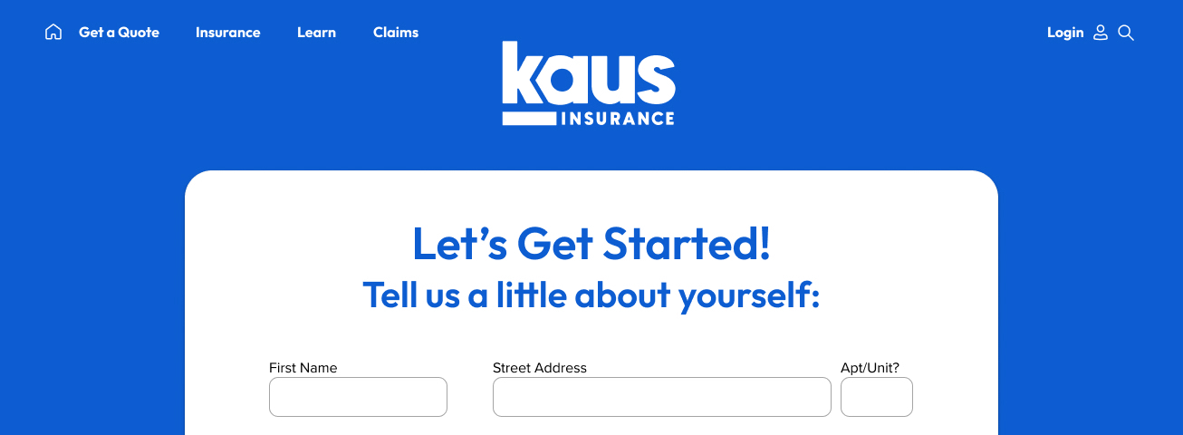
Hi-Fidelity Wireframes
Combined the low fidelity wireframes and the UI Kit elements to create high fidelity wireframes.
Homepage
Insurance
Auto Insurance
Quote Wizard
Prototypes
Using the high fidelity designs, a prototyped version was created to implement usability testing.
USABILITY TESTING
Usability Testing Objectives
- Determine the length of time that it takes a user to follow the task flow of obtaining a quote
- Discover any pain points users have when navigating the site
- See if the navigation bar has any obstacles for users
Methodology: Remote testing (Users share their screen via a Zoom call whilst completing tasks on the site)
Participants: 5
Demographics: Millennials (age 23-40); individuals who have purchased insurance online
Results
The overall feedback on the site from users was positive and said to be easy to navigate. The biggest change that should be made from the data is to reevaluate the navigation bar to be simpler to use. This can be achieved by having the main pages listed at the top, rather than behind a hamburger menu. A few other minor changes were listed as possible improvements as well: having a location to print an insurance card, listing reasons why Kaus is better than their competitors. Lastly, a moderated user testing session could prove to be useful to determine if the misclick rates are accurate to the use of the page, or if the user was simply exploring.
TASK: Learn more about insurance
- This task resulted in a high misclick and drop off rate
- Based on the feedback that was received, and viewing the heat maps, it appears that users may have just been exploring the page
- Majority of users found this information easy to locate
- Most users didn’t list any improvements
- Improvements that were listed:
- Two users noted to list the navigation instead of keeping them within the hamburger menu
- One user noted not being able to hit ‘auto’ on the menu
- Another user noted adding a feature to print their auto insurance card
TASK: Obtain an insurance quote
- This task had a low misclick rate
- However, the results showed that a significant number of users left the expected paths
- However, the results showed that a significant number of users left the expected paths
- All users stated that this information was easy to locate
- Most users didn’t list any improvements
- Improvements that were listed:
- One user noted an improvement, to make the hamburger menu icon larger
PAIN POINTS
- Multiple users referenced expecting to see why this insurance company is better than its competitors
- Based on the tasks, most improvement-based feedback was surrounding the navigation bar layout
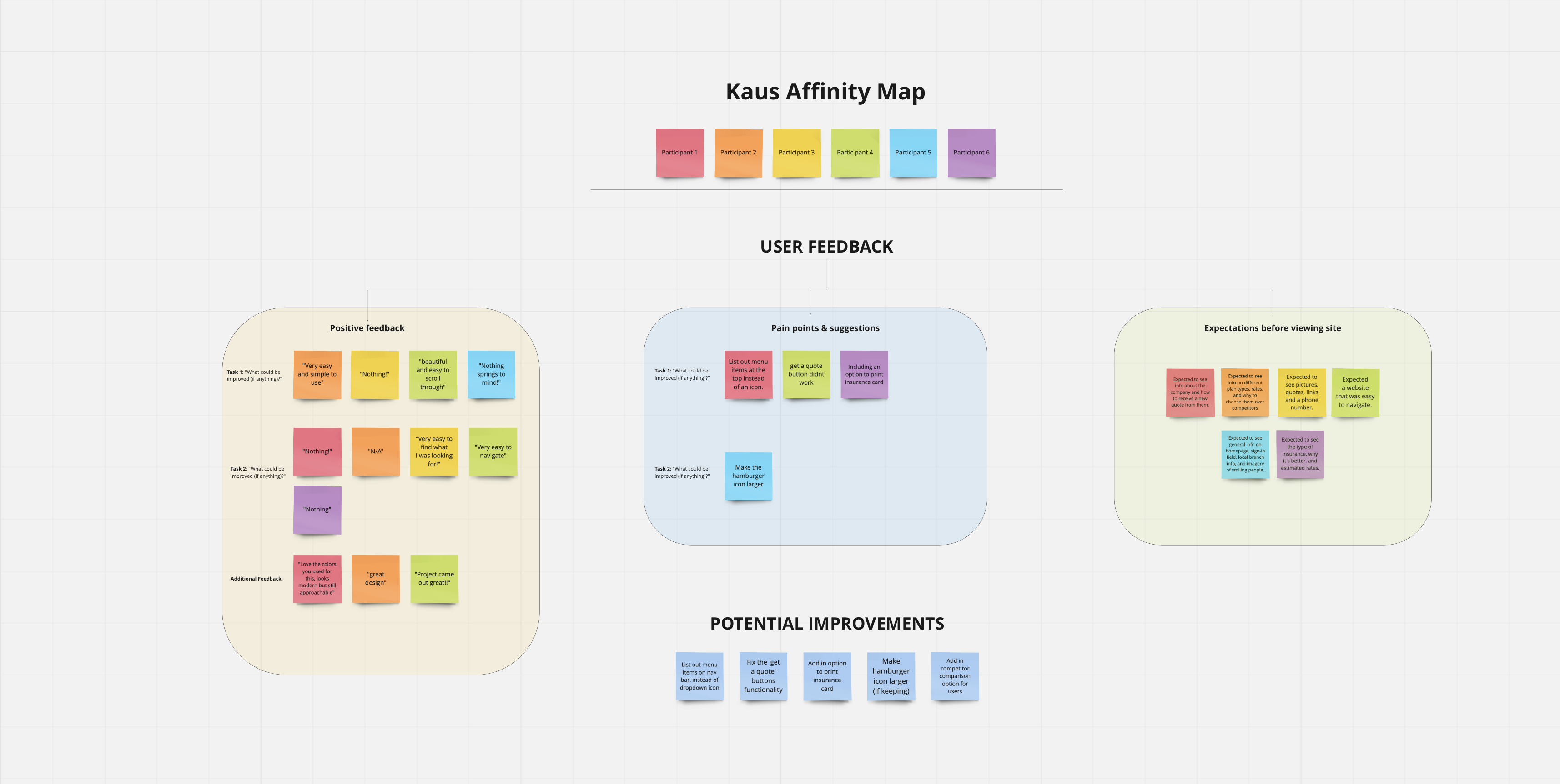
Affinity Map
Based on the information gathered from the participants, an affinity map was created to better understand the successes, pain points and the opportunities to change or learn. Afterwards, the findings were used to make adjustments for the final designs.
Revisions
Revisions to the design were implemented to have the navigation be more in line with the feedback from users.
FINAL THOUGHTS
Future Considerations
Given the option of more time and resources, a few things I would love to explore are:
- Building out additional pages for the site, including: login/account access, claims, and an Insurance 101 page
- Continuing to adjust the protoype, with special consideration to the micro interactions
- Creating responsive tablet and mobile designs for multiple pages based upon feedback
Key Takeaways
From research to implementation, this project has taught me a great deal. Here are my key takeaways:
✋🏻You are not your user
- This was a mantra I continually repeated to myself throughout this process. It is all to easy to include your own opinions and preferences when designing, but the user's wants and needs need to be the priority.
⭐️ Understanding when to move on is crucial
- As a designer, it is tempting to fall into the rabbithole of iterating with the goal of perfection. In practice, however, there may be occasions when it simply needs to be sufficient for the time being. I'm working on improving my ability to tell when it's time to move on.
SELECTED WORKS
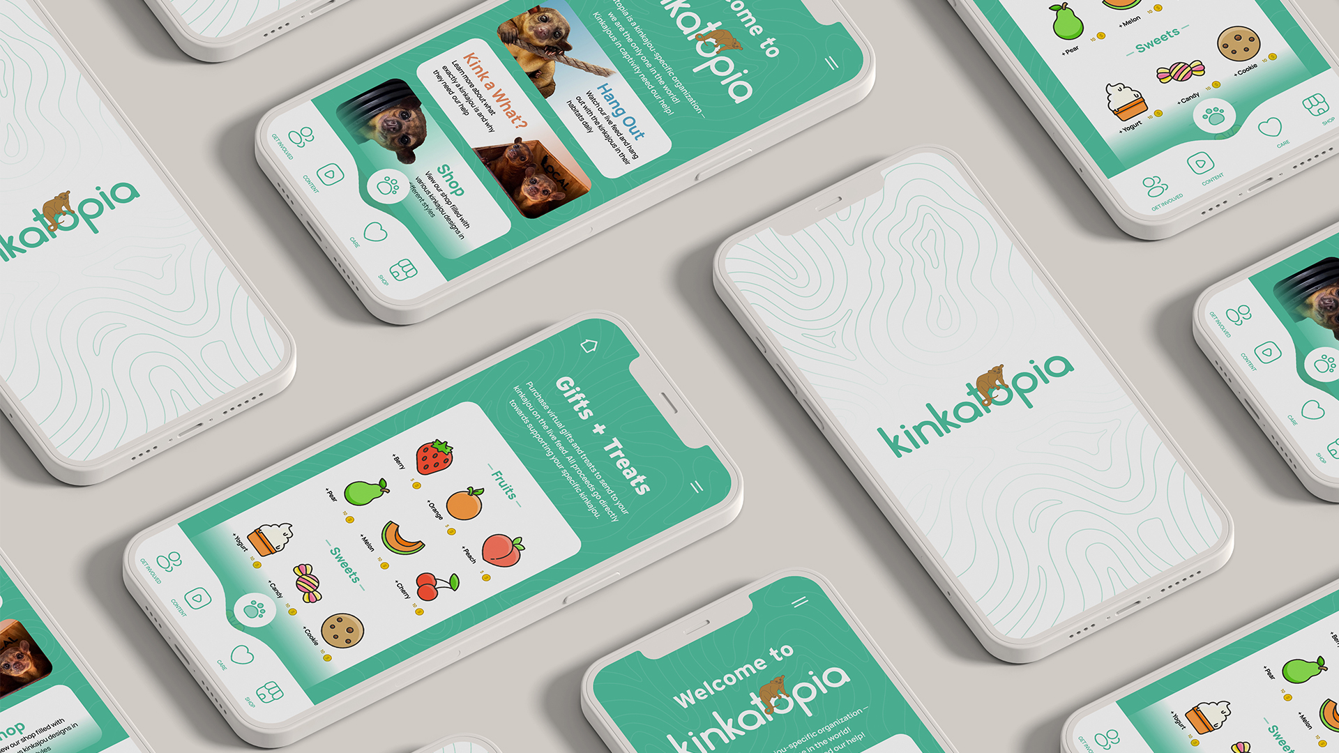
KinkatopiaProduct Design
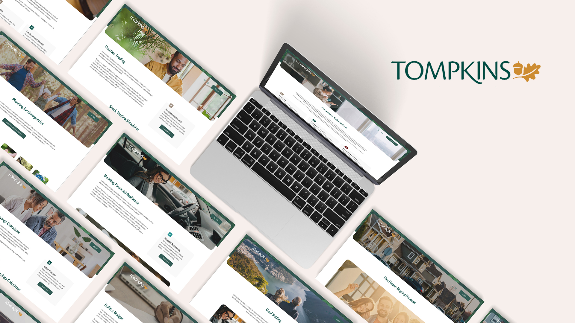
Tompkins BankProduct Design
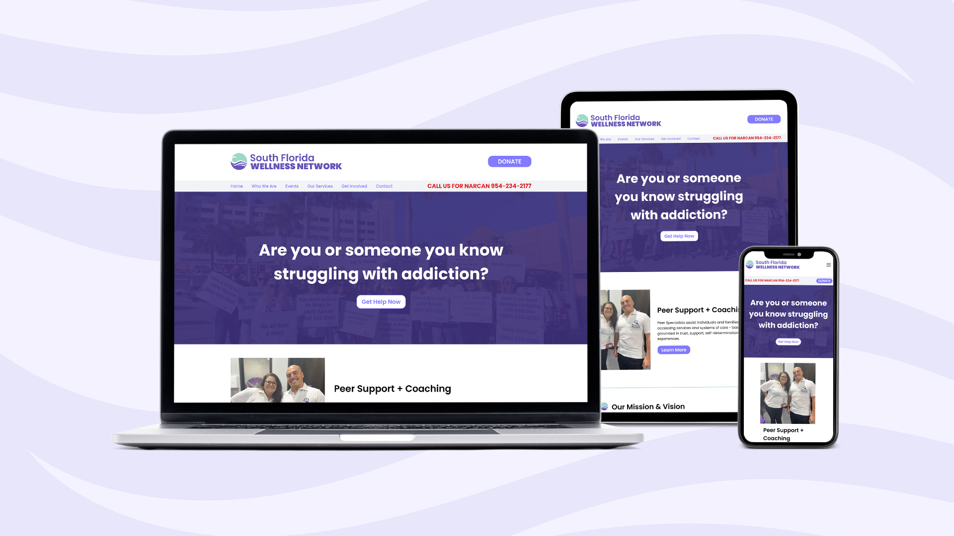
South Florida Wellness NetworkProduct Design
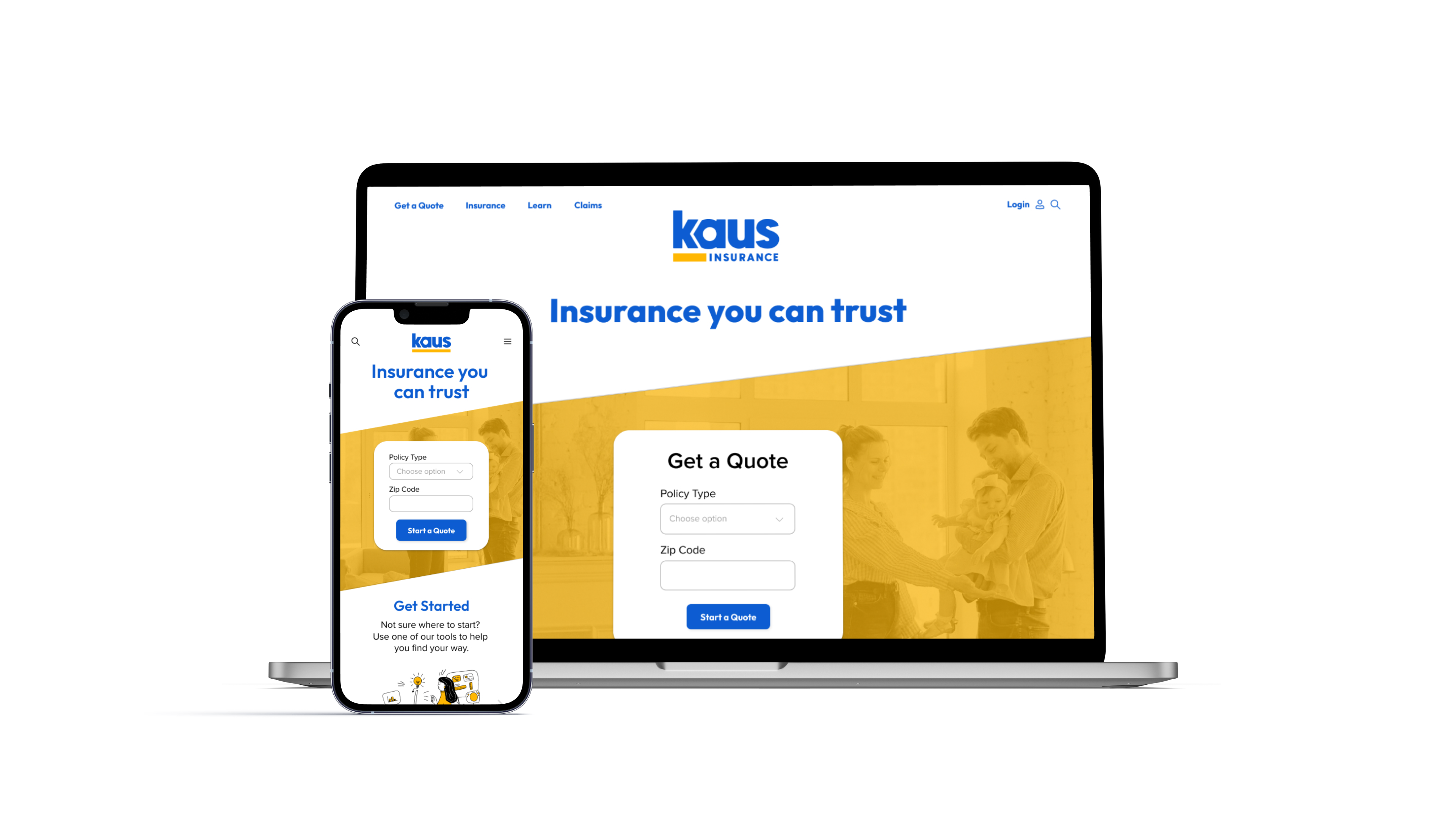
Kaus InsuranceProduct Design

Prosperity ResearchGraphic Design
ARK Resilience AwardsGraphic Design
Total Wealth SymposiumGraphic Design
Profits UnlimitedGraphic Design