ROLE
Product Designer
Branding
User Research
Interaction/Visual design
Prototyping & Testing
TOOLS
Figma
Maze
Optimal Workshop
Whimsical
PLATFORMS
Desktop
Tablet
Mobile
TIMELINE
4 weeks
(20 hours/week)
OVERVIEW
Who is South Florida Wellness Network?
South Florida Wellness Network is a Recovery Community Organization (RCO) committed to promoting holistic wellness to individuals and families. They provide wellness driven recreational activities, education, and trainings. Their peer specialists help to provide linkage, information, and education about community resources.
They also provide educational trainings in Leadership, Whole Health Action Management, Wellness Recovery Action Planning, Family Road Map, Motivational Interviewing, Mental Health First Aid.
Problem
South Florida Wellness Network’s current website could benefit from an updated interface design and information architecture restructure. They are doing great work for the community and deserve a site that not only reflects their work but will also contribute to their ongoing success.
Goal
Understand the user's needs and pain points when donating to a recovery-based nonprofit to better position South Florida Wellness Network's online presence and increase traffic to the site.
DISCOVER
Research Objectives
- Identify motives behind the user’s decision-making, specifically regarding donations
- Identify and analyze current pain points within the online donation process
- Discover if those motives change when specifically talking about recovery-based non-profits
- Research what other successful non-profits are doing and see how it can be applied to South Florida Wellness Network
Competitive Analysis
Research was conducted based on successful non-profits that are geographically close to South Florida Wellness Network. The majority were located in South Florida, but all were within the state of Florida.
Direct Competitors
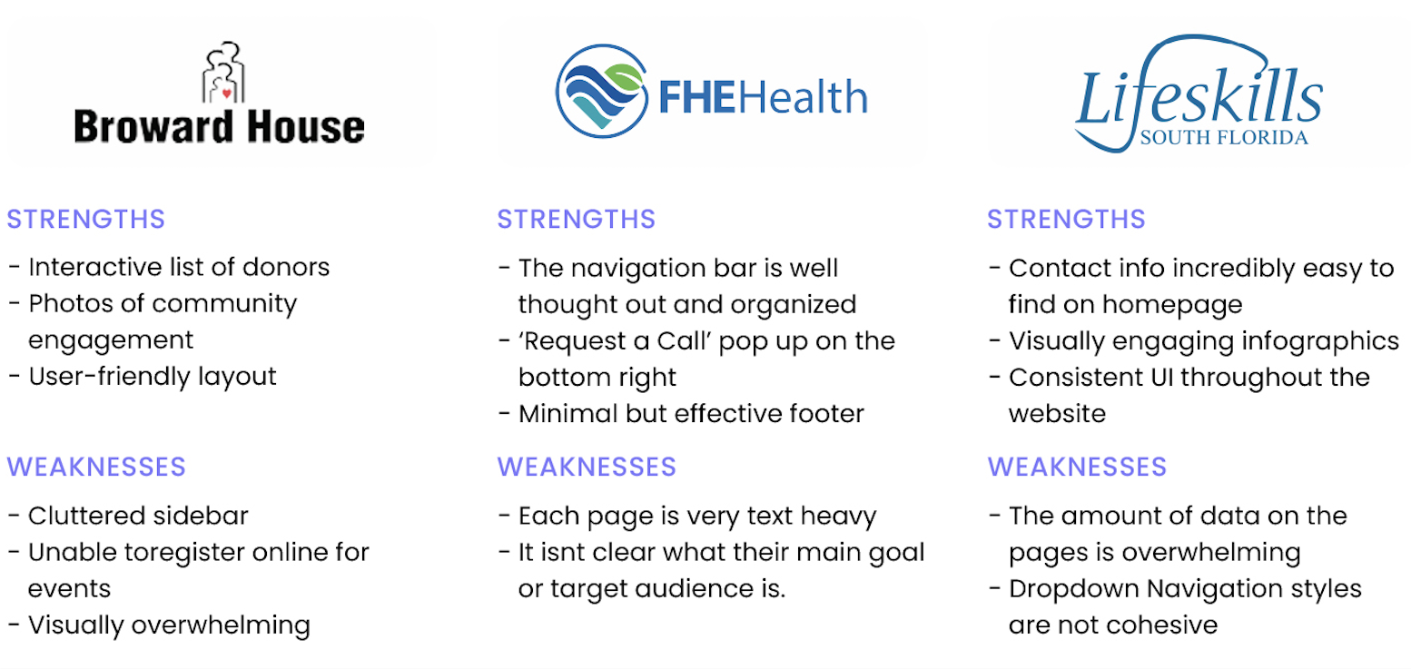
Indirect Competitors
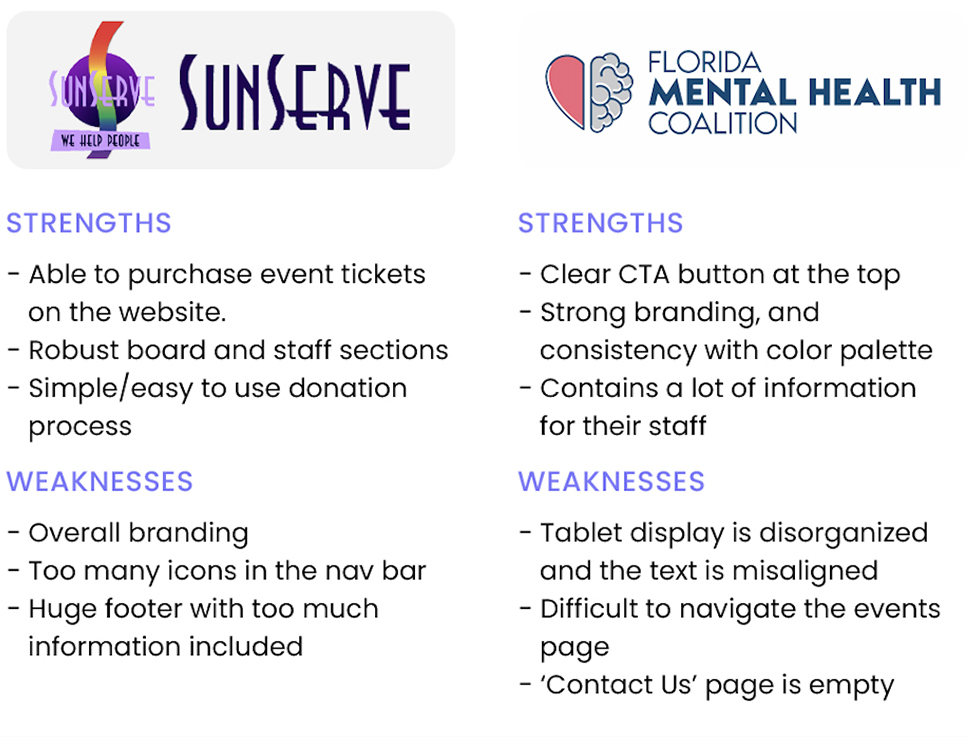
Summary of Findings
The majority of the organizations I compared contained a few commonalities:
- Having a clear call to action (CTA) within their navigation bar.
- Visually showcasing real people who have benefited through their services.
- Having an organized structure for the information throughout the site.
Bringing these components to the redesign for South Florida Wellness Network will enhance their site dramatically. One factor that I discovered within these sites, is that they all try to focus on a single goal, instead of multiple being at the forefront. This could be seeking donations, providing care, events, etc. Based on my findings, South Florida Wellness Network would benefit by focusing on seeking donations and/or events.
EMPATHIZE
User Interviews
For this set of interviews, I interviewed five participants all located in Pennsylvania, but with other varying demographics.
When selecting individuals for my research, to be included they needed to fit within one or more of these groups:
(1) Individuals in any stage of recovery,
(2) Family members of individuals in any stage of recovery,
(3) Individuals who have donated within the last 12 months to a non-profit organization, and/or
(4) Individuals working in the mental health field.
Key Findings
- 4 out of 5 participants stated that transparency of the NPO’s finances was a key factor in their decision of whether to donate
- 4 out of 5 participants stated that the ability to reserve meetings/courses online, instead of over the phone or in-person, was preferred
All participants were either actively involved with an NPO or had donated to one within the last 12 months
All participants preferred to send donations via an online checkout process
All participants had close family members or friends that were in recovery and had at some point sought out recovery-related services for someone
4 out of 5 participants identified as someone who is in recovery
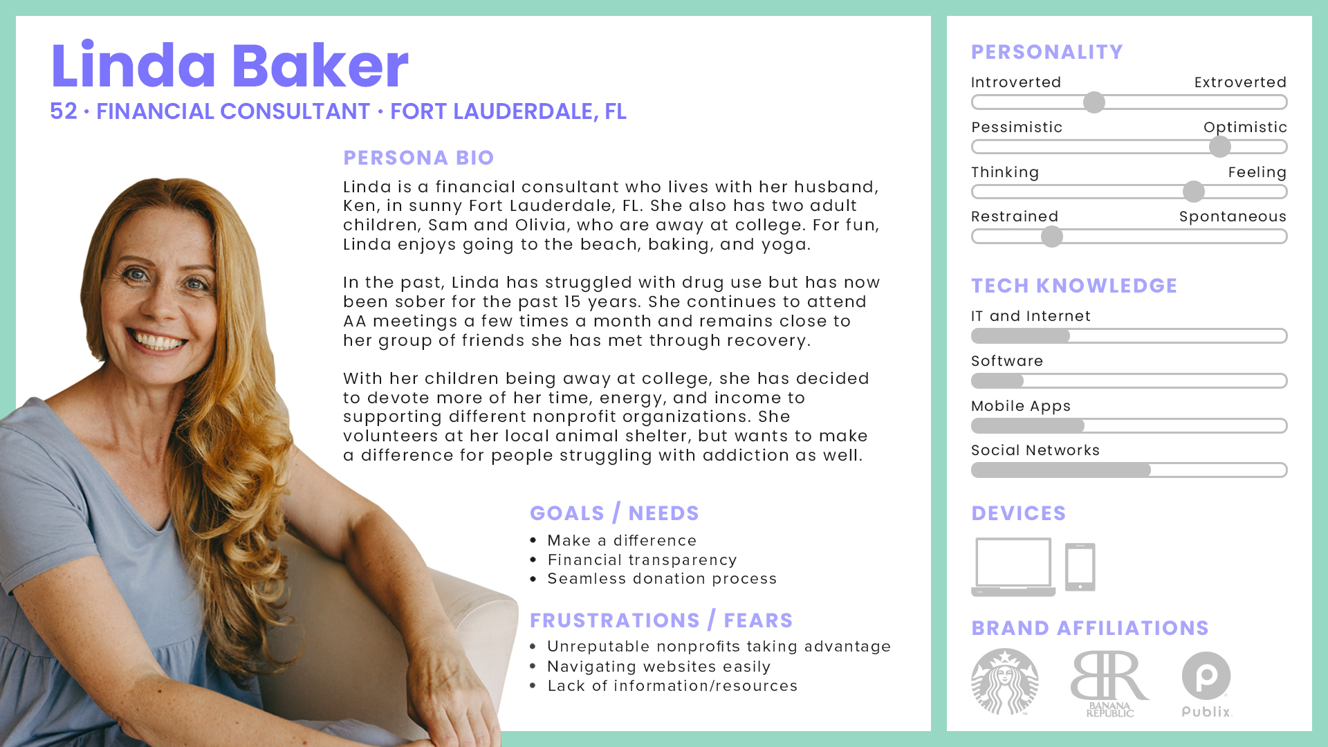
User Persona
With insights gathered, the user persona for Linda was created to identify the target audience’s needs.
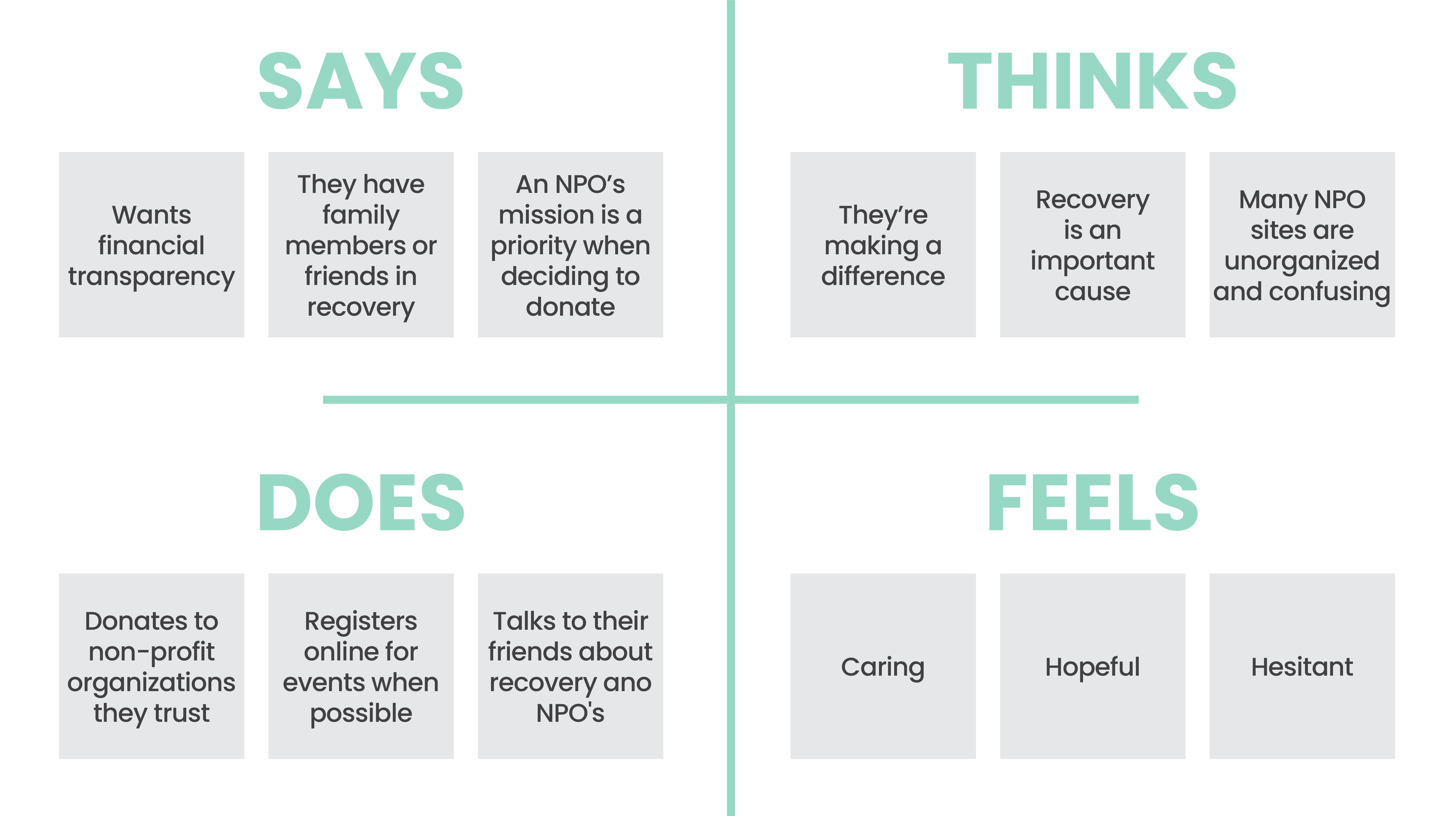
Empathy Map
To complement the user persona for Linda, an empathy map was constructed.
CATEGORIZE
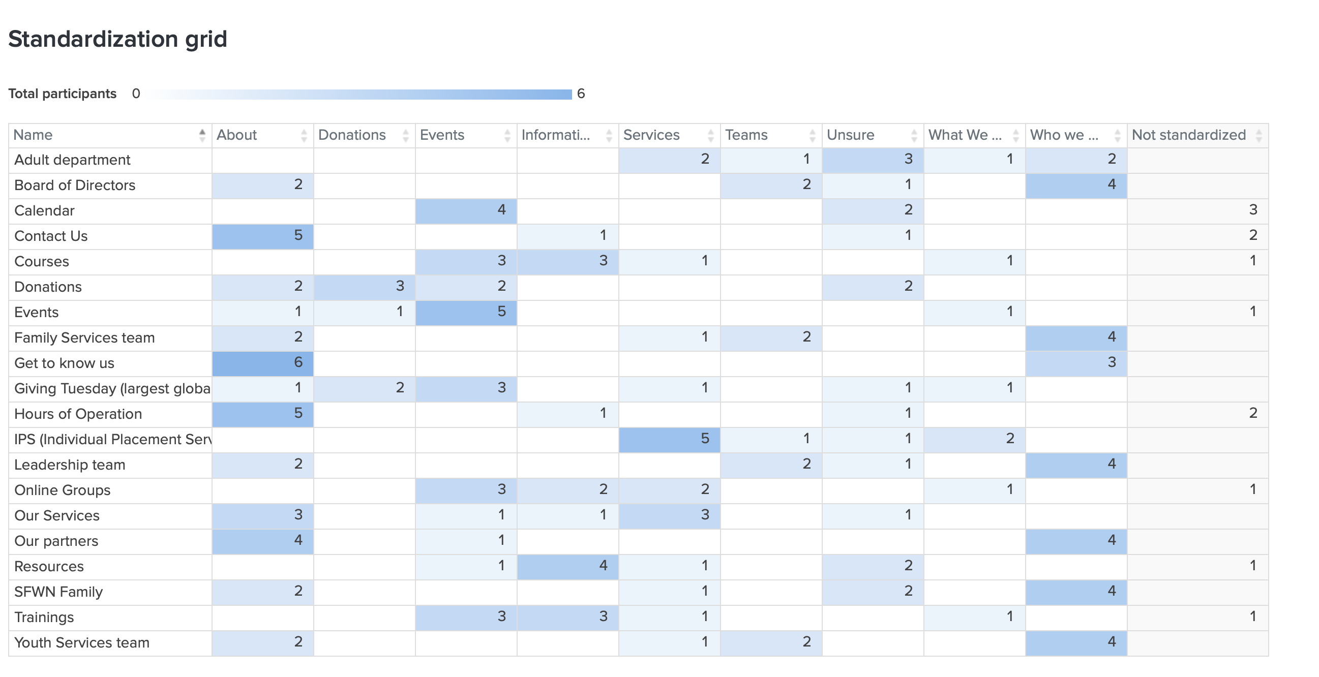
Card Sorting
This study was conducted to discover how users would group/organize content that South Florida Wellness Network had on their site .
METHOD
Open Card Sort
FORMAT
OptimalSort
PARTICIPANTS
9
LOCATION
Virtual/Online
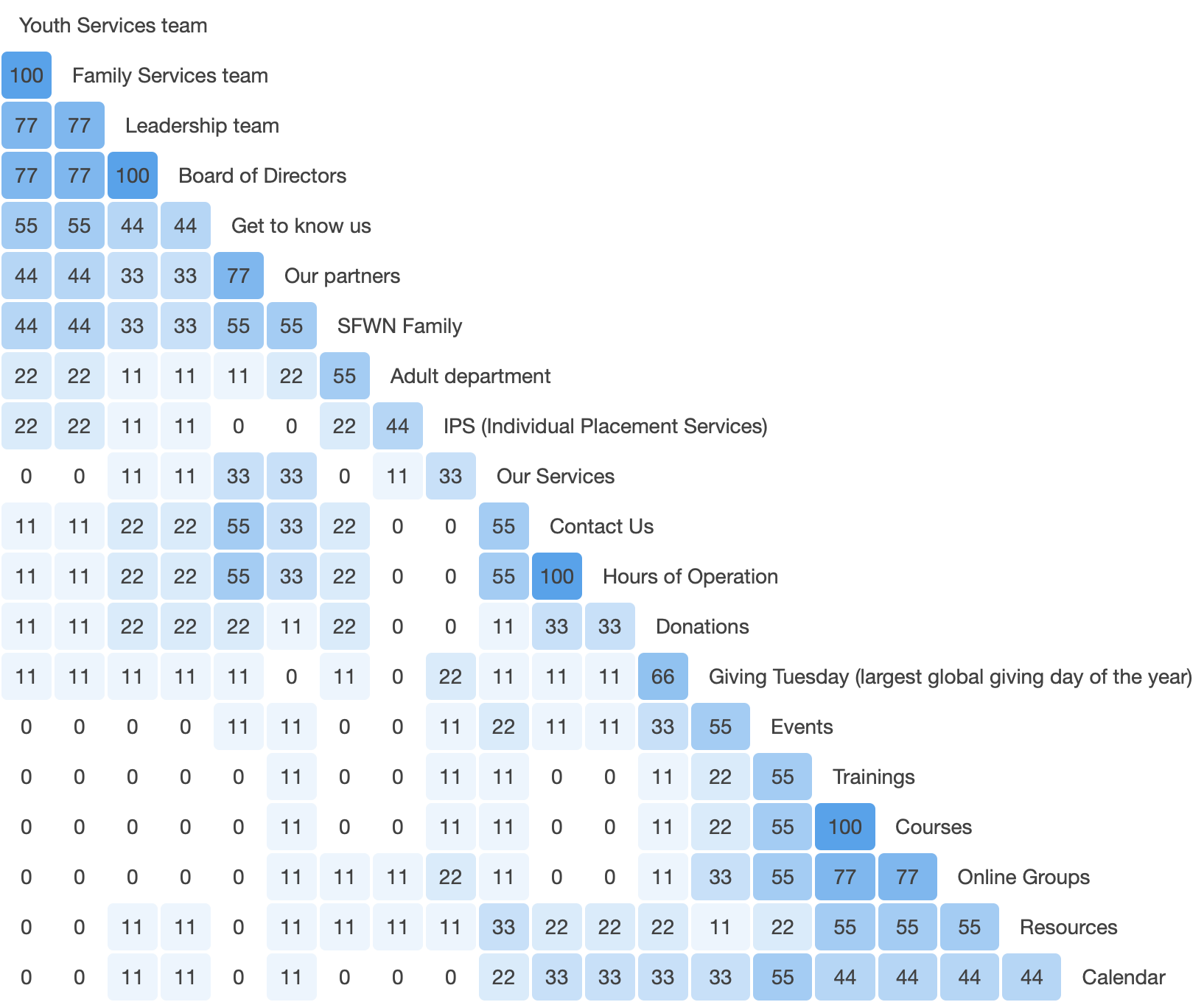
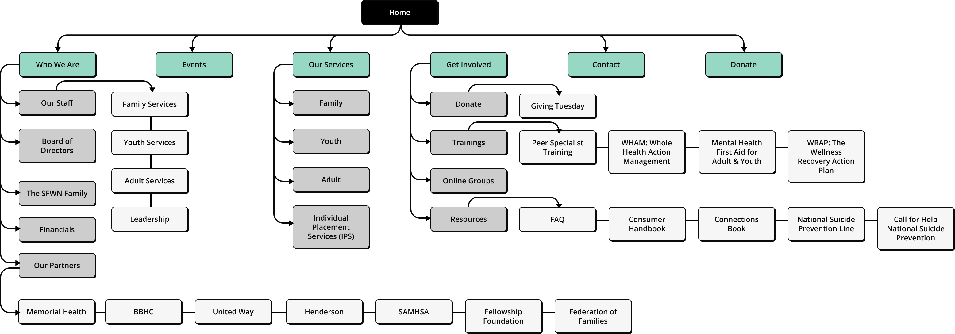
Sitemap
The sitemap is designed with donations and events being the main focus. The open card sort data in tandem with the interview findings were used to determine the navigation and information architecture of the site.
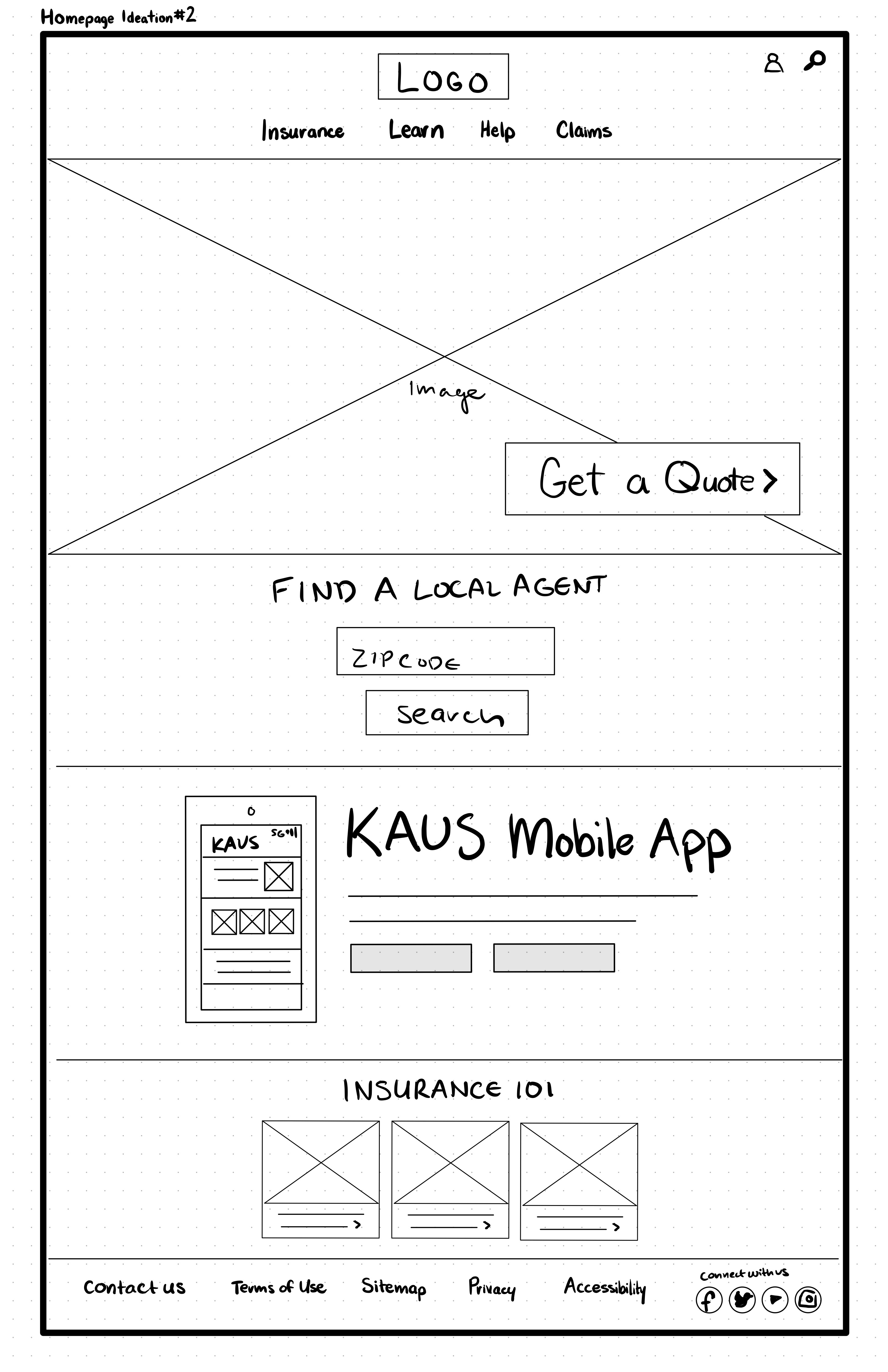
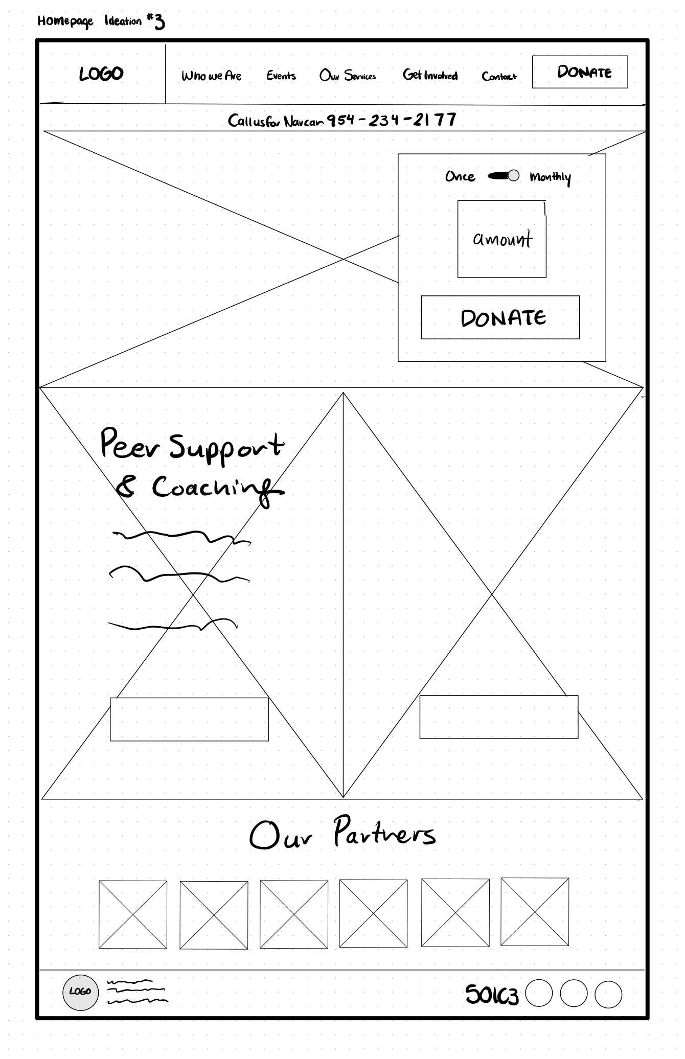
Homepage Sketches
Potential content was ideated and then sorted visually with design drafts. The research and strategies listed above assisted in figuring out the user's priorities, needs, and wants when visiting an NPO's website. With that data in mind, homepage sketches were drafted to assess the best way to present and organize the information on the site.
INTERACTION
User Flow
To understand the viewpoint of the user, a user flow was created to visualize the steps taken to complete the essential task of donating.
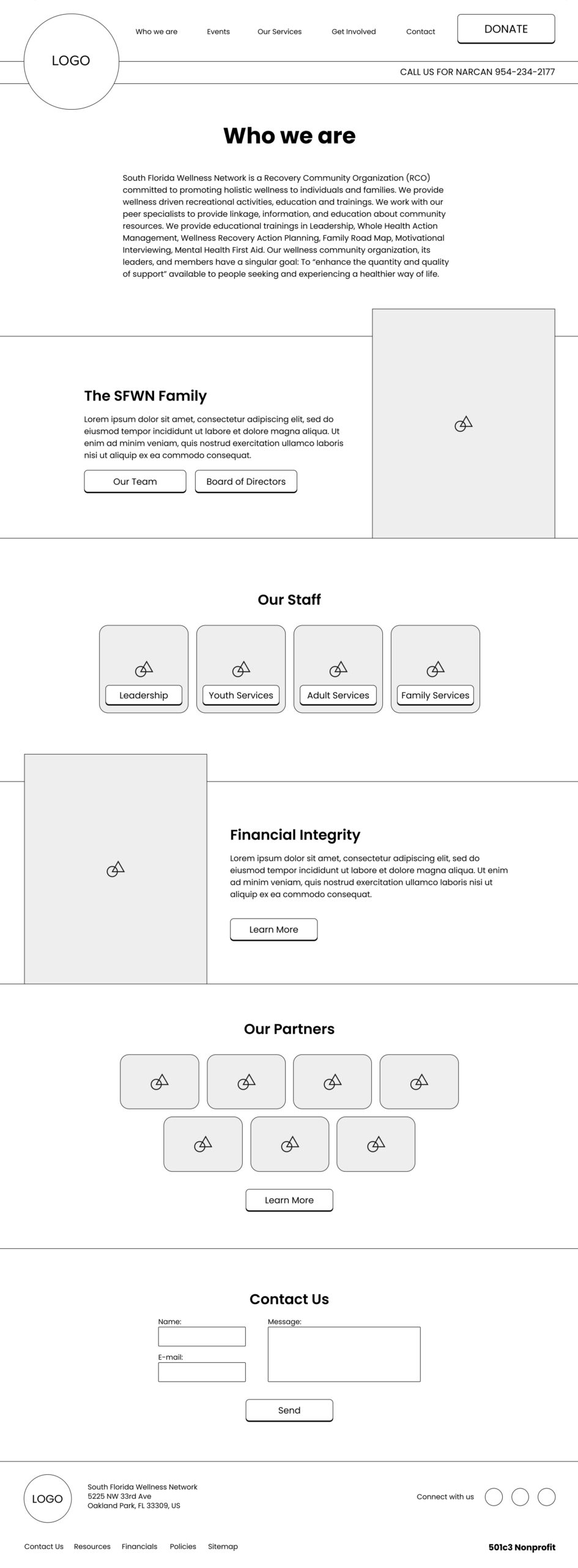
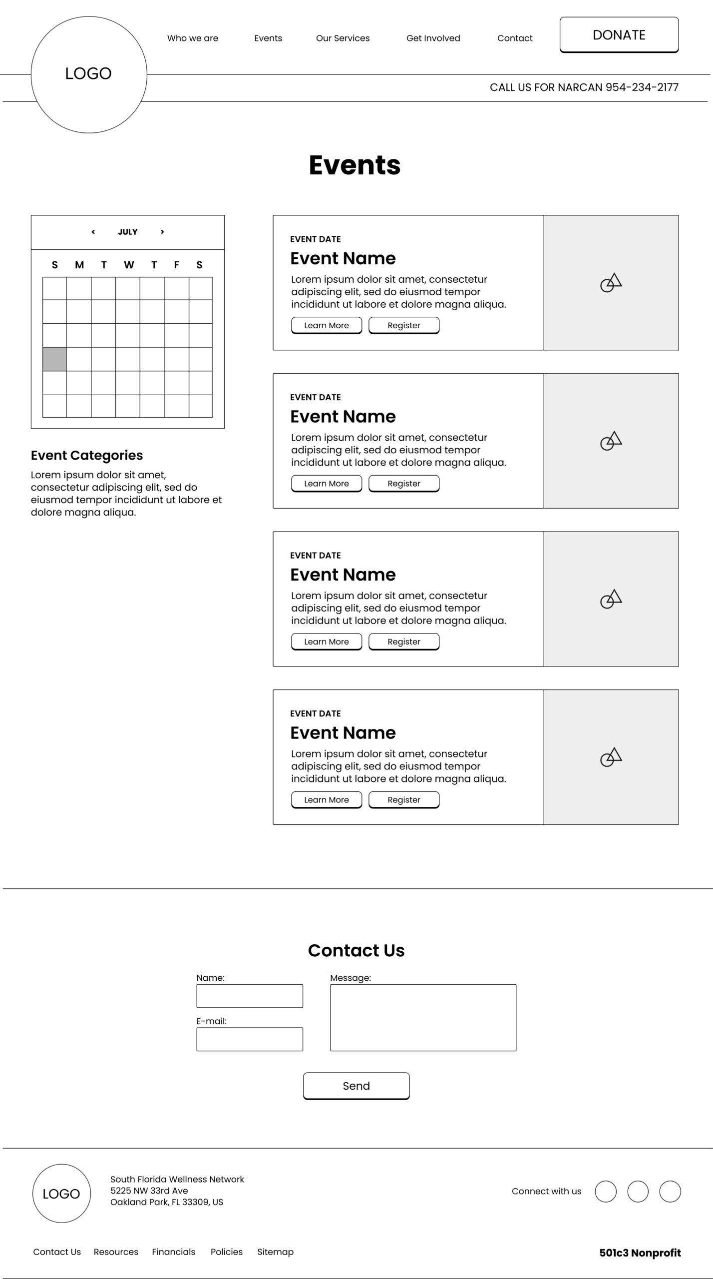
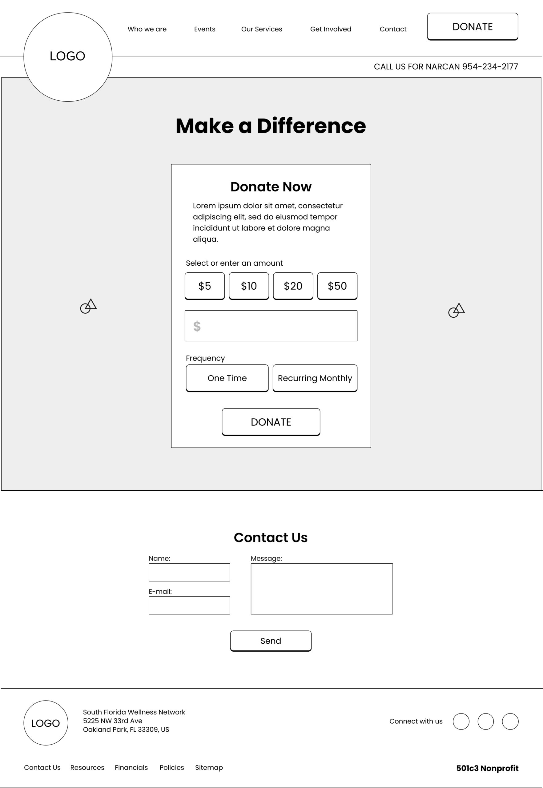
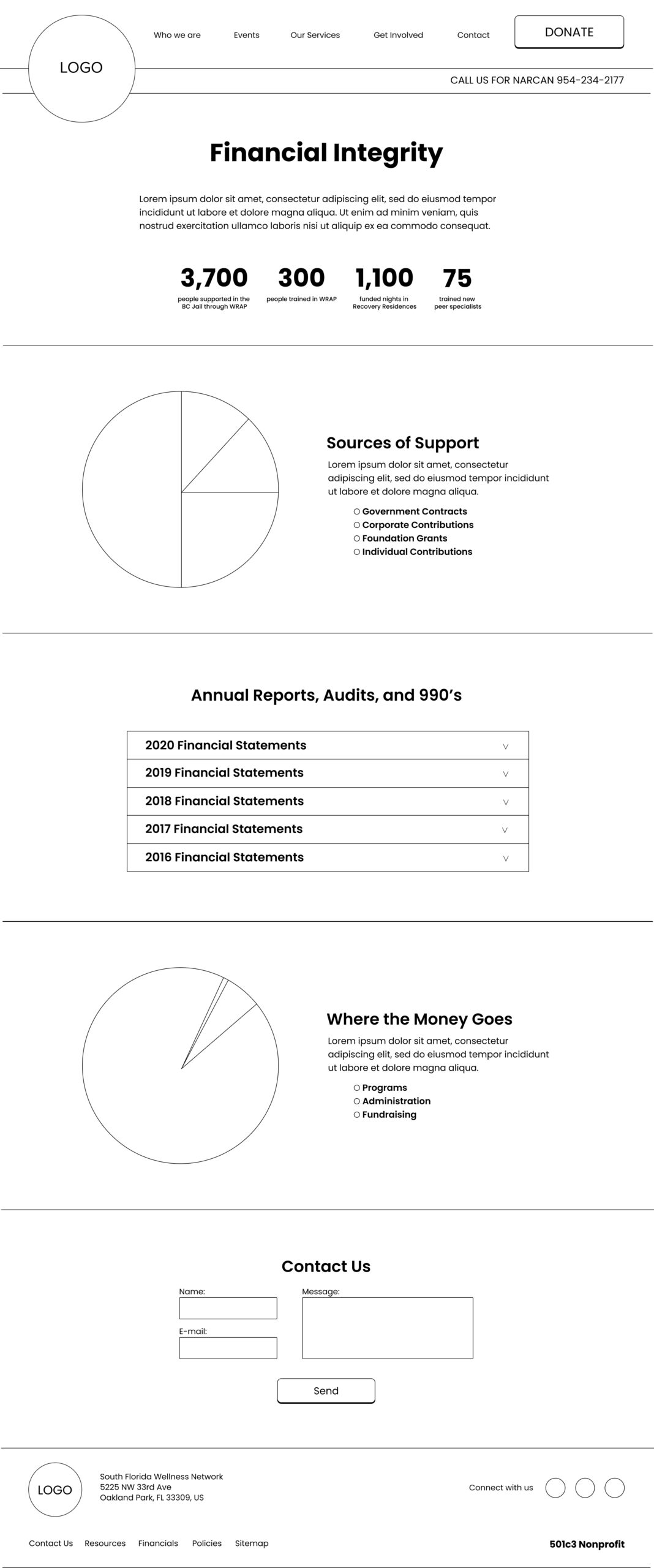
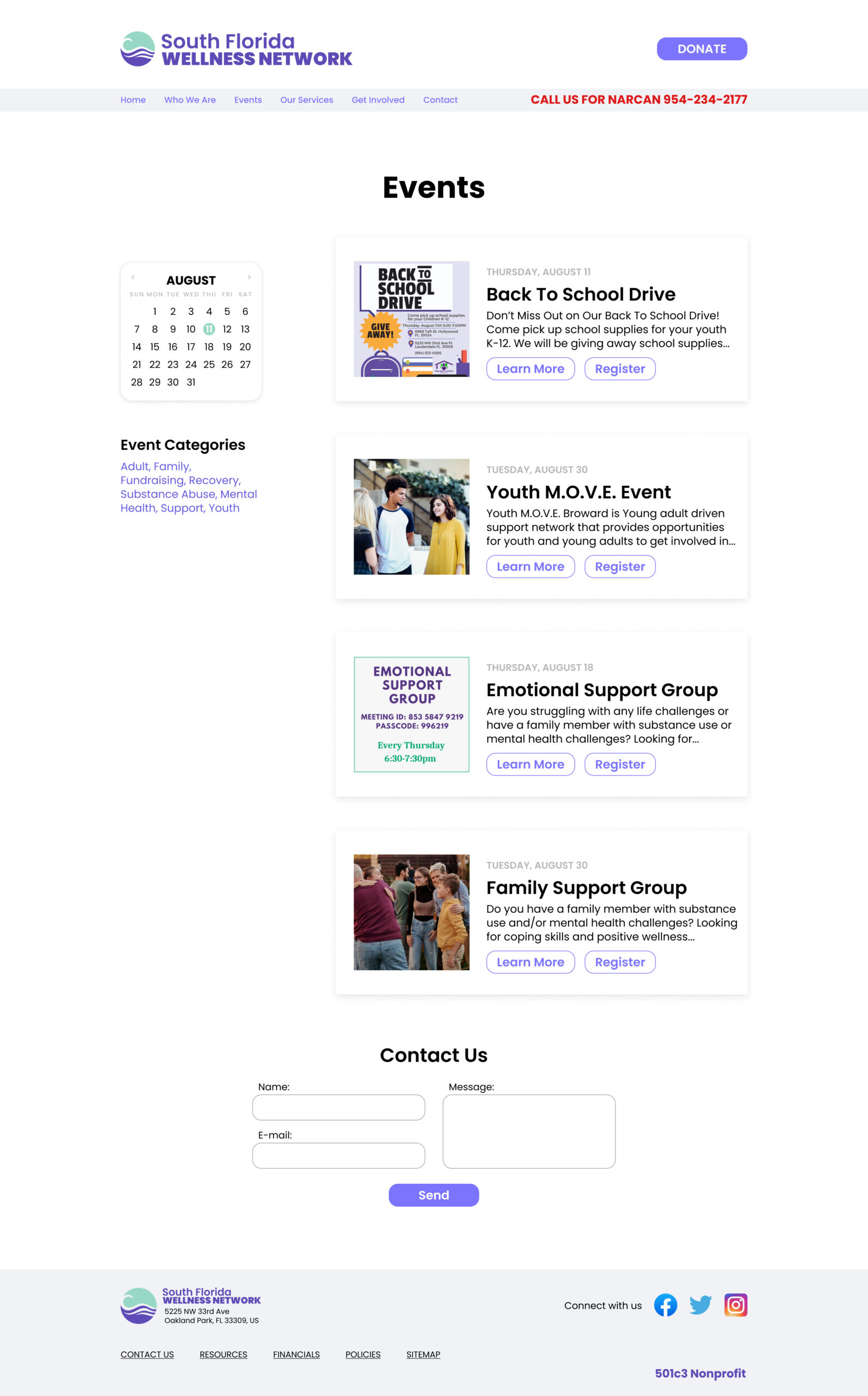
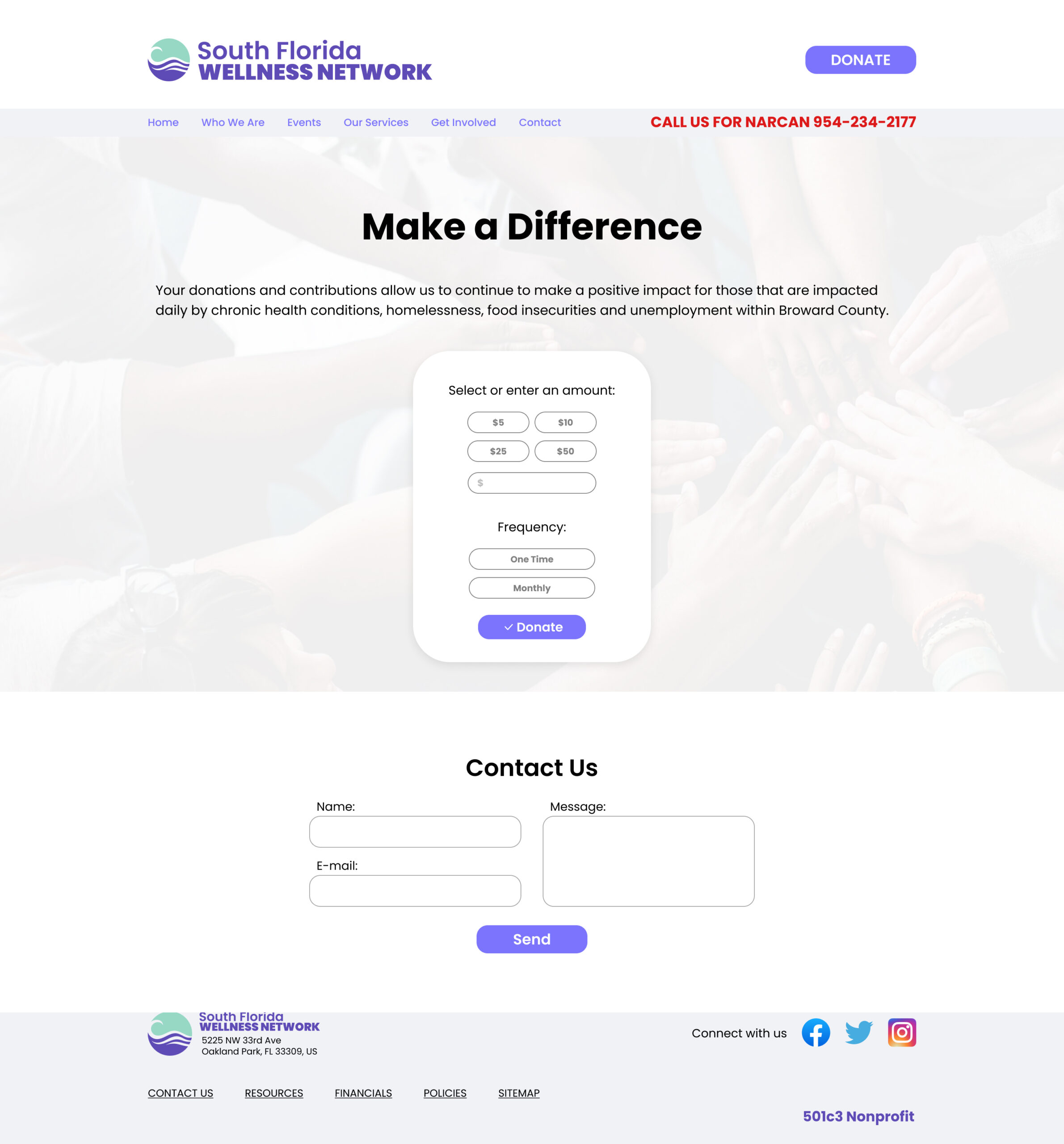
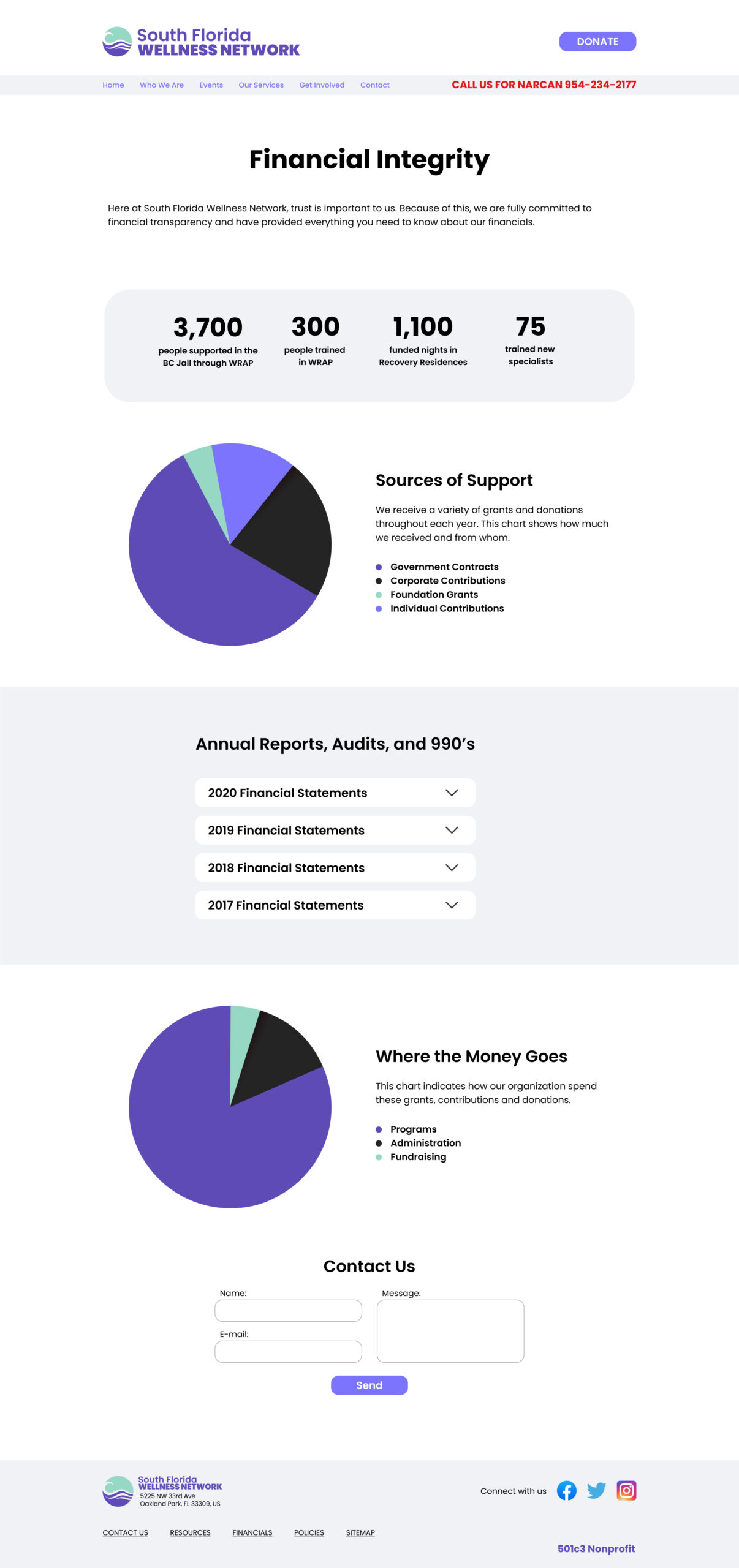
Wireframes
Homepage
Who we are
Events
Donate
Financials
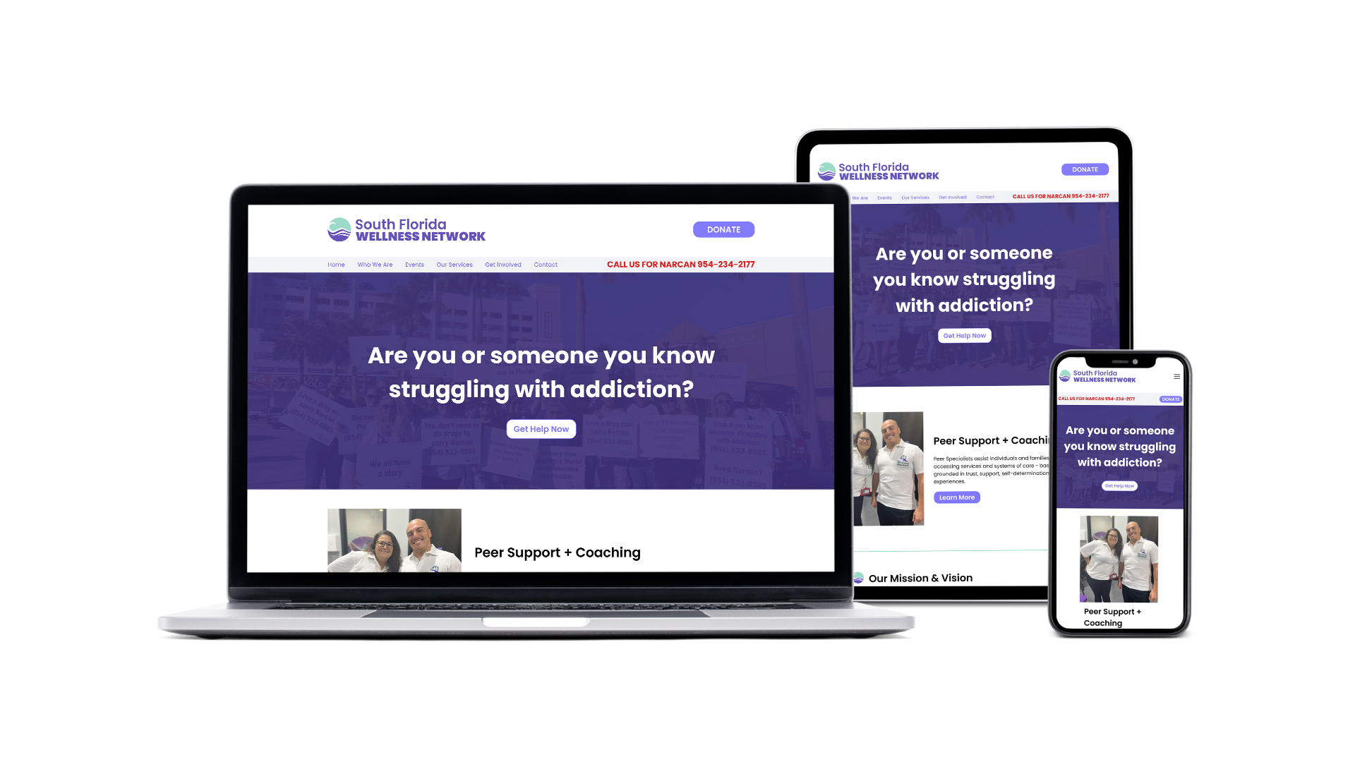
INTERFACE
Branding
South Florida Wellness Network requested new branding elements during this process. The goal was to still have the overall aura of the original, but to bring it up to date.
The concept behind the new branding style was to incorporate the color for recovery awareness (purple), with the color for mental health awareness (green) and to tie it all together in a fresh, modern take. For the multiple iterations, the focus continually shifted back to aesthetics and iconography that fit with South Florida.
Ultimately the chosen branding incorporated a minimalistic wave, and a refresh of the text treatment from the original.
Final Branding
Branding Design Concepts
UI Kit
After the branding elements were completed, a UI kit was built to balance the branding and style with user interactions. The UI kit defined the visual aspects of the site by selecting a color palette, fonts, and other design choices. This helped the site feel balanced and unified, aesthetically.
IMPLEMENTATION & ITERATION
Hi-Fidelity Wireframes
The low fidelity wireframes and the UI Kit elements were combined to create high fidelity wireframes.
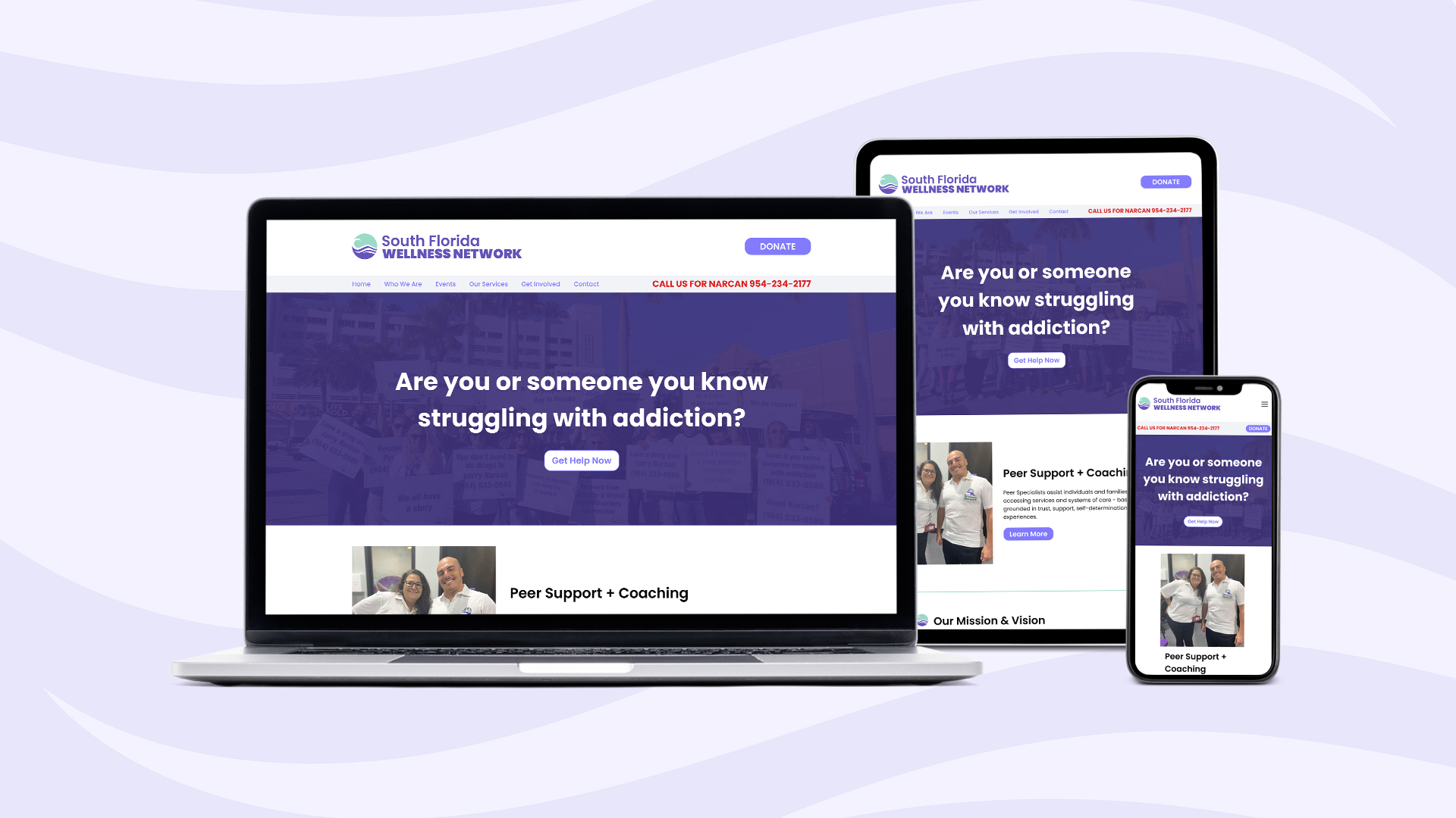
Homepage
Who we are
Events
Donate
Financials
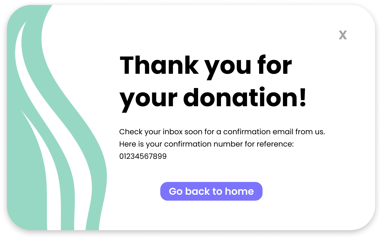
Pop Ups
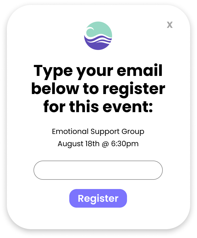
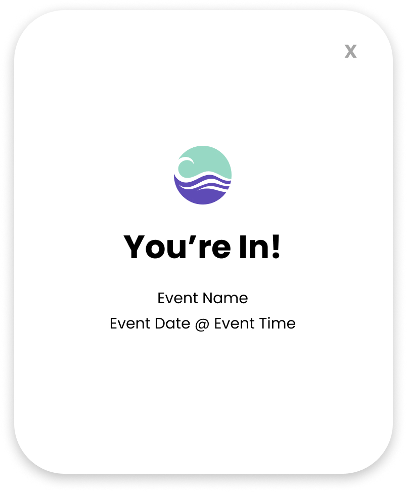
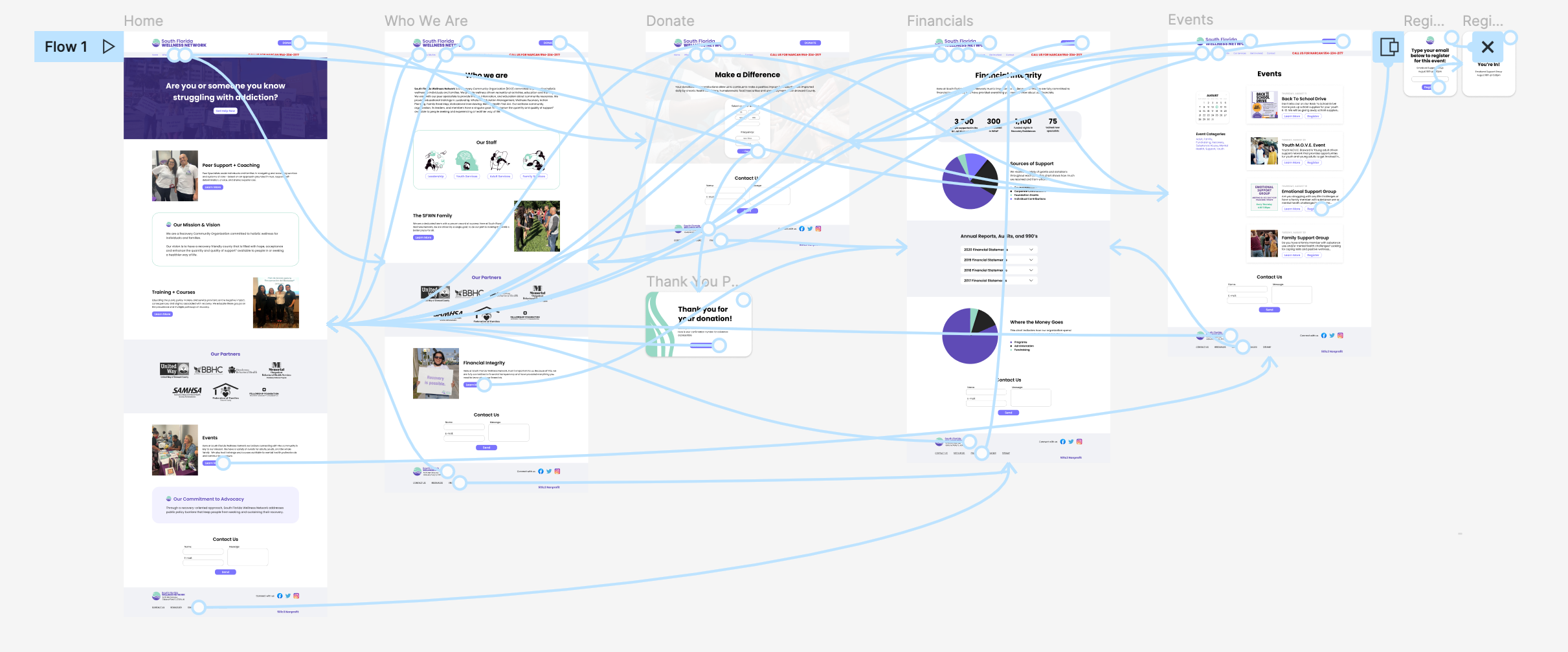
Prototype
Using the high fidelity designs, a prototyped version was created to implement usability testing.
USABILITY TESTING
Usability Testing Objectives
- Assess the length of time that it takes a user to follow the task flow of donating
- Discover specific needs for users who are at any point in the recovery process
- Evaluate user feedback to mitigate any pain points that occur when navigating the site
Methodology: Remote testing via Maze
Participants: 15
Demographics: Participants needed to fit within one or more of these groups:
(1) Individuals in any stage of recovery,
(2) Family members of individuals in any stage of recovery,
(3) Individuals who have donated within the last 12 months to a non-profit organization, and/or
(4) Individuals working in the mental health field.
Results
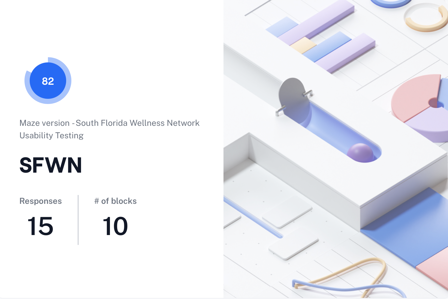
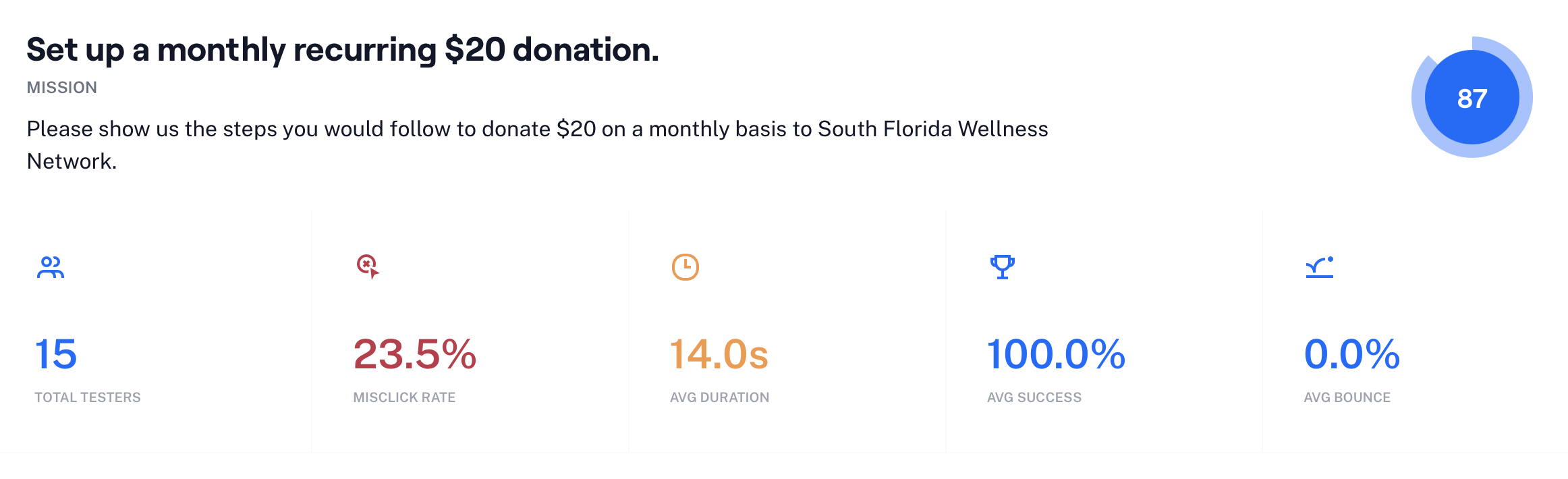
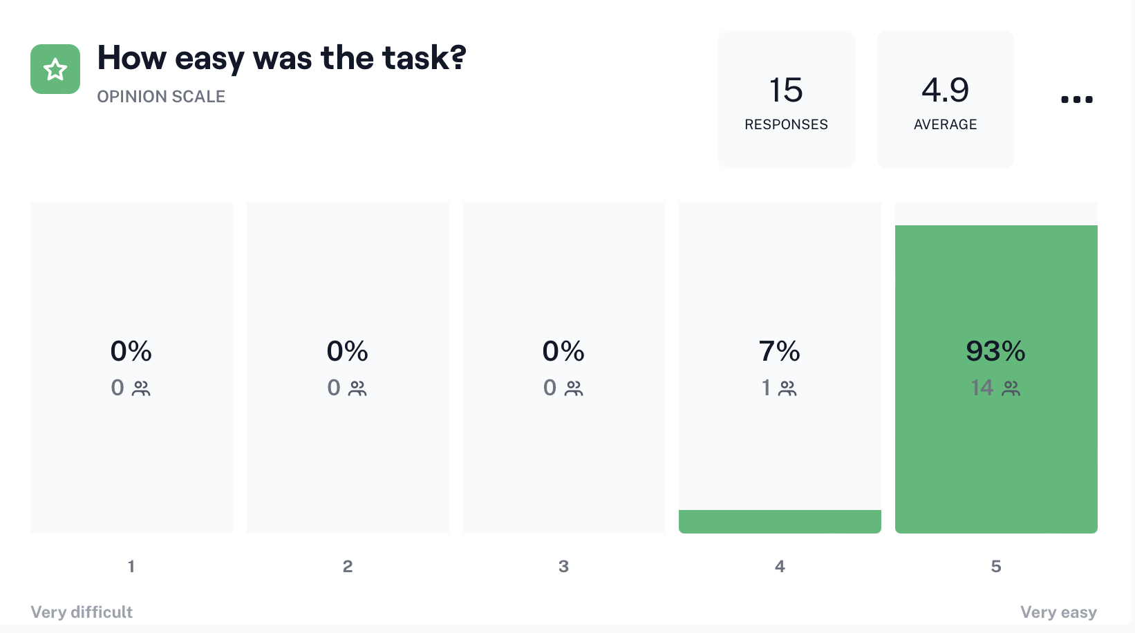
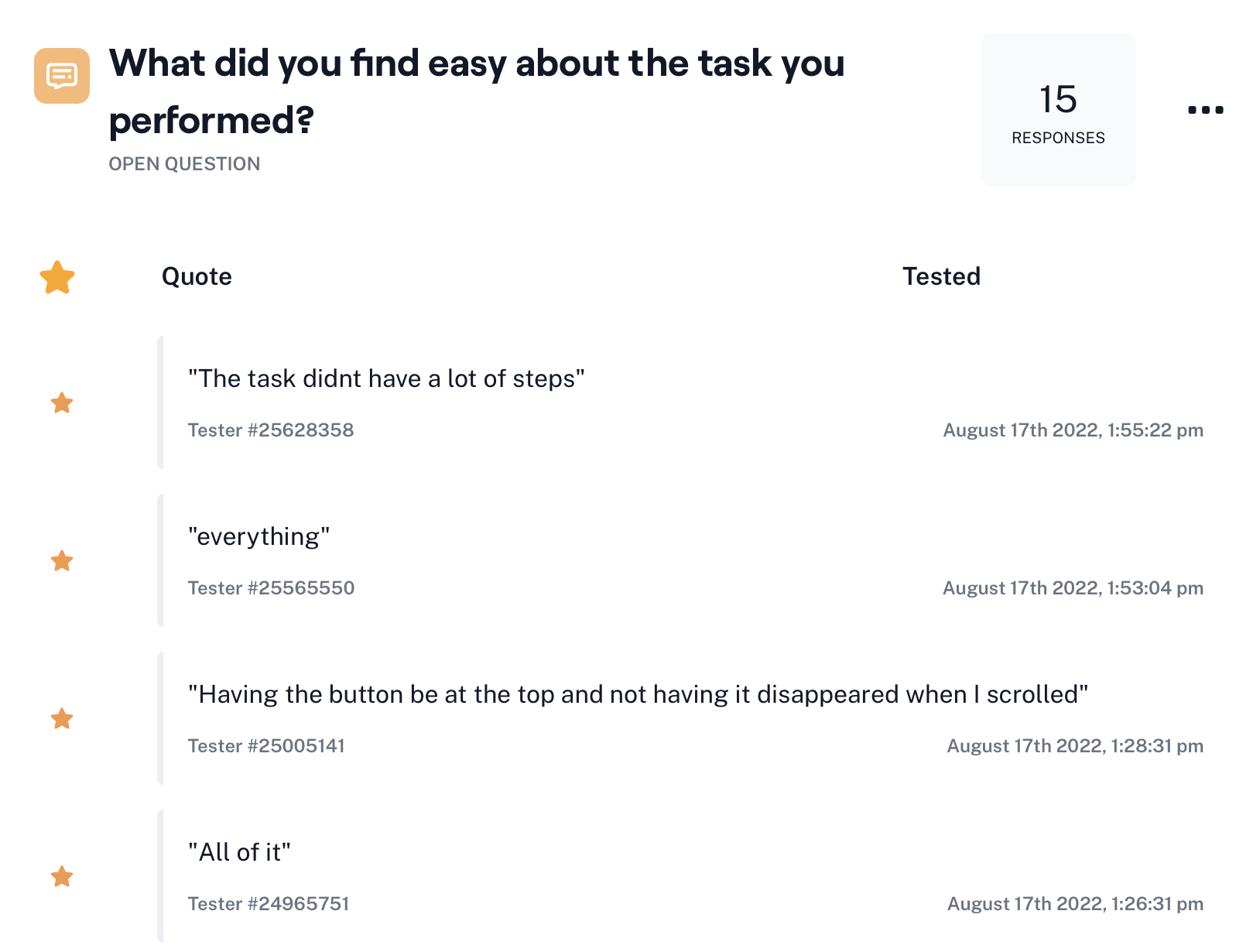
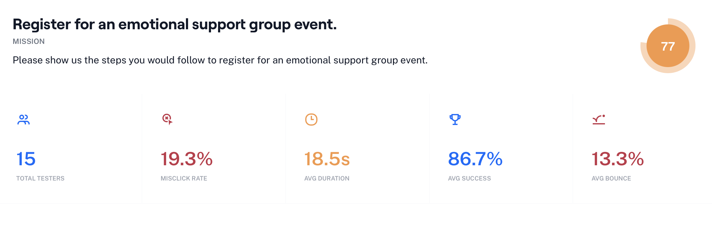
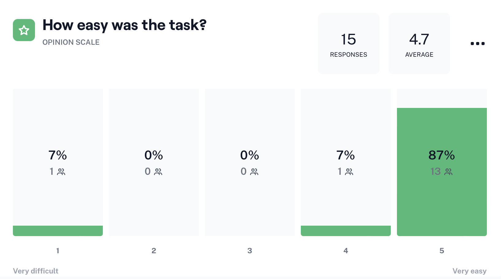
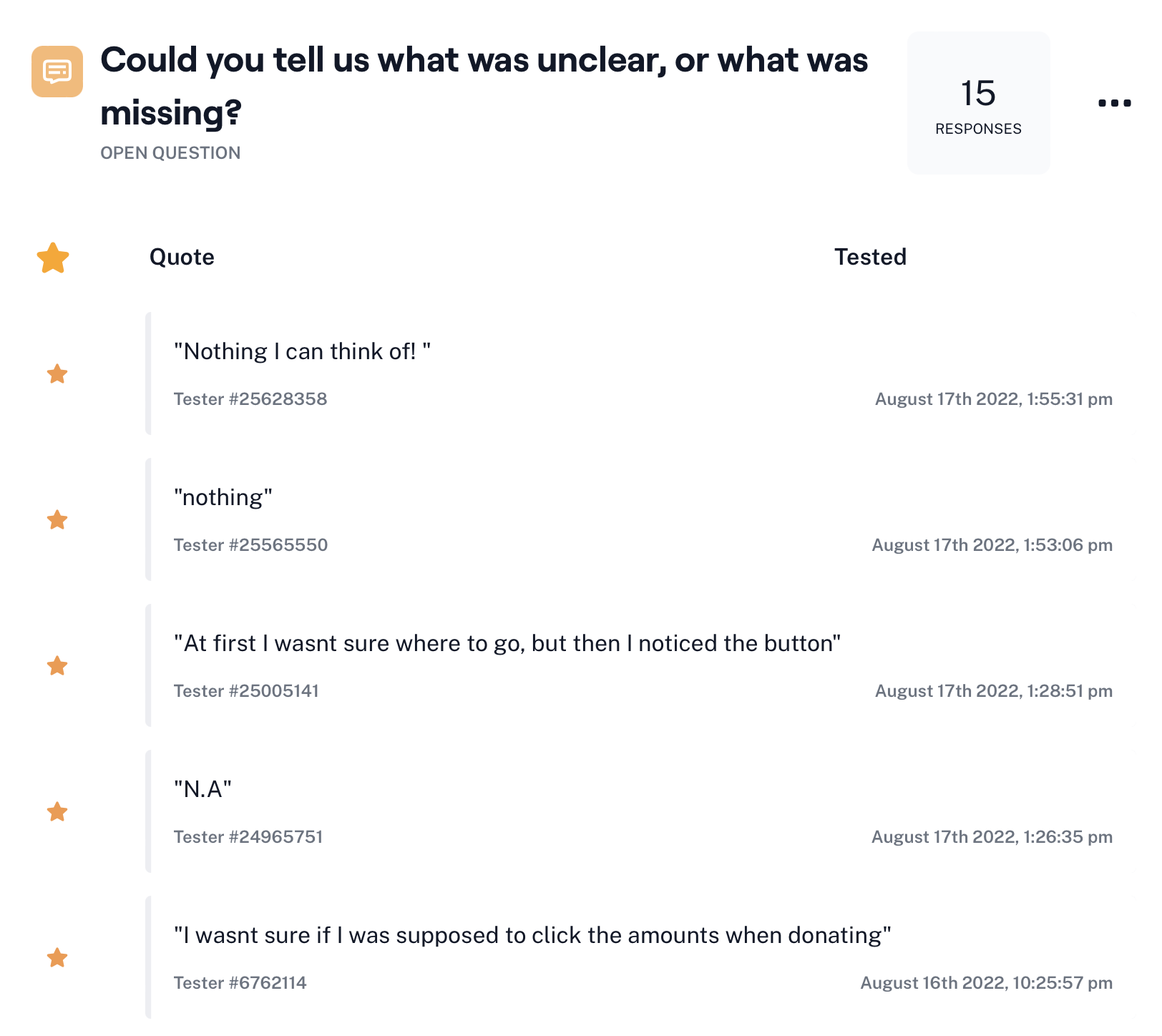
Overall, user feedback was positive with little to no indication of pain points or hurdles. Most of the concerns stated were minor cosmetic adjustments, i.e. changing the donation button color. It would be useful for this process to be repeated once more screens and task flows have been designed. This could result in more process-based outcomes rather than minor visual adjustments.
FINAL THOUGHTS
Future Considerations
Given the option of more time and resources, a few things I would love to explore are:
- Continuing to build out the rest of the pages for the site, including: get involved, our services, and a contact us page
- Monitor traffic on the updated site and compare it to the previous design's metrics
- Conducting another round of user testing, when more pages are drafted, to see if there are any elements that were overlooked
Key Takeaways
 Developing cultural competency practices is essential
- Throughout this process I found myself perpetually asking some variation of the question, "would this be useful/tactful/empathetic to someone in recovery?" This is an important practice to continue implementing in the future.
⚖️ Balancing Act
- Balancing the needs of the user with the goals of the stakeholder can be a precarious spot to be in. However, I found myself getting more comfortable voicing these to the stakeholder as the project continued. Advocating for the user needs to stay the focus, but that doesnt mean the stakeholder's needs go by the wayside.
SELECTED WORKS
KinkatopiaProduct Design
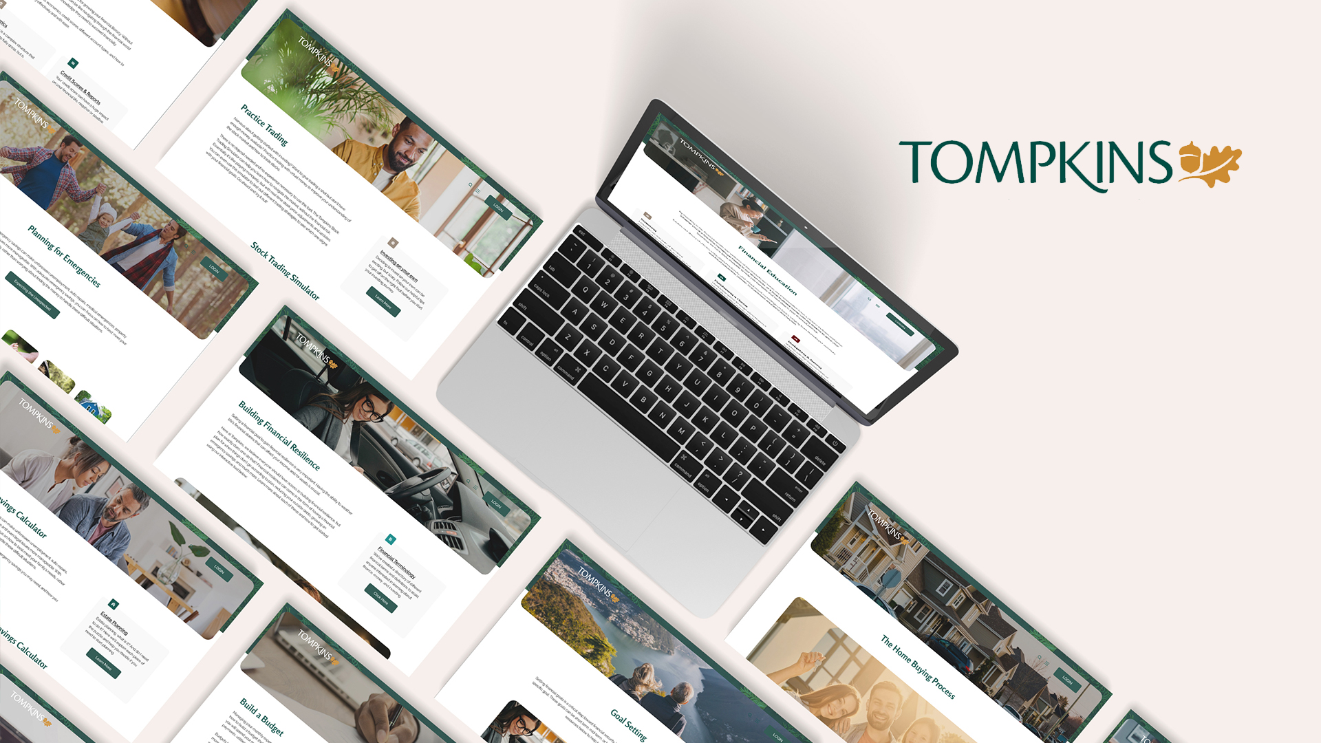
Tompkins BankProduct Design
South Florida Wellness NetworkProduct Design
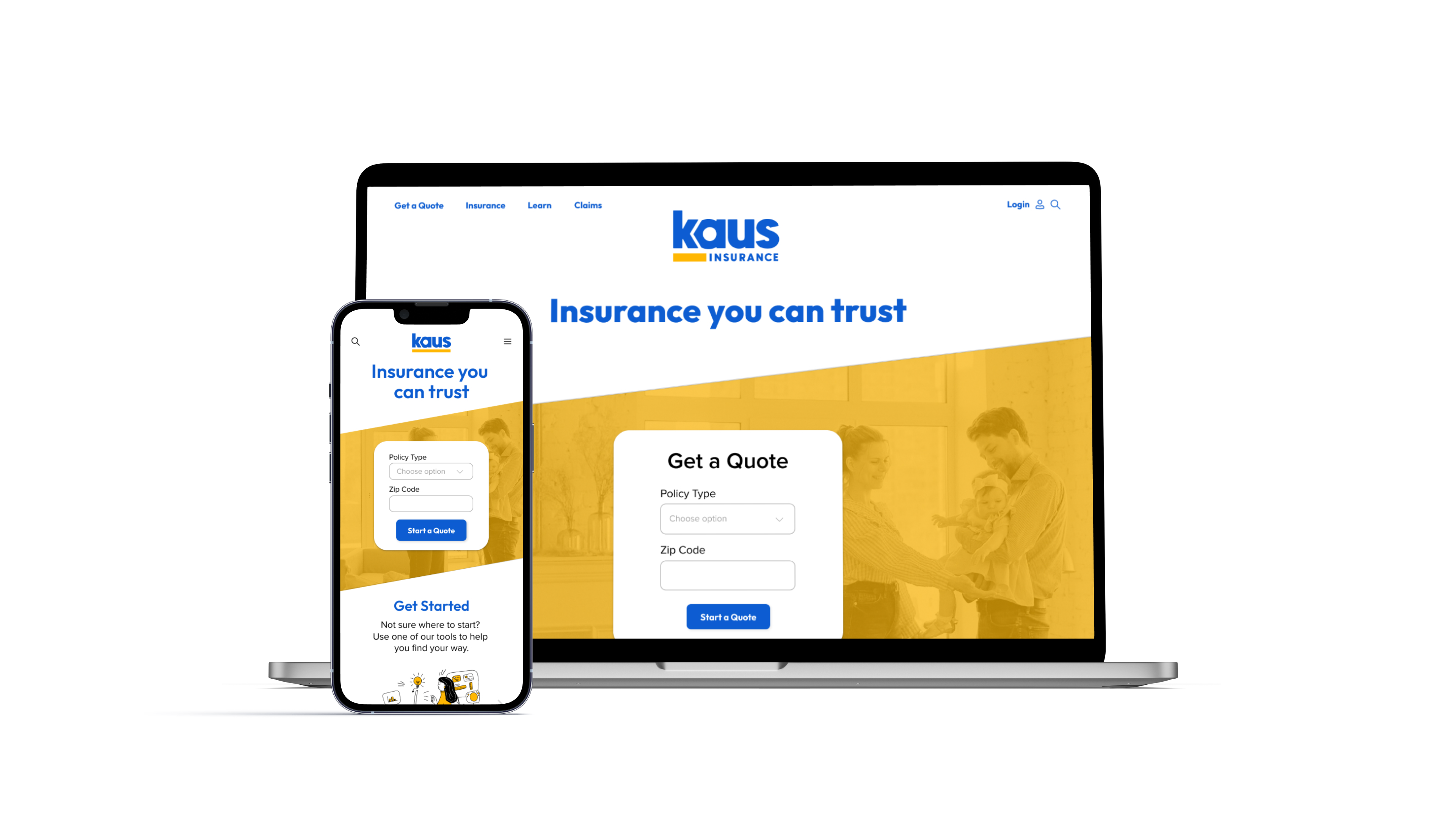
Kaus InsuranceProduct Design
Prosperity ResearchGraphic Design
ARK Resilience AwardsGraphic Design
Total Wealth SymposiumGraphic Design
Profits UnlimitedGraphic Design